Designing packaging for a new category entrant
It can be tricky entering a product category that already has well-established players. For new category entrants, the challenge is in disrupting any habitual purchasing of shoppers.
The biggest hurdle is getting shoppers to notice your new product on shelf and then getting them to put it in their trolley. Regardless of budgets, the key is to develop strong distinctive brand codes, to seed them in the minds of shoppers; and then trigger these instore from the shelf.
These distinctive brand codes need to be established in the positioning and packaging design process for your brand. At Onfire Design, we thrive on the challenge of working with our clients to create brand and packaging design that that will stand out in the cluttered supermarket and ignite your sales and success.
Our belief around the development of brand codes is that they need to be visually powerful and distinctive. This could be your logo design, your pack shape or format, the colours you use, typography or a combination of all of these.
Consider the power of the pack format and shape with the launch of Monday into the personal haircare category. The intent with this brand is to change the hair game, and their packaging certainly delivers to this intent, standing out from existing supermarket haircare brands, and making shoppers stop in their tracks.
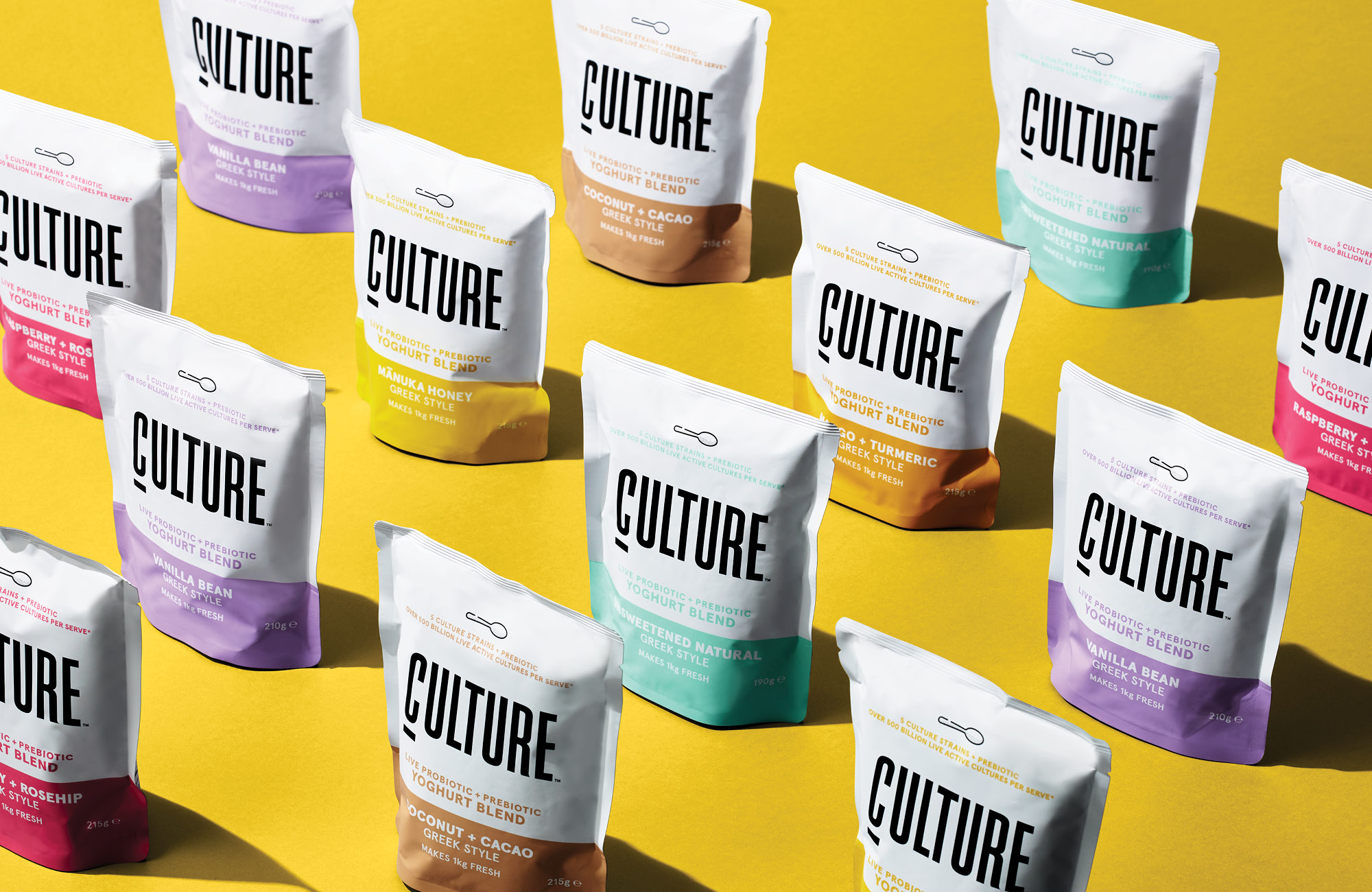
A recent project completed by Onfire Design is the development of packaging for the CULTURE brand of powdered yoghurt. This category was dominated by Easiyo and the Hansells brand, both of which had been in the category for a number of years and had modernised their packaging and innovated in new products. The challenge with the brief for CULTURE was to launch a straight-up, fresh, lively, fuss-free, premium offering as a second brand within the Hansells portfolio.

The final pack solution is design focussed; the pack format was set as pouches (the same as the rest of the category). With CULTURE, the pack design takes the ‘straight up’ nature of the brand literally, and delivers a fresh perspective for the category.
The pack design is bold and stripped back. The use of white for 2/3 of the pack enables strong brand blocking and stand out on shelf. The pop of bright colour along the bottom third enables clear flavour differentiation. And the strong typography used for the logo communicates strength and modernity; whilst being minimalistic – in contrast to the market incumbents.

The CULTURE team have a number of strong, distinctive brand assets they can use to codify any brand communications or activations off shelf, building awareness and seeding the brand subconsciously in the mind of consumers and shoppers.
For shoppers of the powdered yoghurt category, CULTURE jumps off the shelf, and offers a fresh and modern alternative.
If you have a new brand, range or product launch coming up, please reach out to us at Onfire Design. We would love to work with you to design brand and packaging assets that will connect with shoppers and ignite your sales. Contact Sam Allan, Creative Director on +64 9 480 2036, or sam@weareonfire.co.nz.