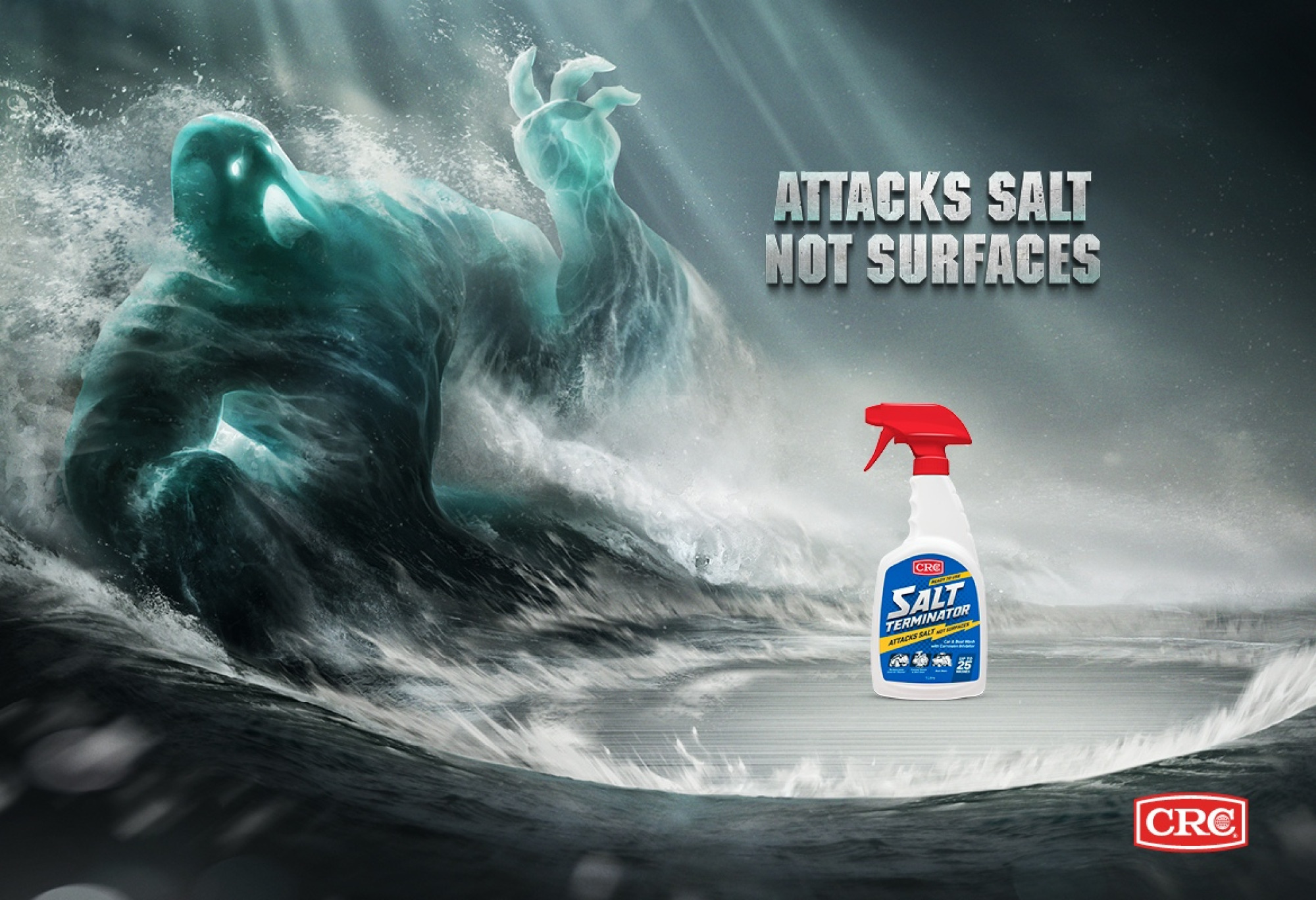
Attacks Salt, Not Surfaces
CRC Salt Terminator
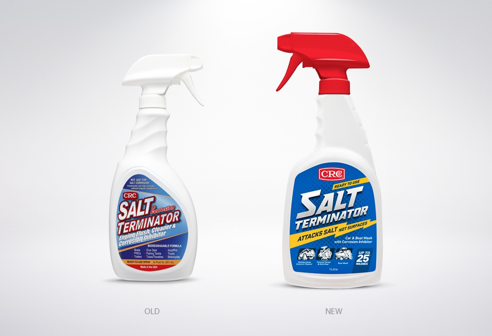
CRC New Zealand introduced a new trigger bottle to their Salt Terminator range. With the change, Onfire was asked to create a new look for the packaging.
As a challenger brand, our aim was to give CRC Salt Terminator a strong shelf presence in a busy retail environment. The previous on pack design was sourced from the USA so it was important to reposition the product to appeal to the New Zealand market, which is both fishing and boating mad!
The design was simplified, with a striking blue and yellow colour palette introduced. The logotype was hand drawn along with a series of icons. Icons were used to make it easier to identify the products use at a glance. The trigger colour was changed to align with the CRC brand colour.
Onfire developed a new slogan, ‘Attacks Salt, Not Surfaces’. The slogan was developed into a BTL campaign, with print and point of sale material.
The result? An unmistakable look and feel that gives the brand real cut through.