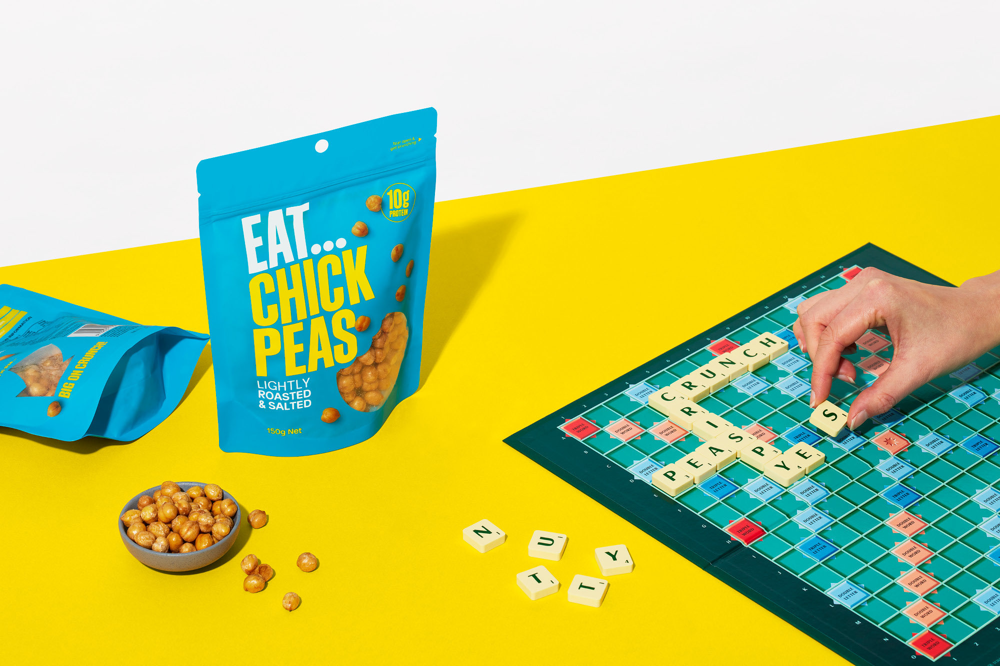
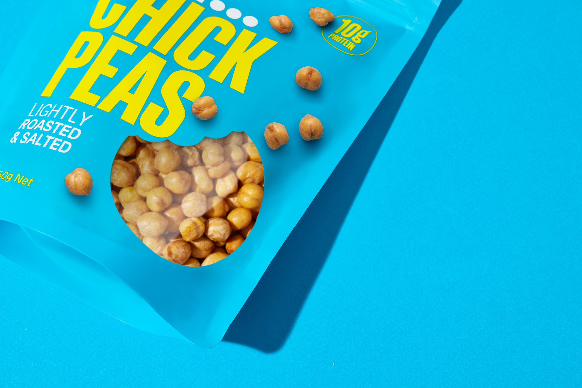
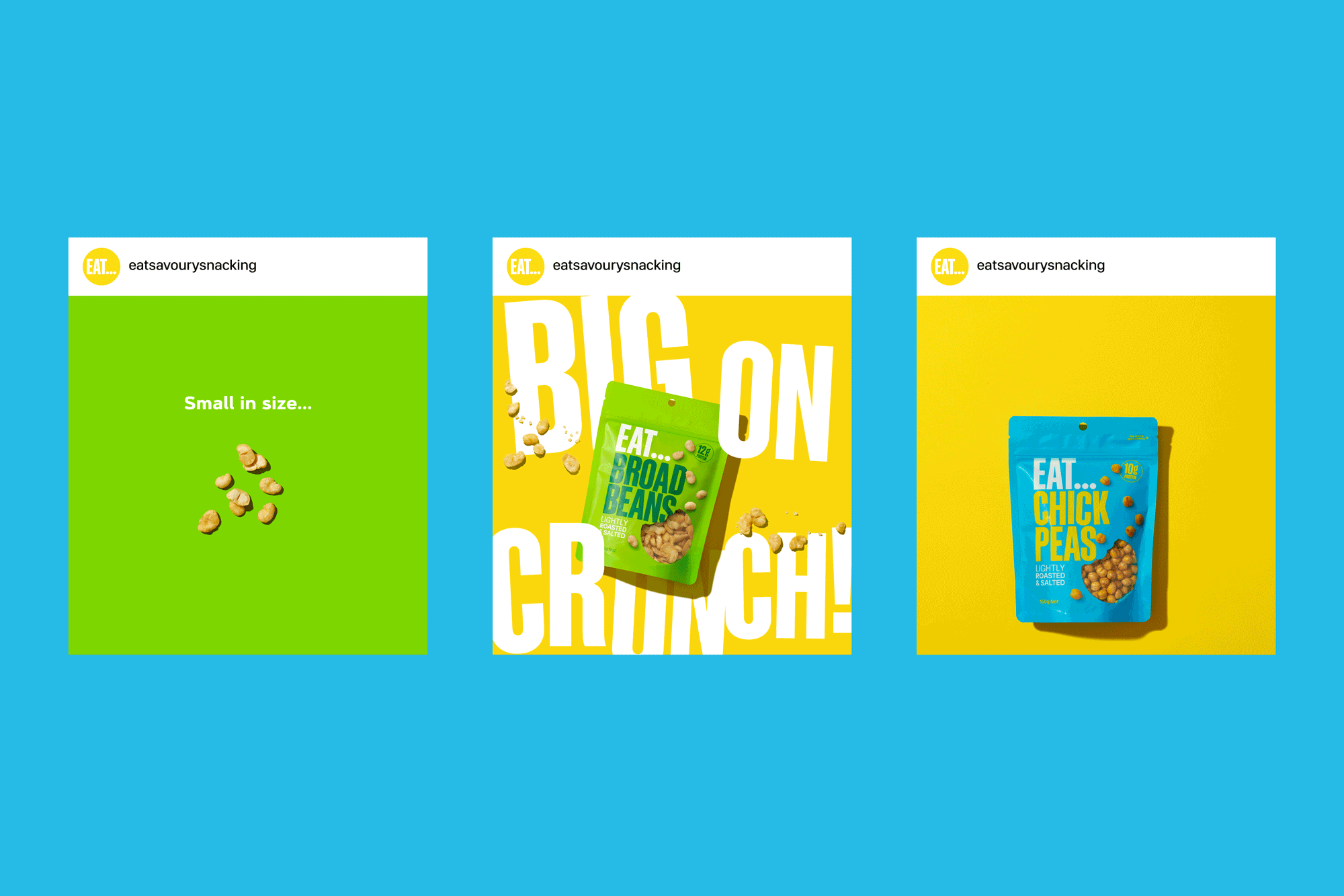
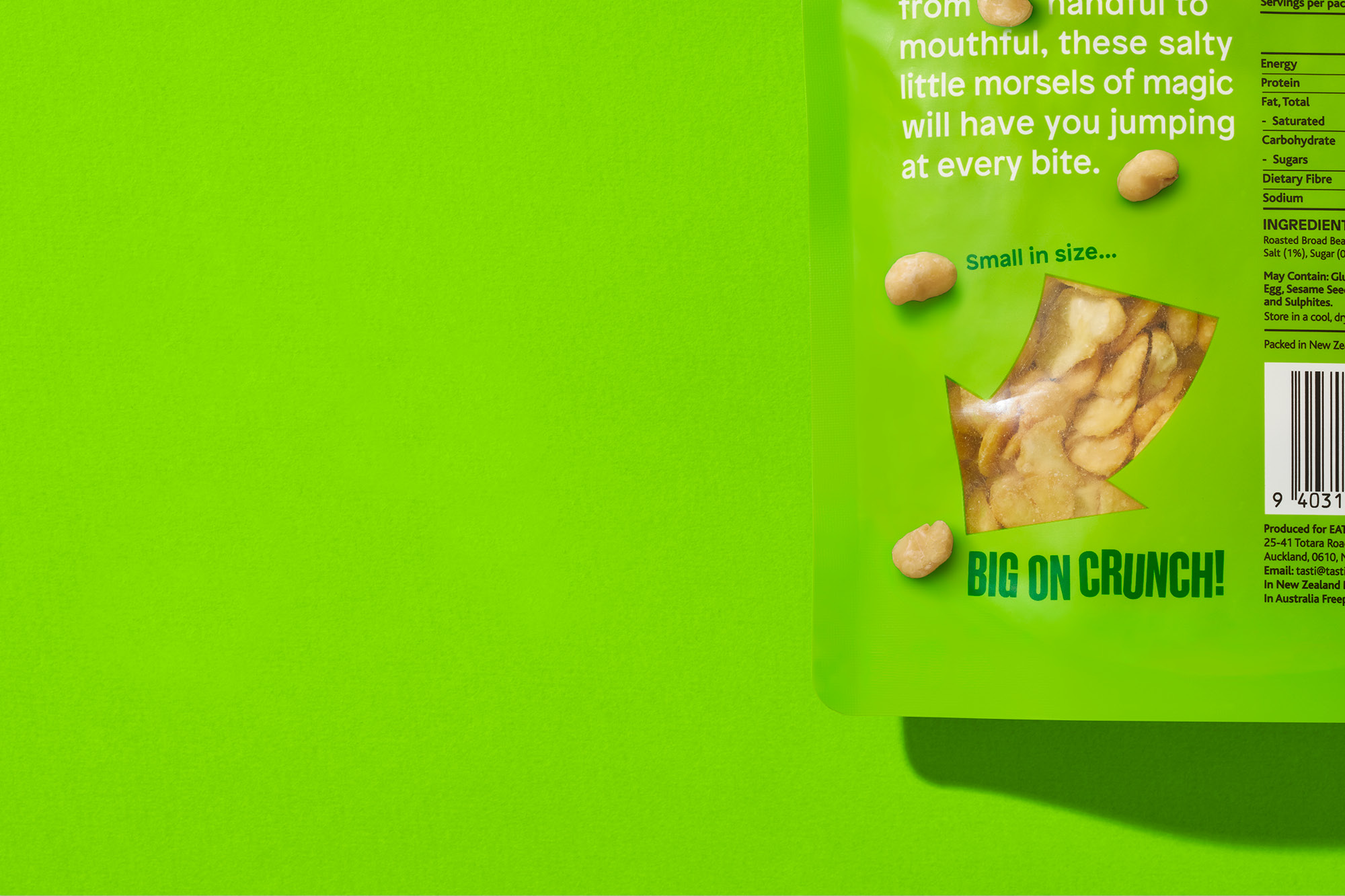
EAT...

Small in size, big on crunch!

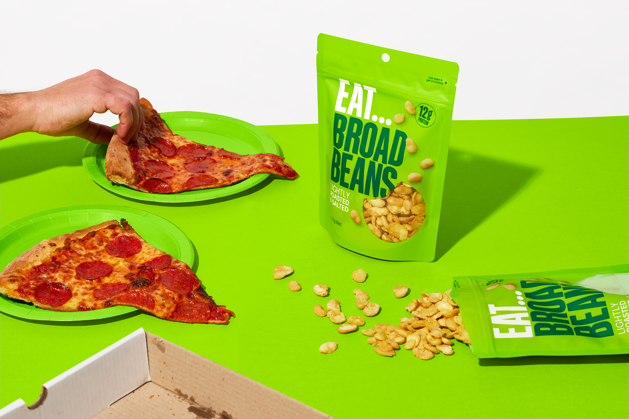
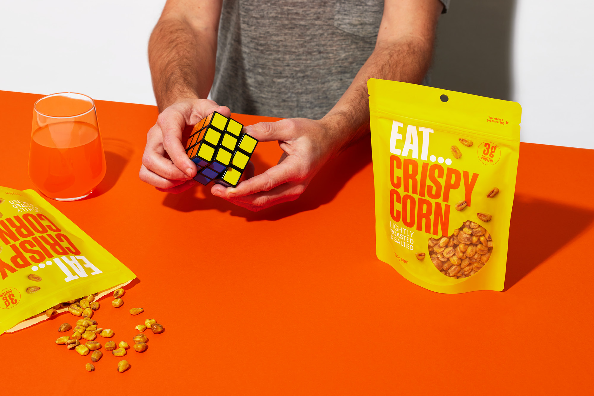
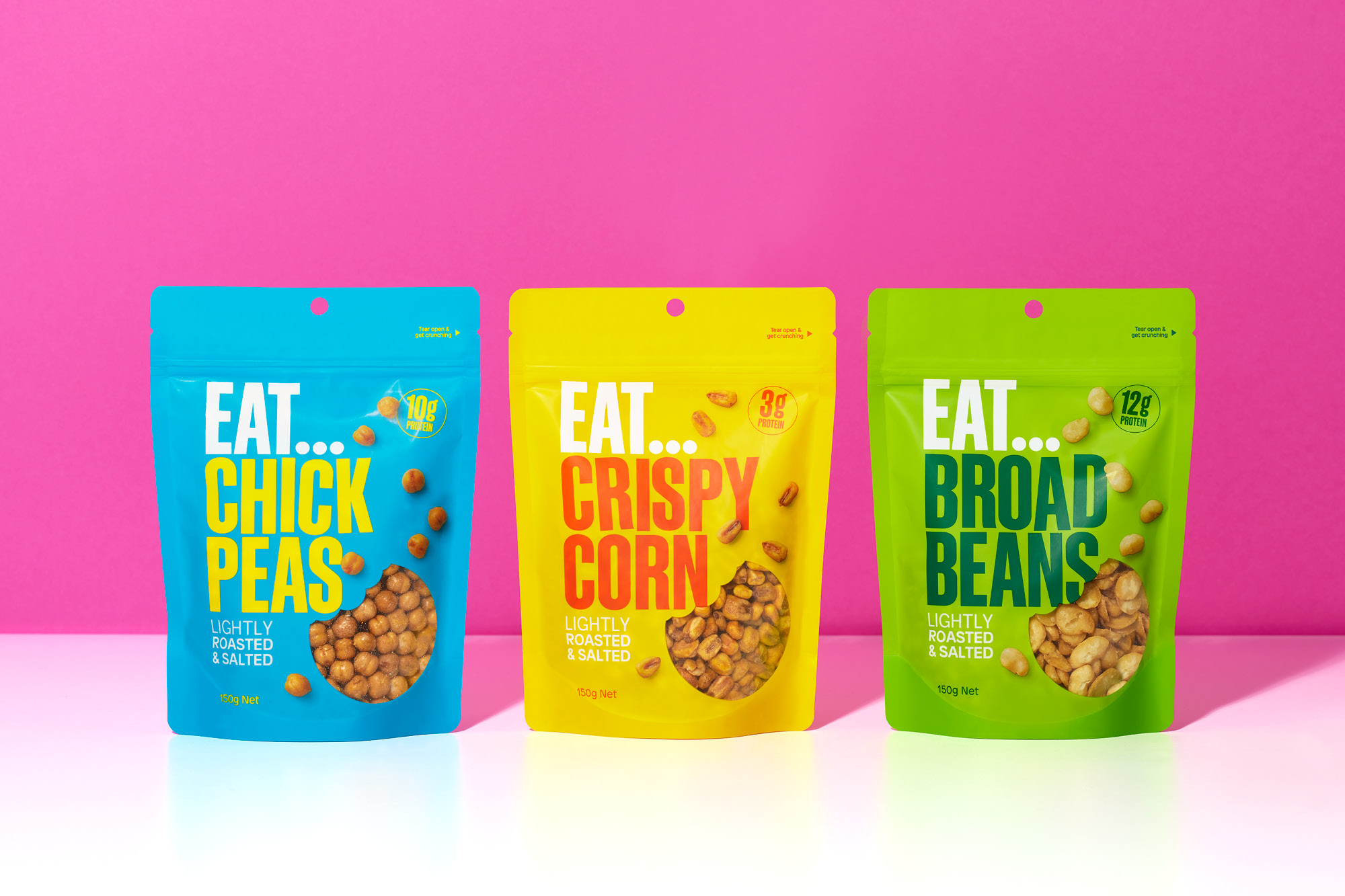
No one should feel guilty about snacking, far from it. The team at EAT… are on a mission to prove that there are delicious options beyond the usual suspects of savoury snacks. Taking small and naturally good chickpeas, broad beans and corn kernels, toasting them, then adding a pinch of seasoning, they created small morsels of satisfaction that are big on crunch.

The name and brandmark are inspired by the eternal ‘what to snack on?’ moment that hits every day; the simple premise of the word ‘Eat' combined with ellipses captures the thinking moment - the pause before deciding. Aimed primarily at savvy millennials and Gen X’ers with an appetite for new healthy ways of snacking, we took our design inspiration from the product premise - small in size, big in crunch. A bright and positive colour palette with oversized typography combines for an overly positive and bright personality while disrupting shelves.

© All images are copyright of Onfire Design and cannot be used without prior permission.

Awards:

onfire design EAT branding packaging design banner
onfire design EAT branding packaging design 23
onfire design EAT branding packaging design 29
onfire design EAT branding packaging design 30
onfire design EAT branding packaging design 10
onfire design EAT branding packaging design 14
onfire design EAT branding packaging design 25
onfire design EAT branding packaging design 24