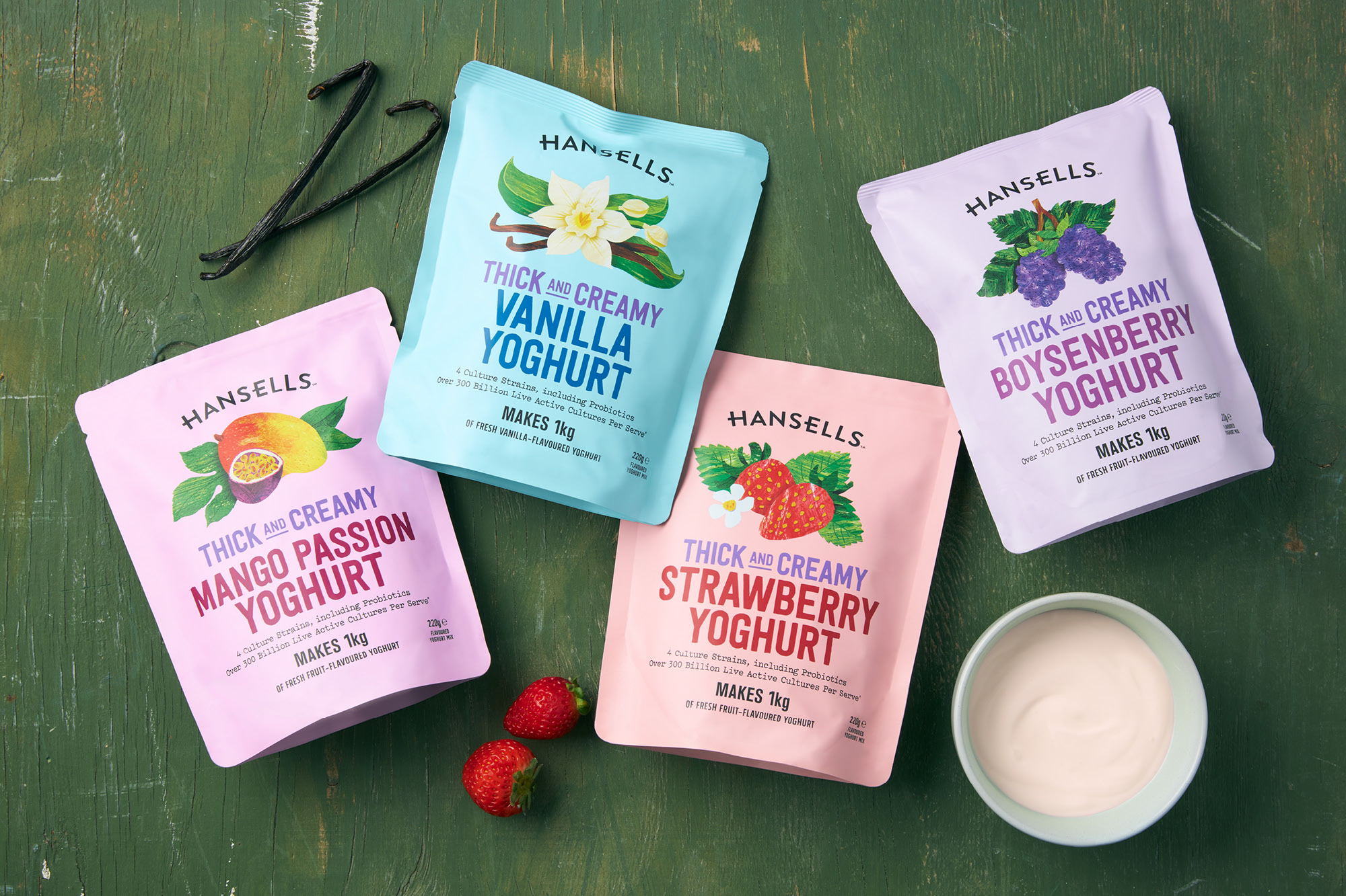
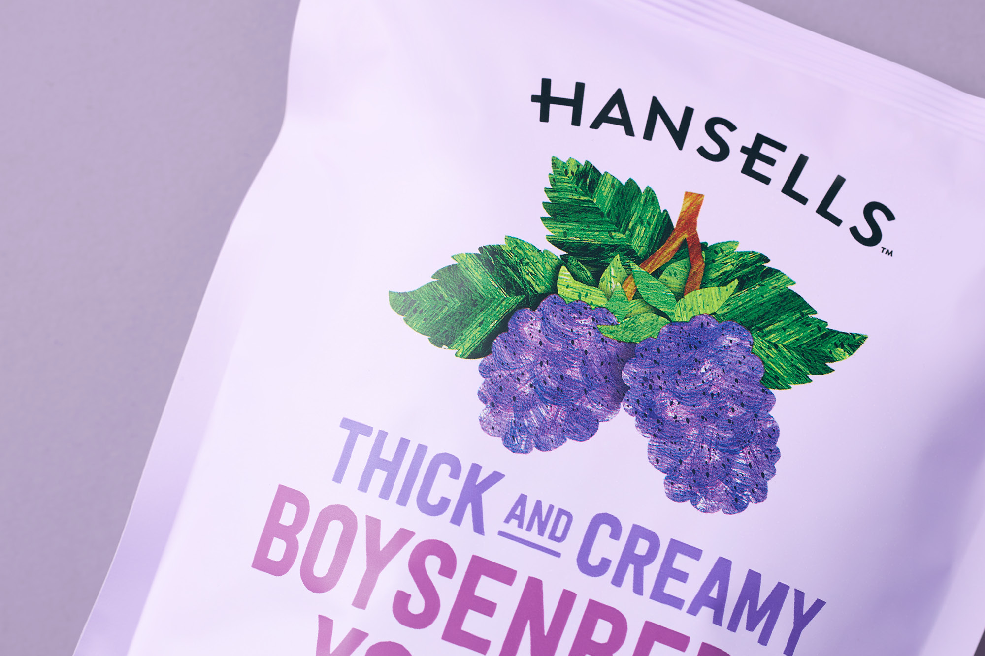
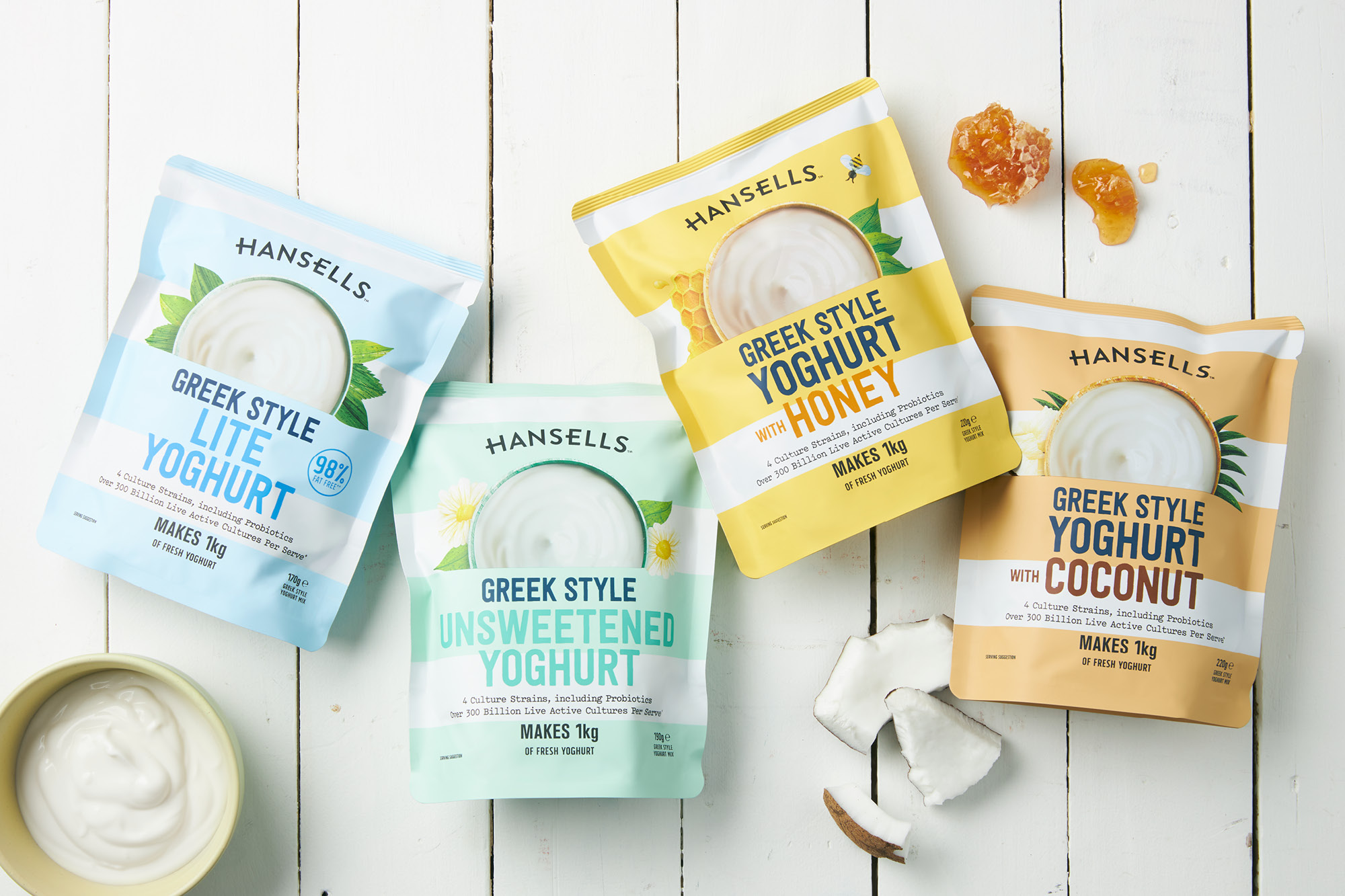
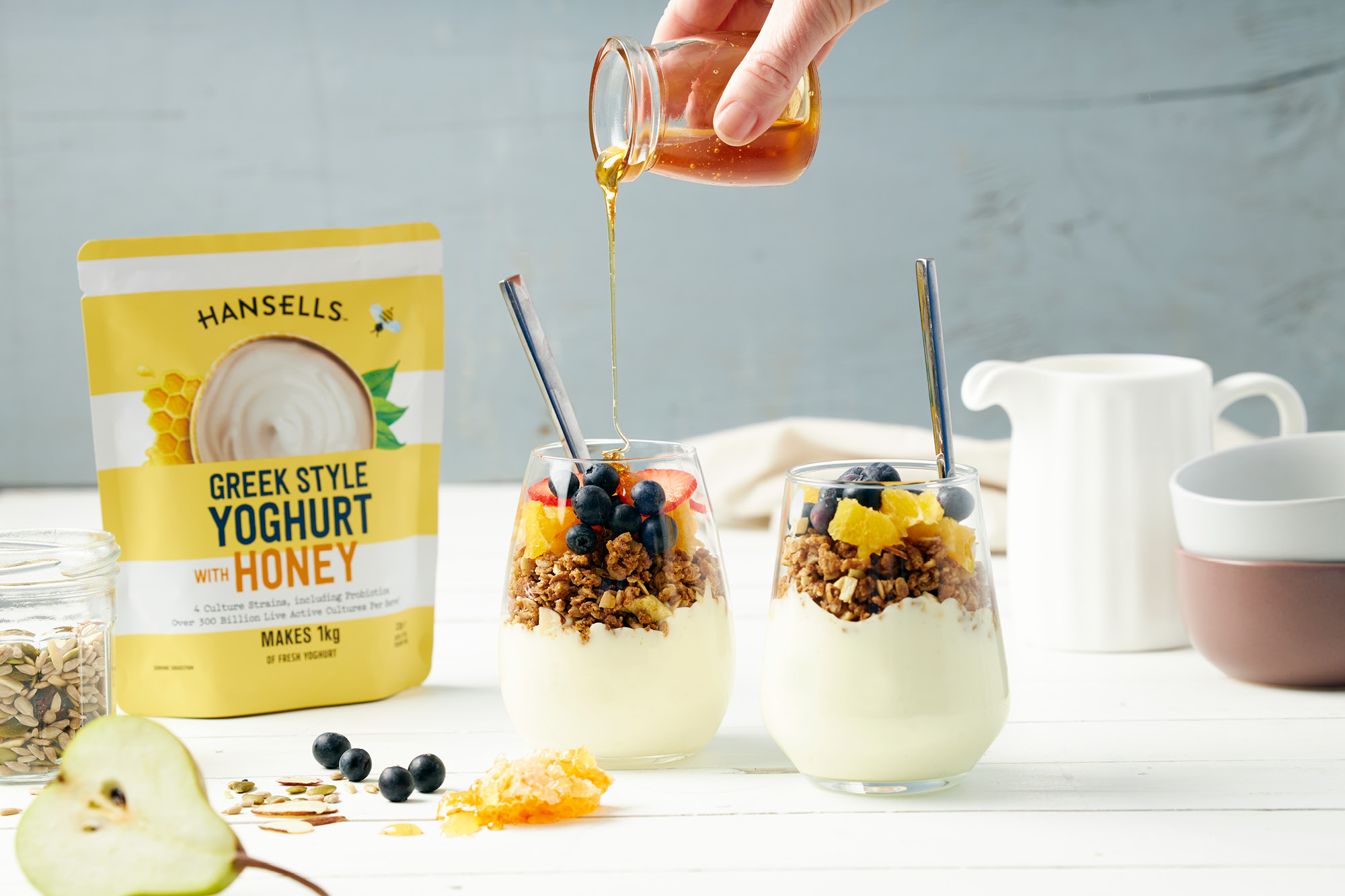
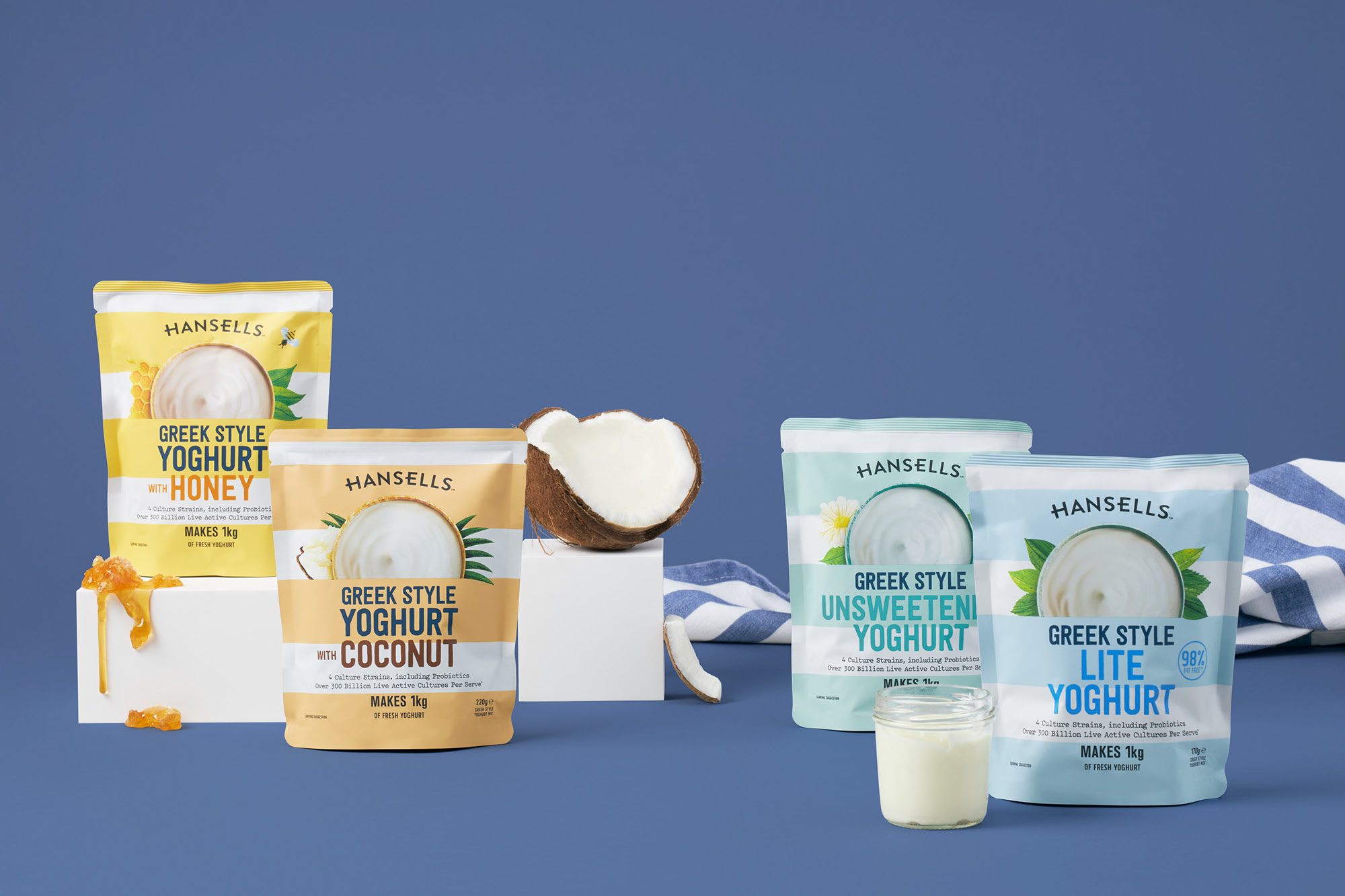
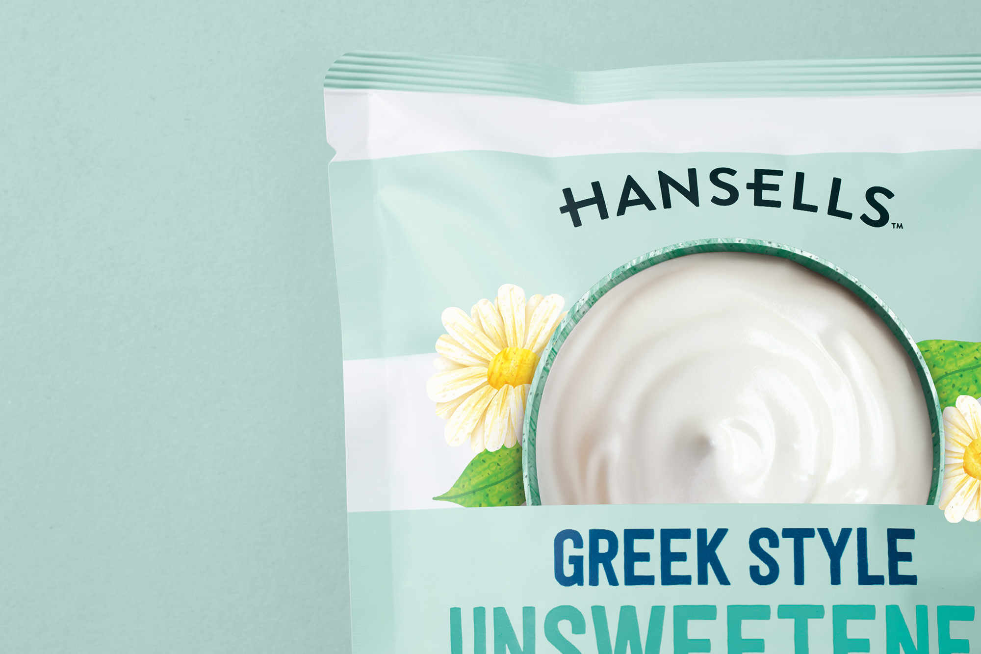
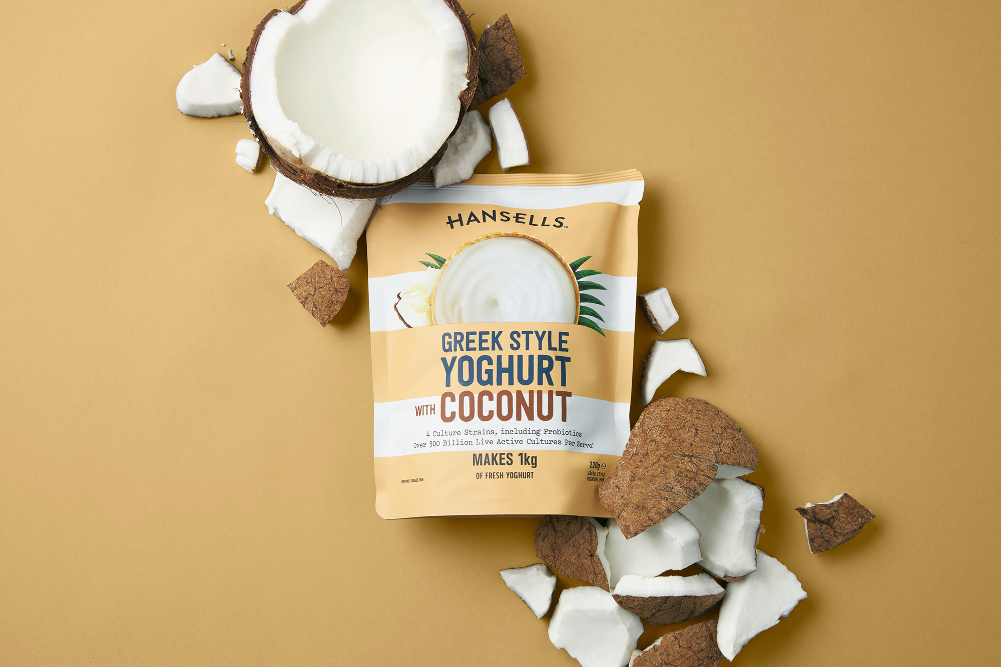
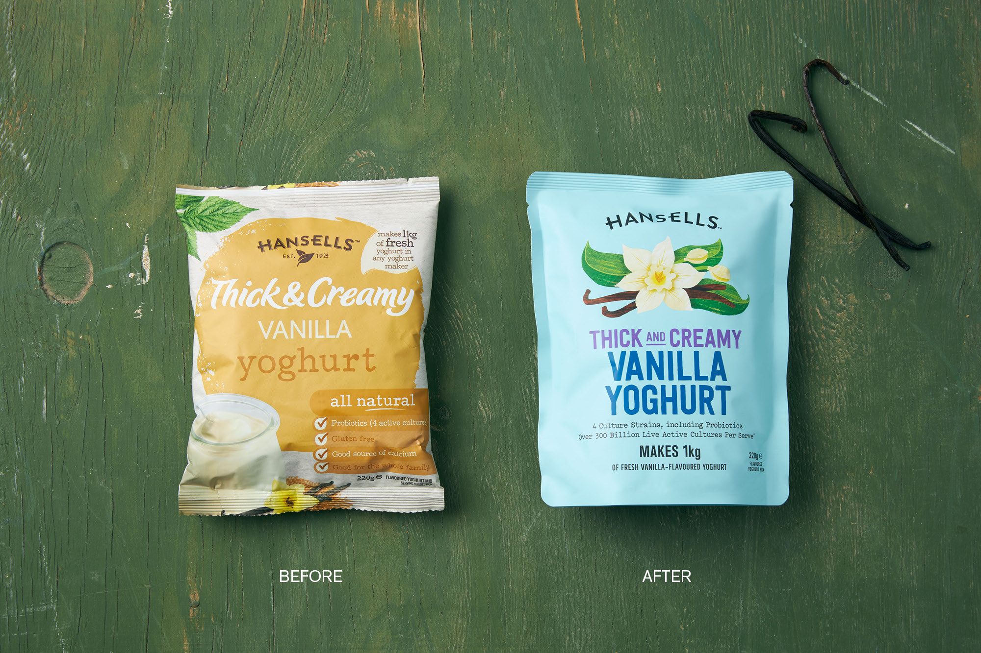
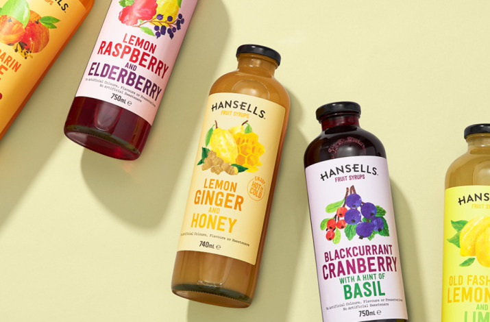
Hansells Yoghurts

Refreshed made-at-home goodness

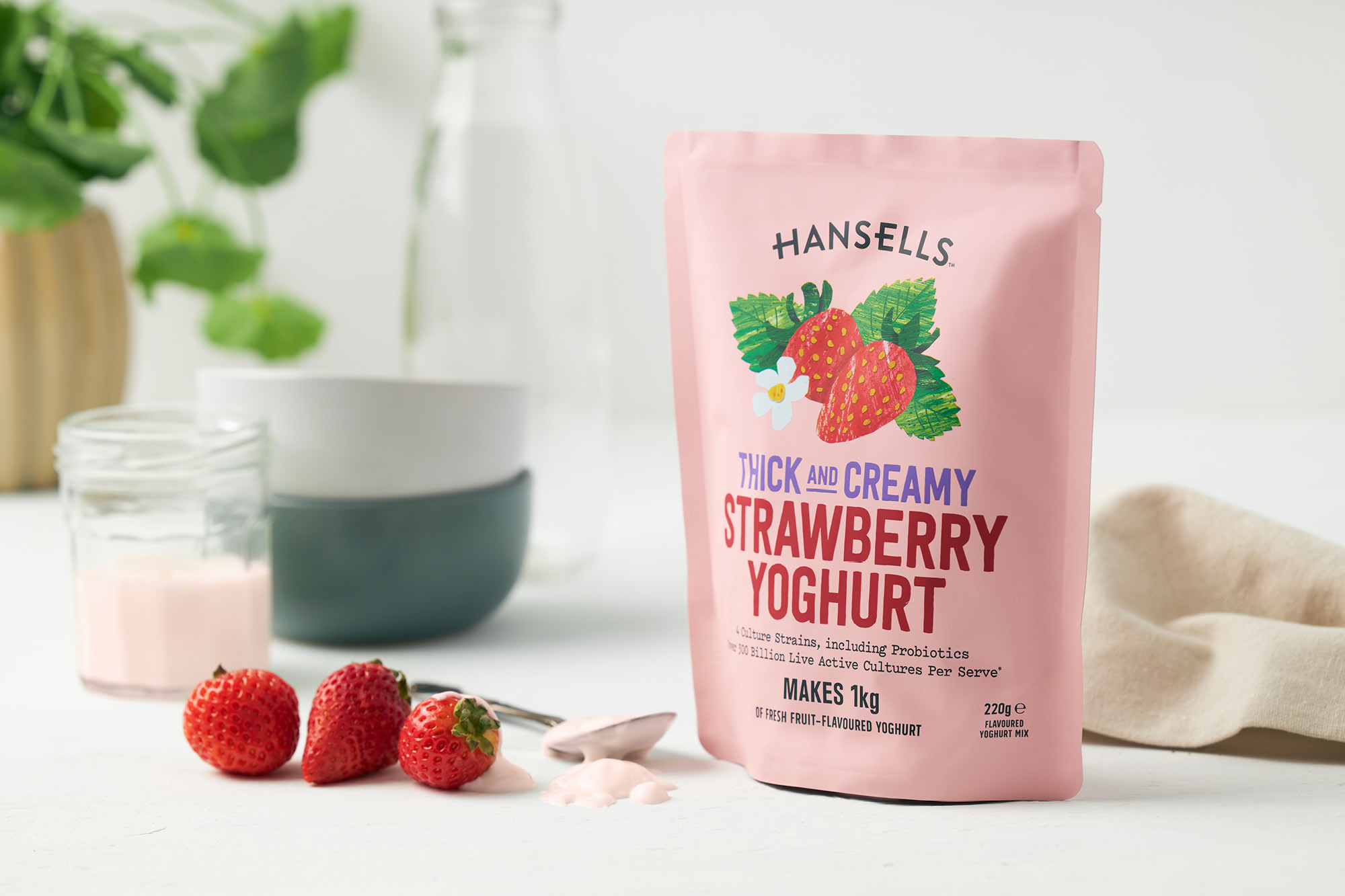
We have been working with the Walter & Wild team refreshing core ranges within the Hansells brand. Decluttering and connecting products back to their authentic ingredient roots, the Hansells brand now has new vigour and a renewed ‘foodie’ energy with a subtle nod to the past.

The much-loved powdered yoghurt range was suffering from front pack message fatigue, trying to say everything but failing to connect with the modern DIY foodie. Taking cues from our work on the brand's cordial range, we applied a simple soft colour coding system, simplifying variant callouts and edited the health cues to the main purchasing drivers. While introducing new textural flavour illustrations to create shelf stand out, another key requirement was to bring equal relevance to the two yoghurt styles in the range, Greek and Thick & Creamy styles. Previously the distinction was lost in the clutter; the Greek is now defined by coloured stripes, taking literal inspiration from the Greek flag.

Hansells is now the new relevant brand in the category, looking as good on the shelves as it does in New Zealander’s pantry’s.

© All images are copyright of Onfire Design and cannot be used without prior permission.

Awards

onfire design hansells yoghurt packaging design 4
onfire design hansells yoghurt packaging design 3
onfire design hansells yoghurt packaging design 4
onfire design hansells yoghurt packaging design 5
onfire design hansells yoghurt packaging design 13
onfire design hansells yoghurt packaging design 7
onfire design hansells yoghurt packaging design 12
onfire design hansells yoghurt packaging design 9
onfire design hansells yoghurt packaging design 10
onfire design hansells yoghurt packaging design 11