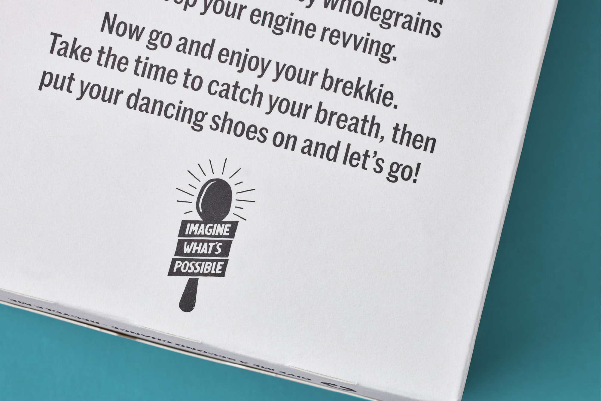
Imagine What’s Possible
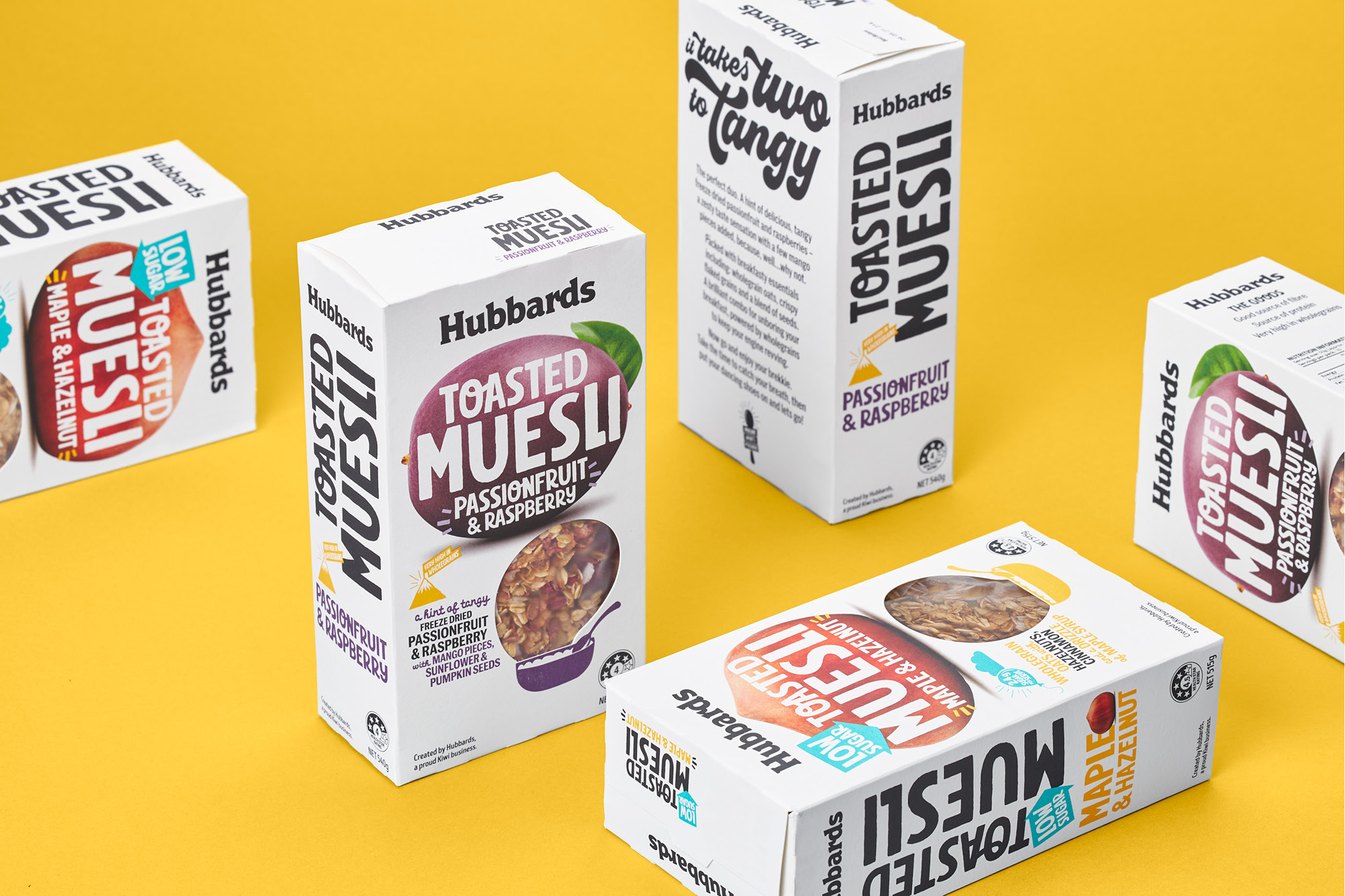
Hubbards Muesli
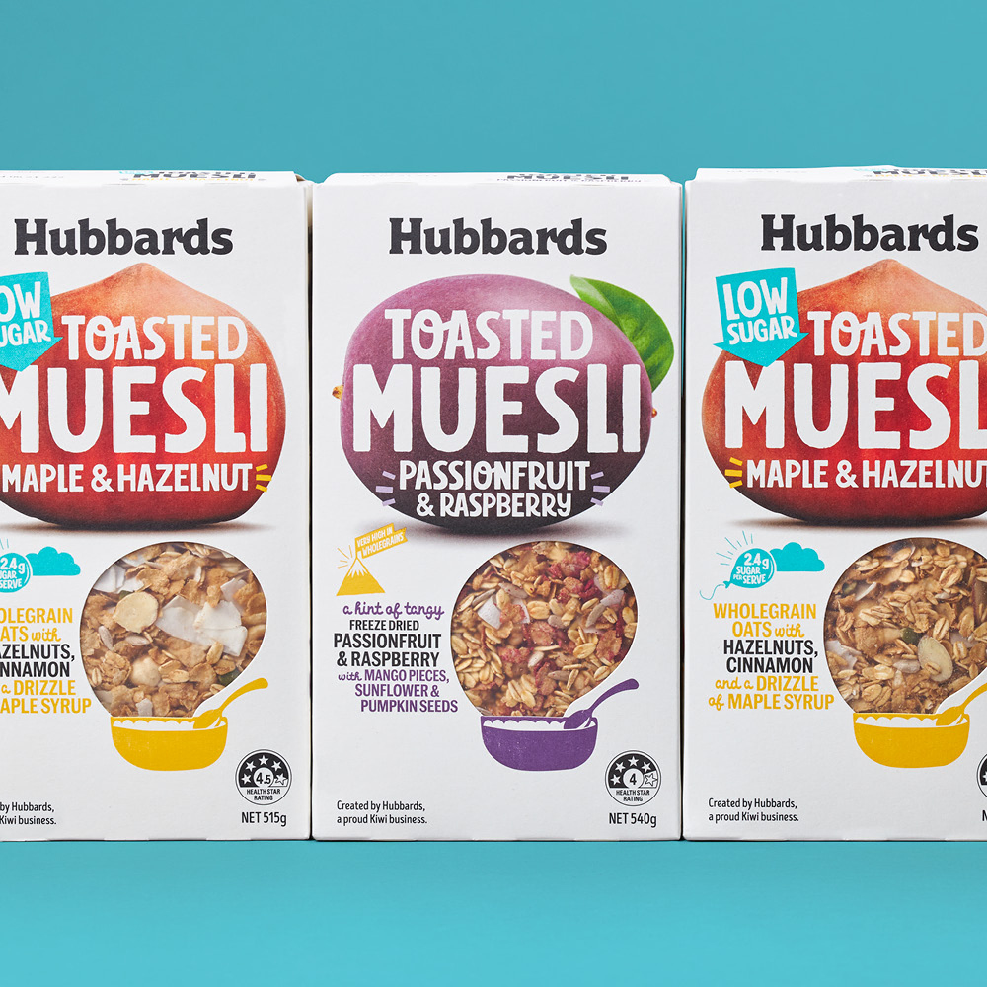
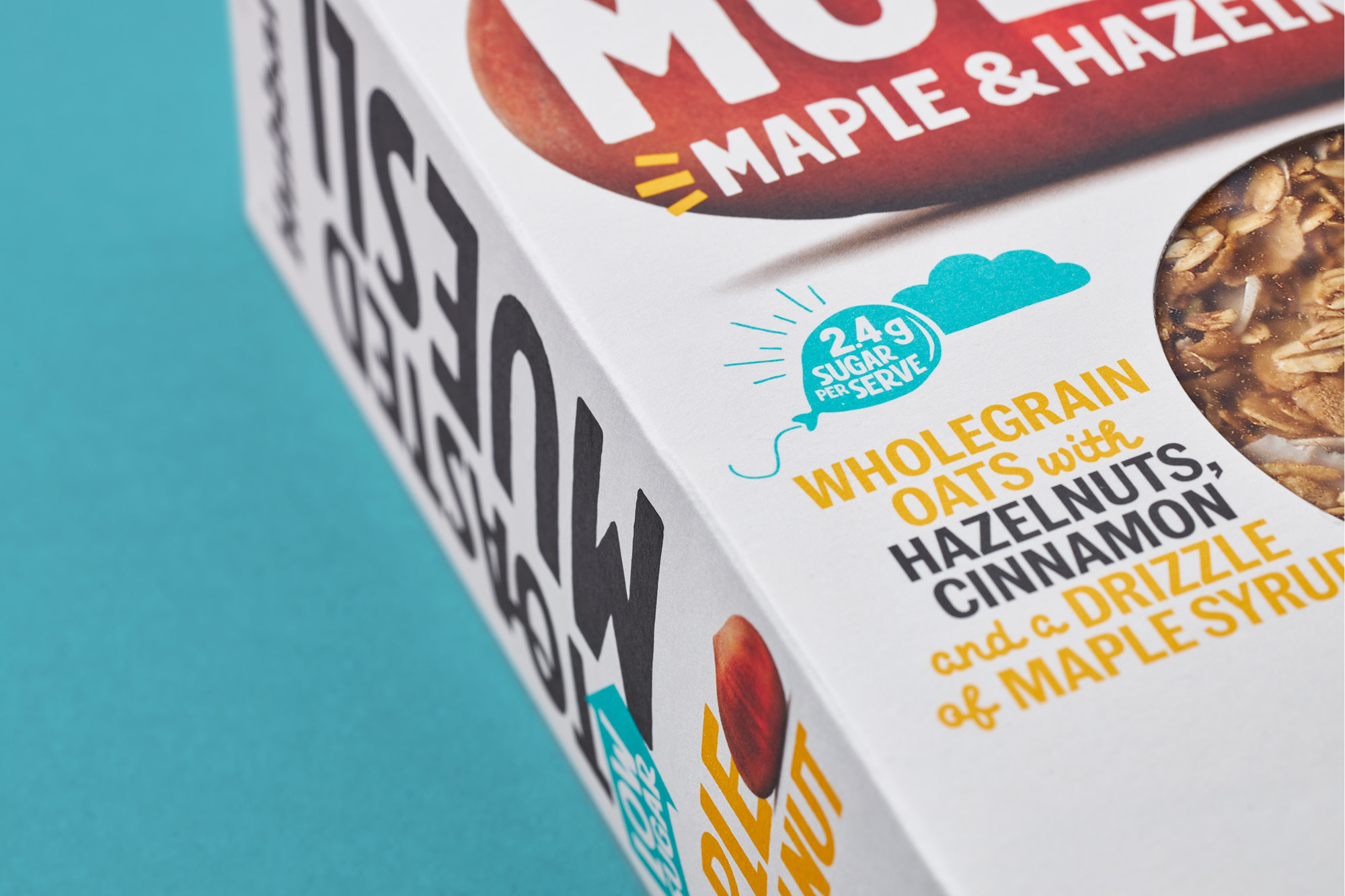
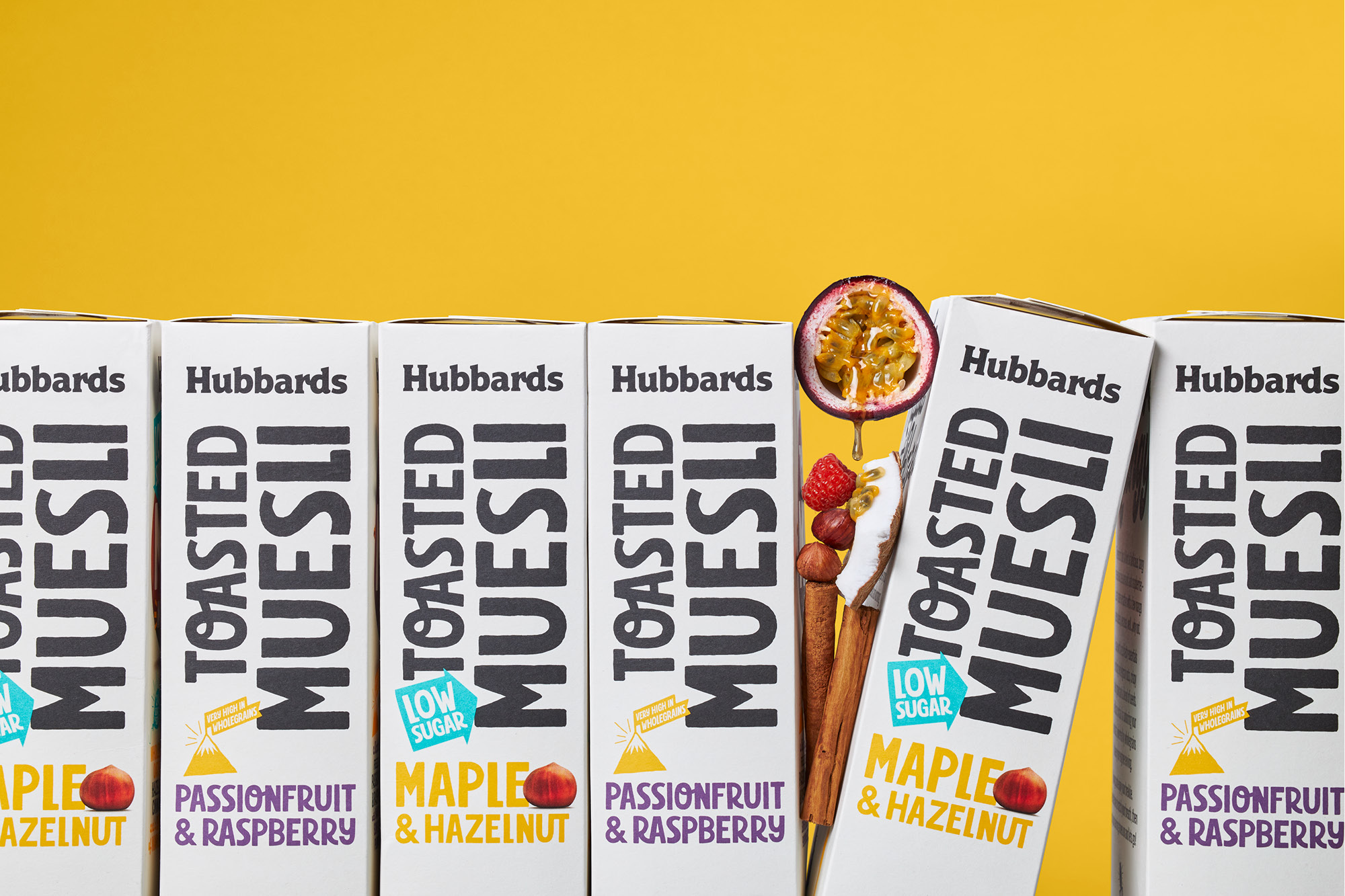
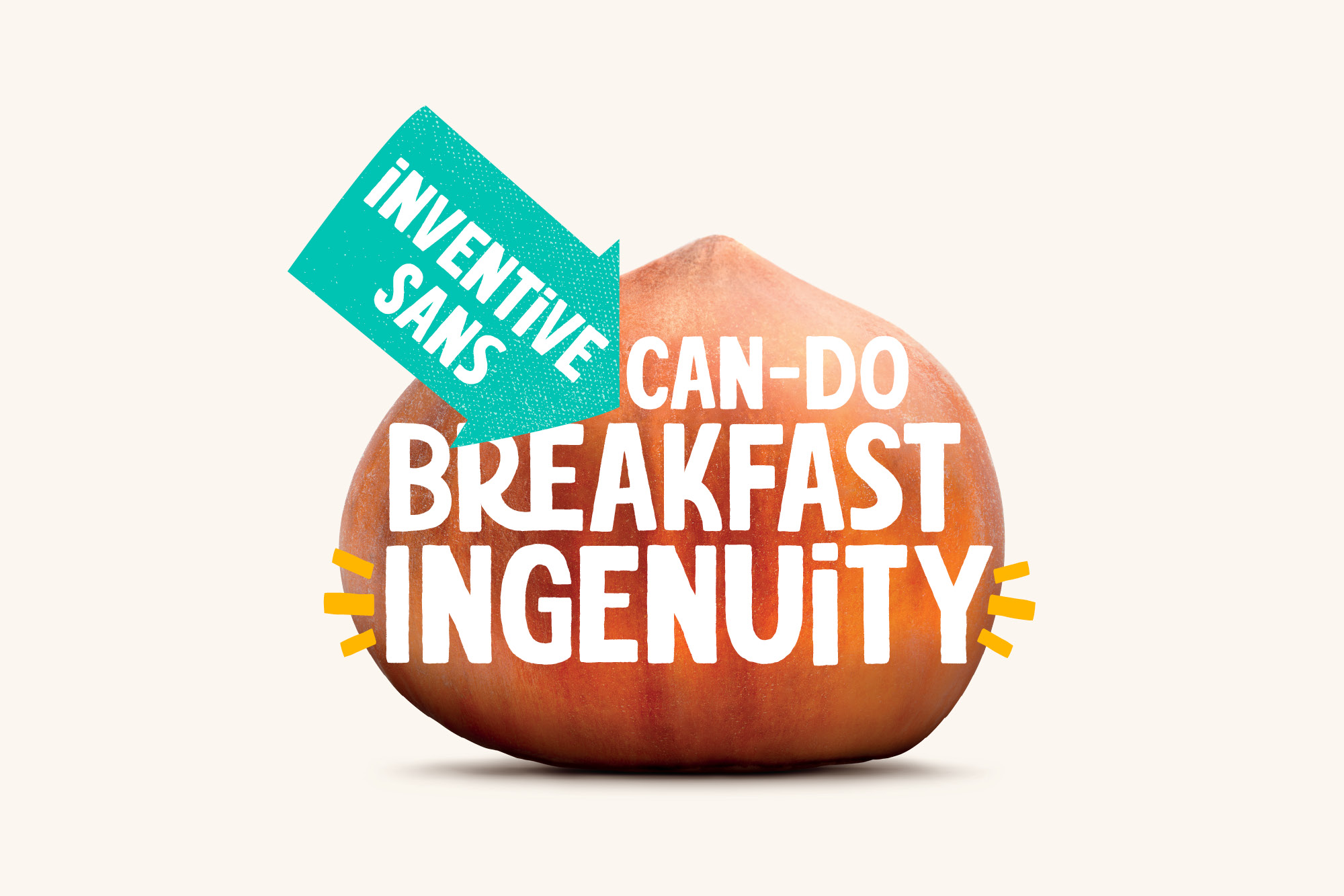
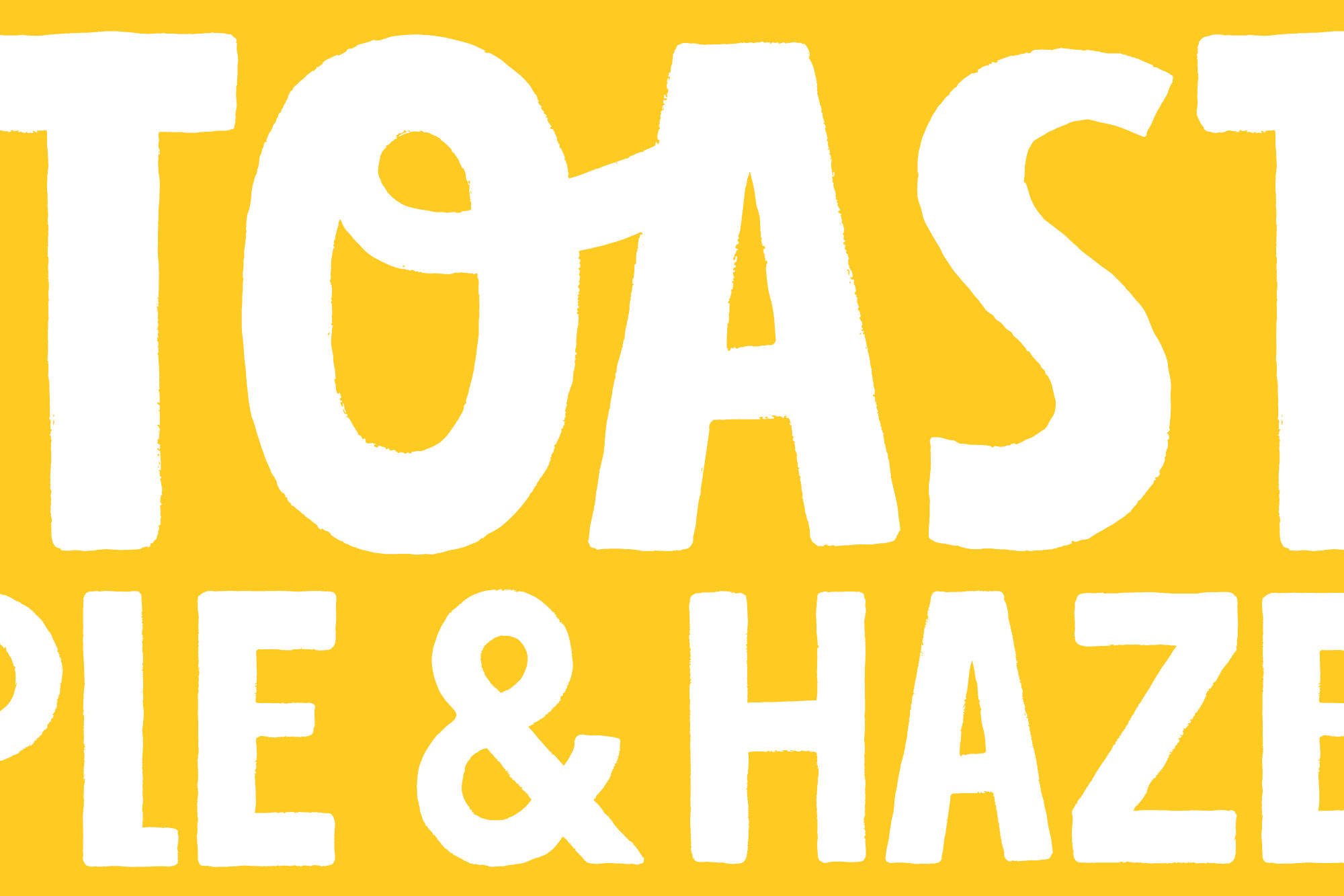
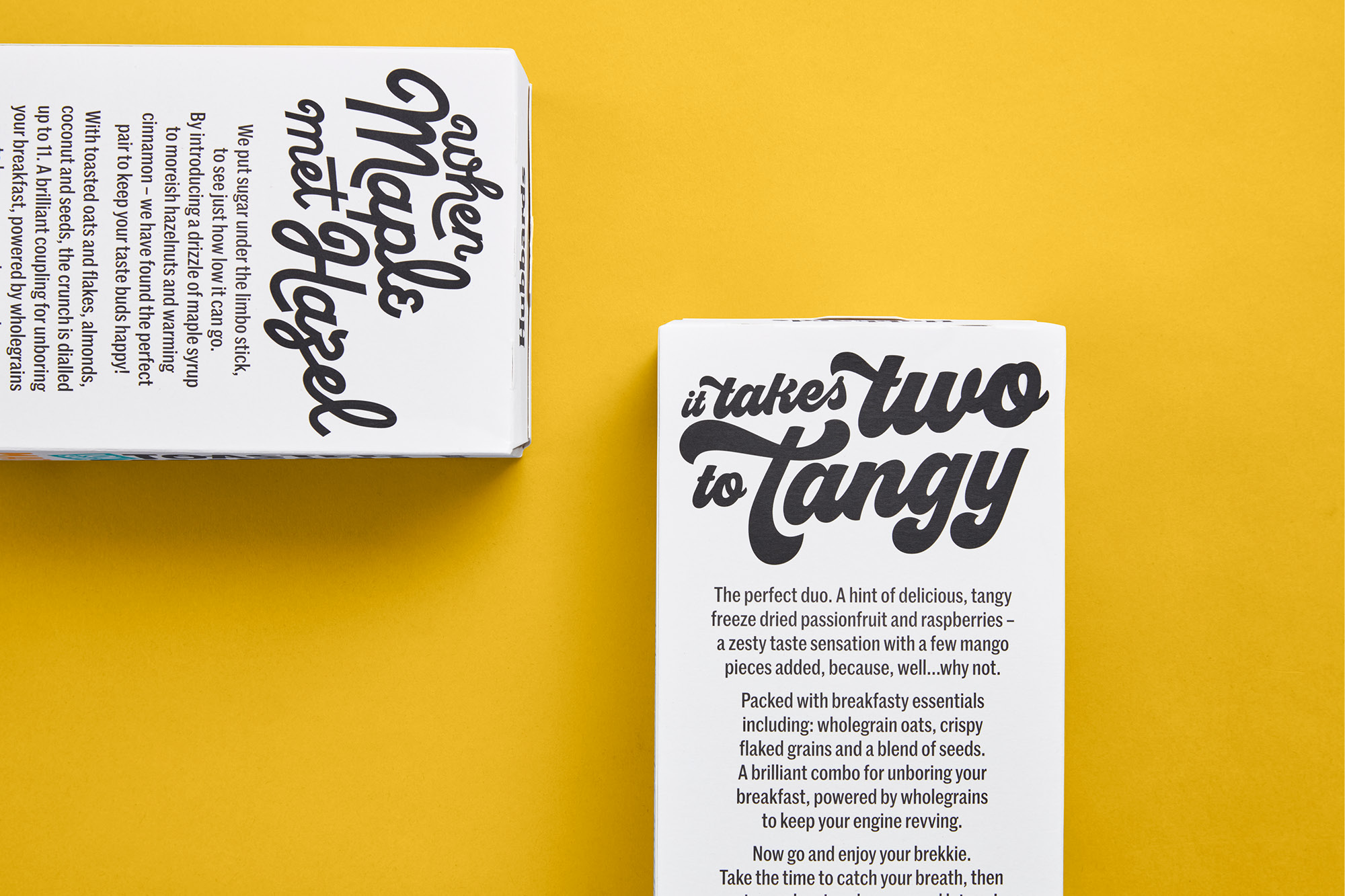
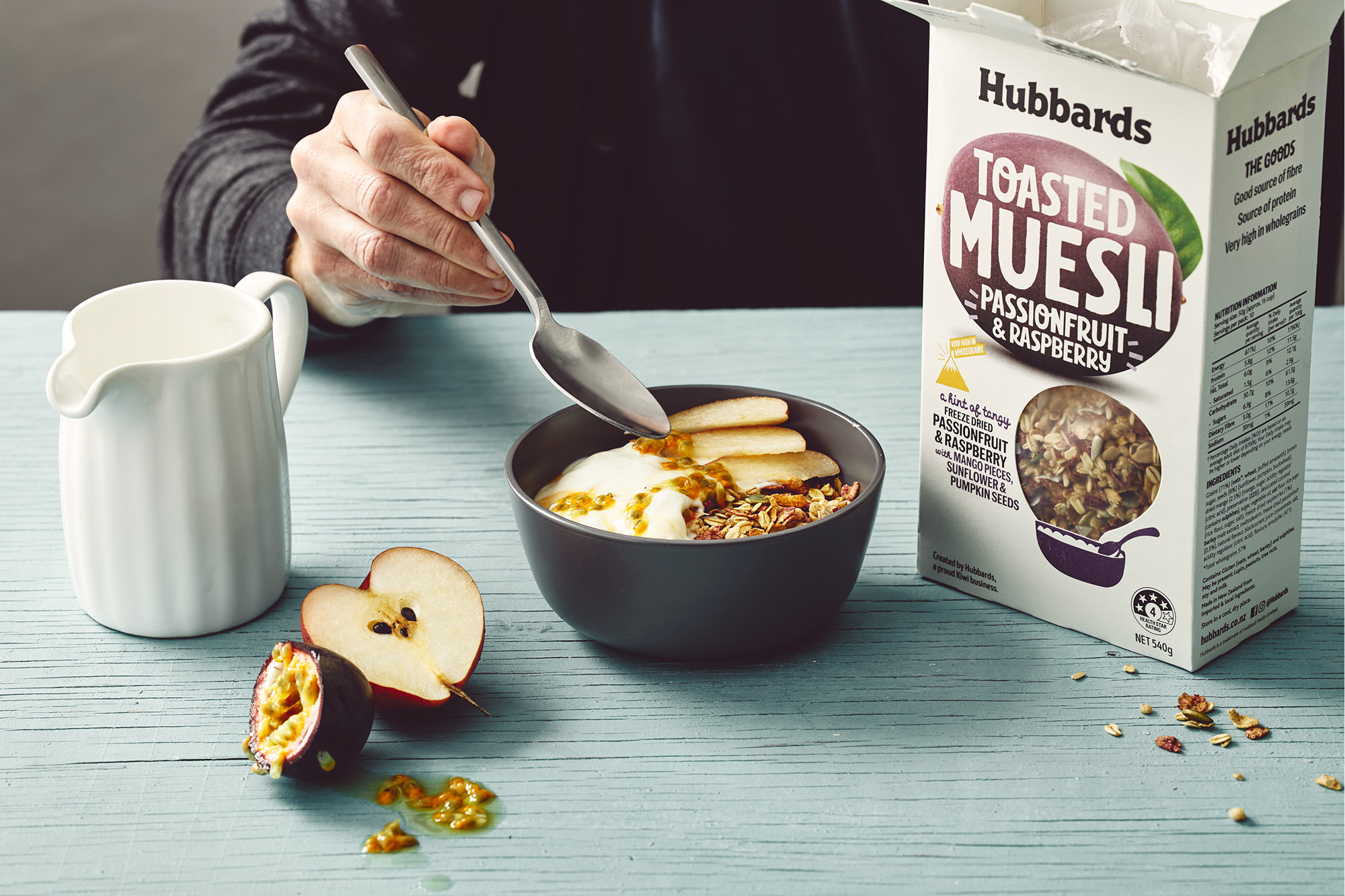
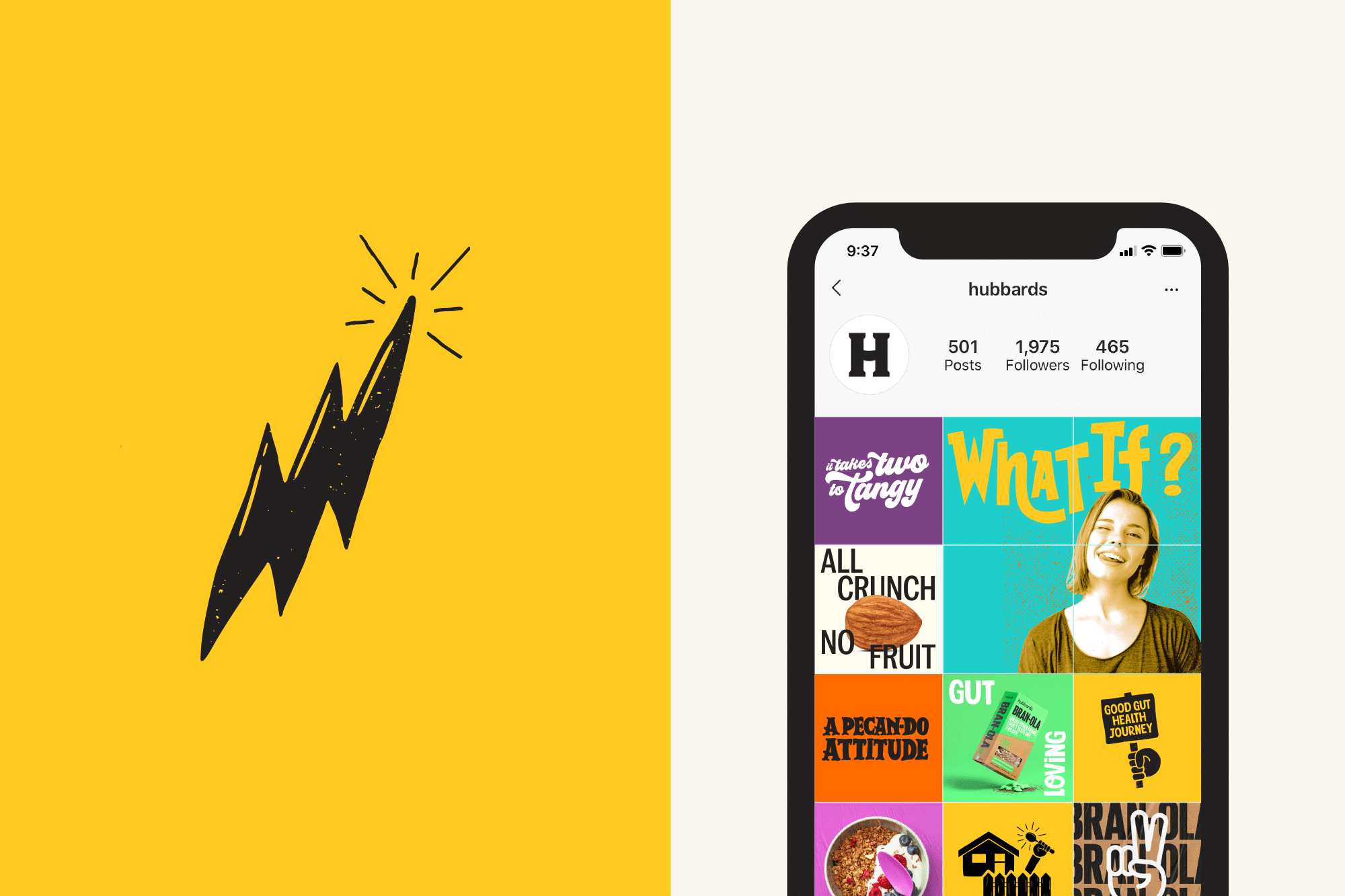
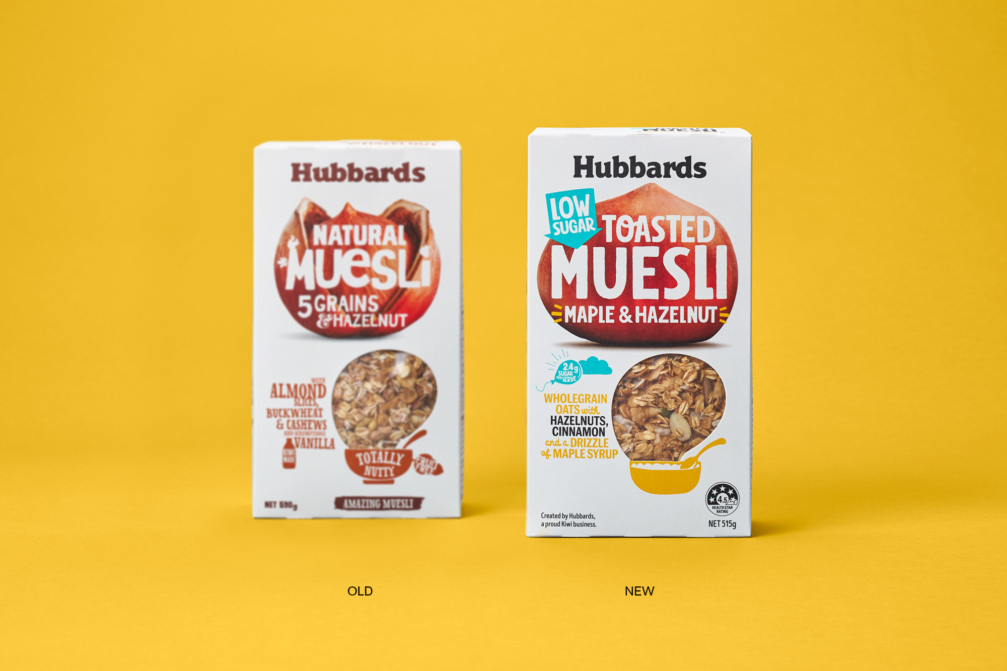
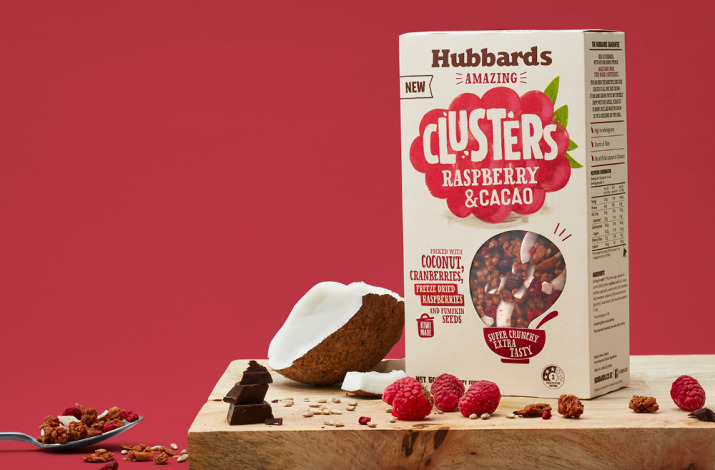
‘Imagine What’s Possible’ marks a new brand journey for the iconic New Zealand brand. Backed by innovative product development, Hubbards is on a mission to reimagine how the ‘breakfast’ world looks for the consumer with a restless and inventive energy. To propel this journey we were tasked with evolving the current brand. It was essential not to lose focus of Dick Hubbards founding principles, instead to give his creative streak and daring personality a new focus. A refreshed brand logo refines the existing typography, black is used instead of brown for ease of use across multiple sub-category ranges. A new brand toolkit was developed which includes a brighter colour palette, product and brand message icons along with its very own bespoke font - Inventive Sans.