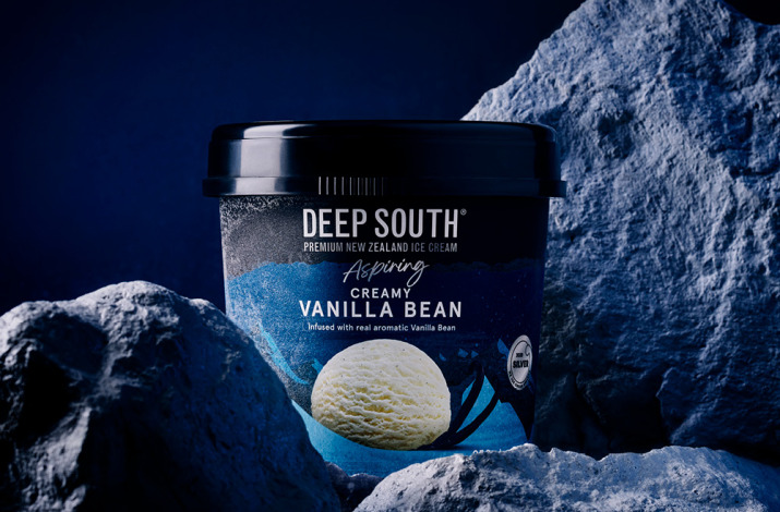
Pride in the South

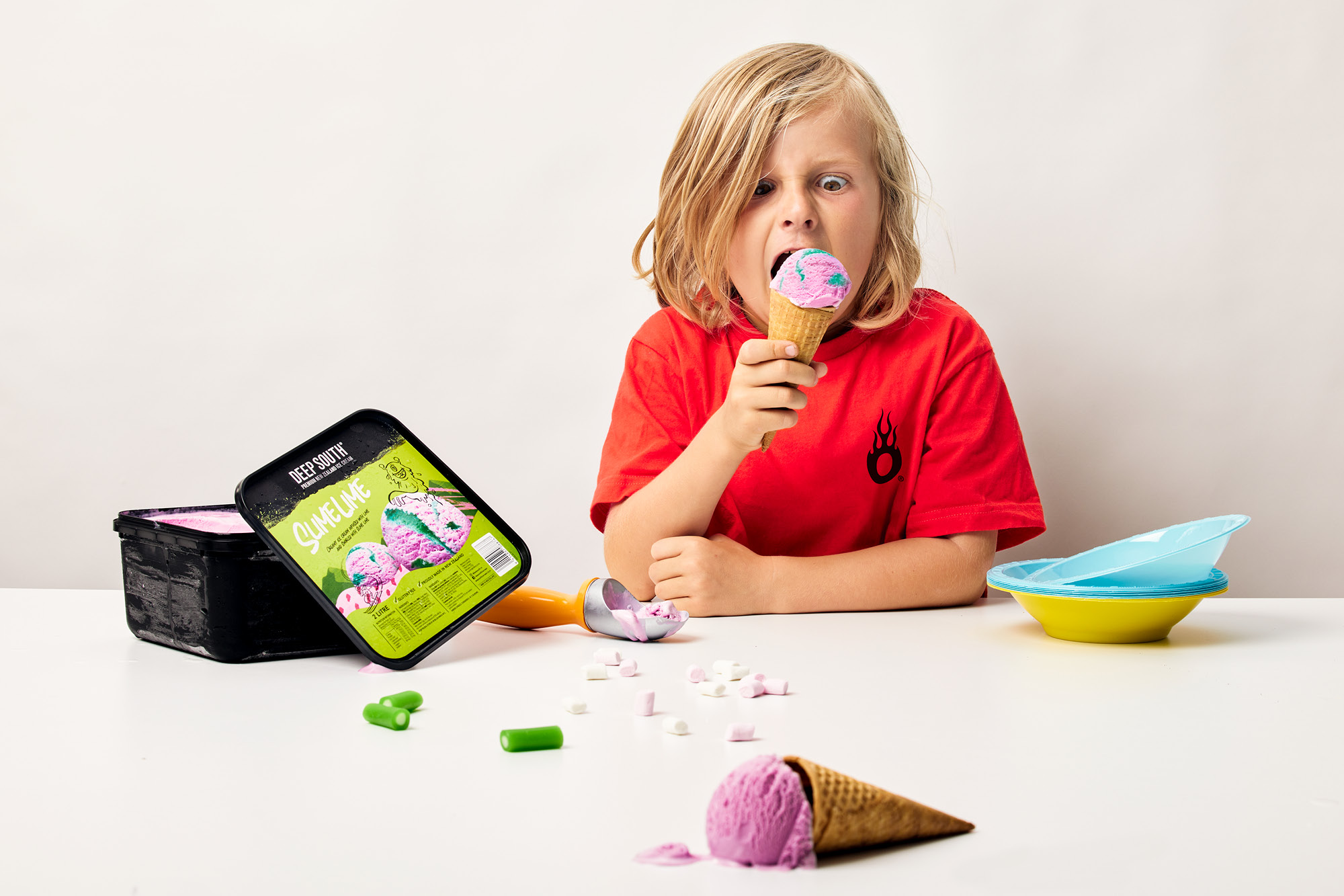
Deep South Family Range

onfire design deep south ice cream packaging design new zealand 1 3

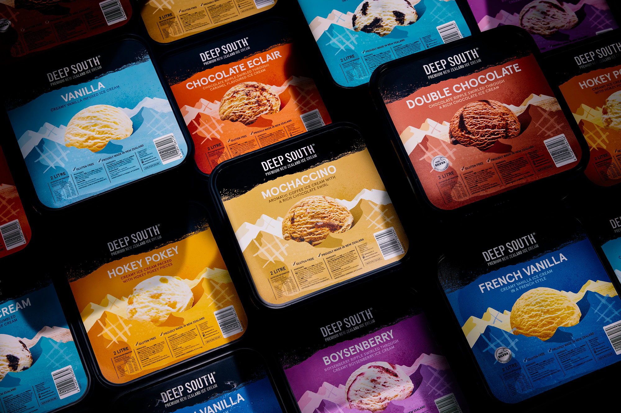
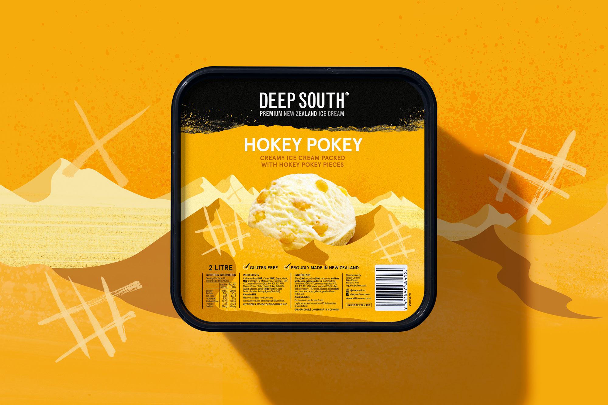
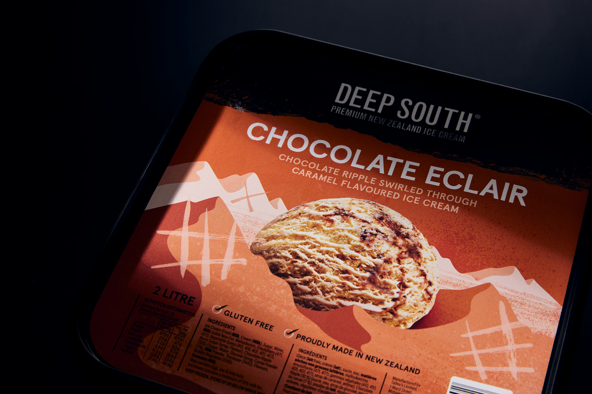
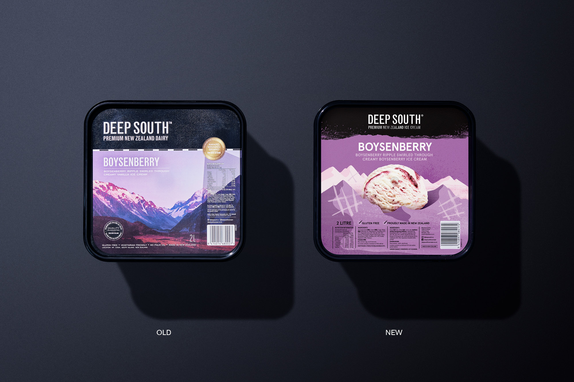
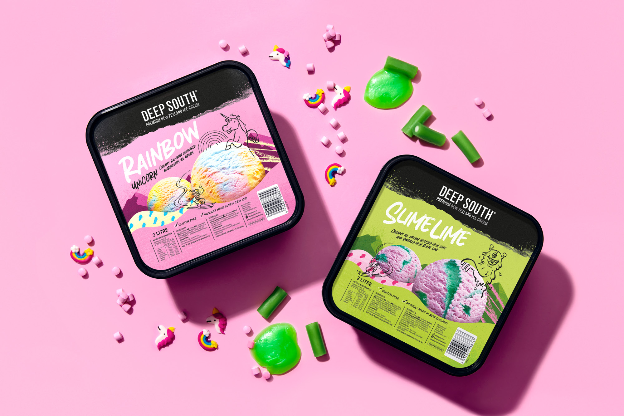
Established in New Zealand’s South Island in 1978, Deep South ice cream has become an iconic brand with a wide range of flavours and styles that cater to a wide range of consumers. Its current design livery has become an iconic, if somewhat cumbersome, livery with its picture-postcard South Island scenery. These illustrate the provenance and pride in the country but are often challenging to communicate pack messaging and muted colour coding.

After a strategic review of the brand, the range was split in two, enabling the ‘Aspiring’ range to compete in the premium category. The two-litre tubs are focused on the everyday ice-cream loving consumer. 

See Deep South Aspiring →

Deliverables

Brand Strategy
Tone of Voice
Brand Identity
Packaging Design
Communication

onfire design deep south ice cream packaging design new zealand 2
onfire design deep south ice cream packaging design new zealand 3

For brand cohesion, the mountain range concept created for ‘Aspiring’ was applied on the tubs. A simplified landscape, brighter pop colours and reduced textures but with the ice cream still proudly sitting in the middle denote this range as the family pleasers. This range was further extended with new kids flavours.

onfire design deep south ice cream packaging design new zealand 5
onfire design deep south ice cream packaging design new zealand 6

Taking the design language one step further, colourful foothills create more layers by introducing kid orientated typography and doodles that interact with the ice cream photography.

The result is a refreshed range that honours the brand past and is proud of its heritage with a livery that wears its love of the South Island on its sleeve.

onfire design deep south ice cream packaging design new zealand 7
onfire design deep south ice cream packaging design new zealand 8

© All images are copyright of Onfire Design and cannot be used without prior permission.