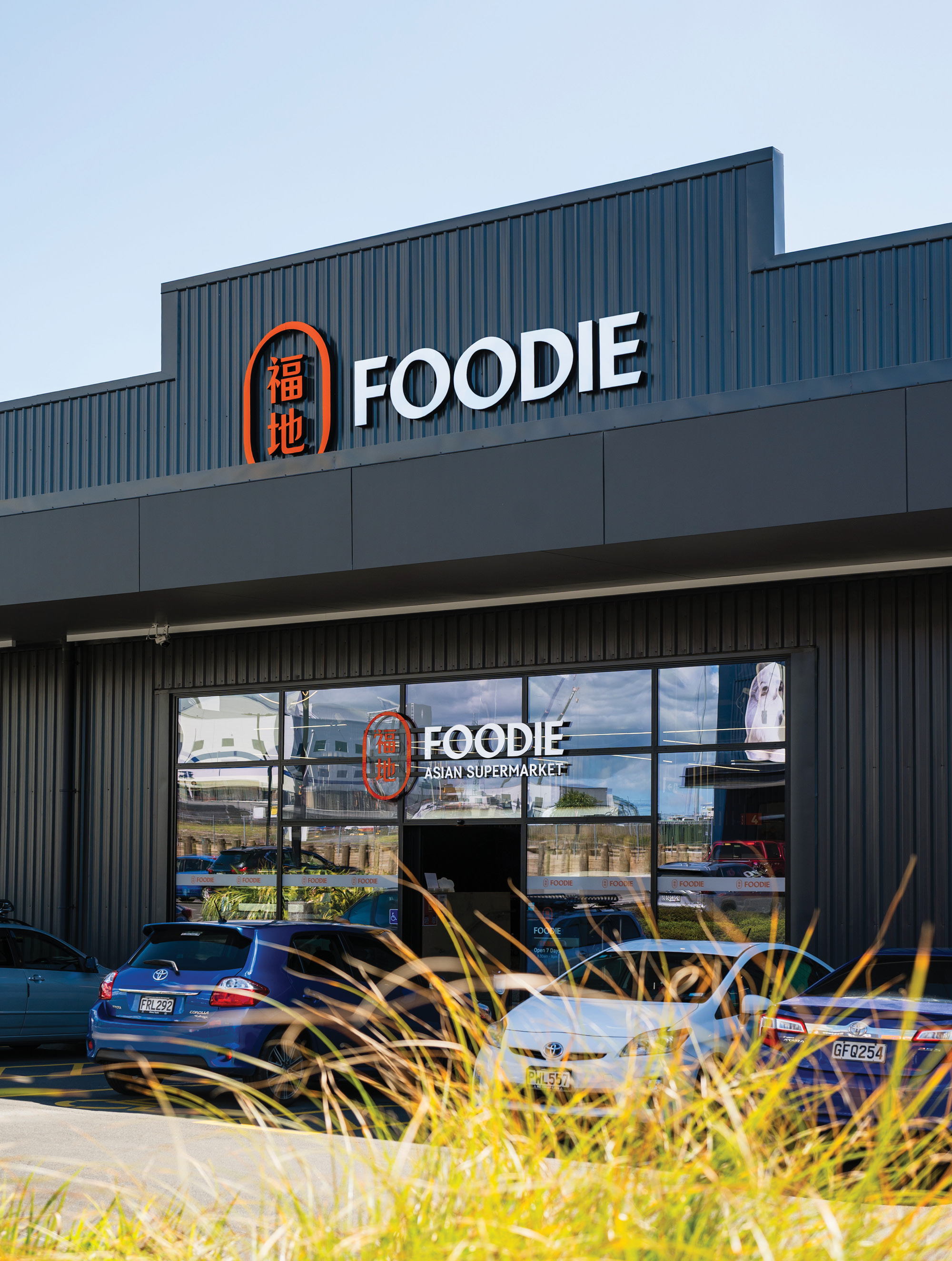
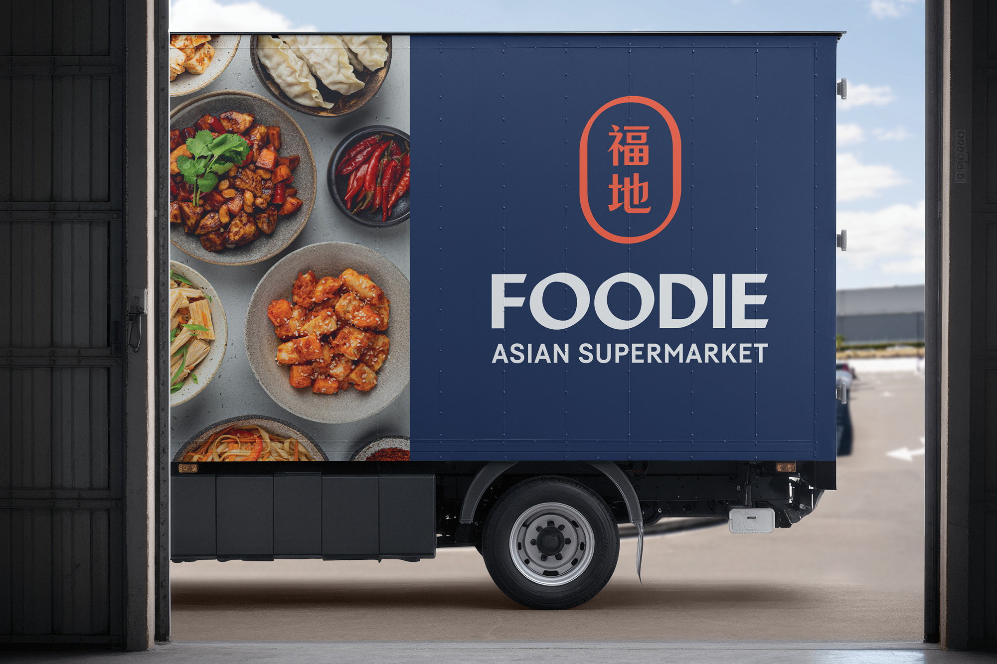
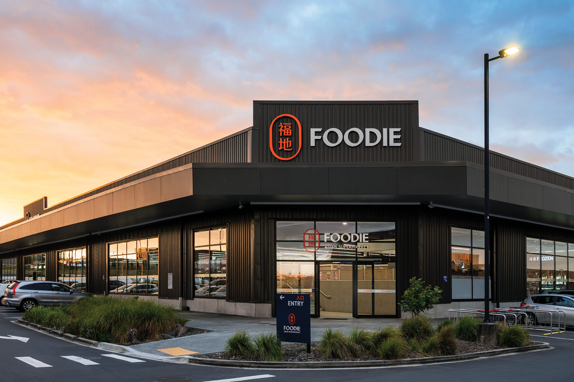
Foodie
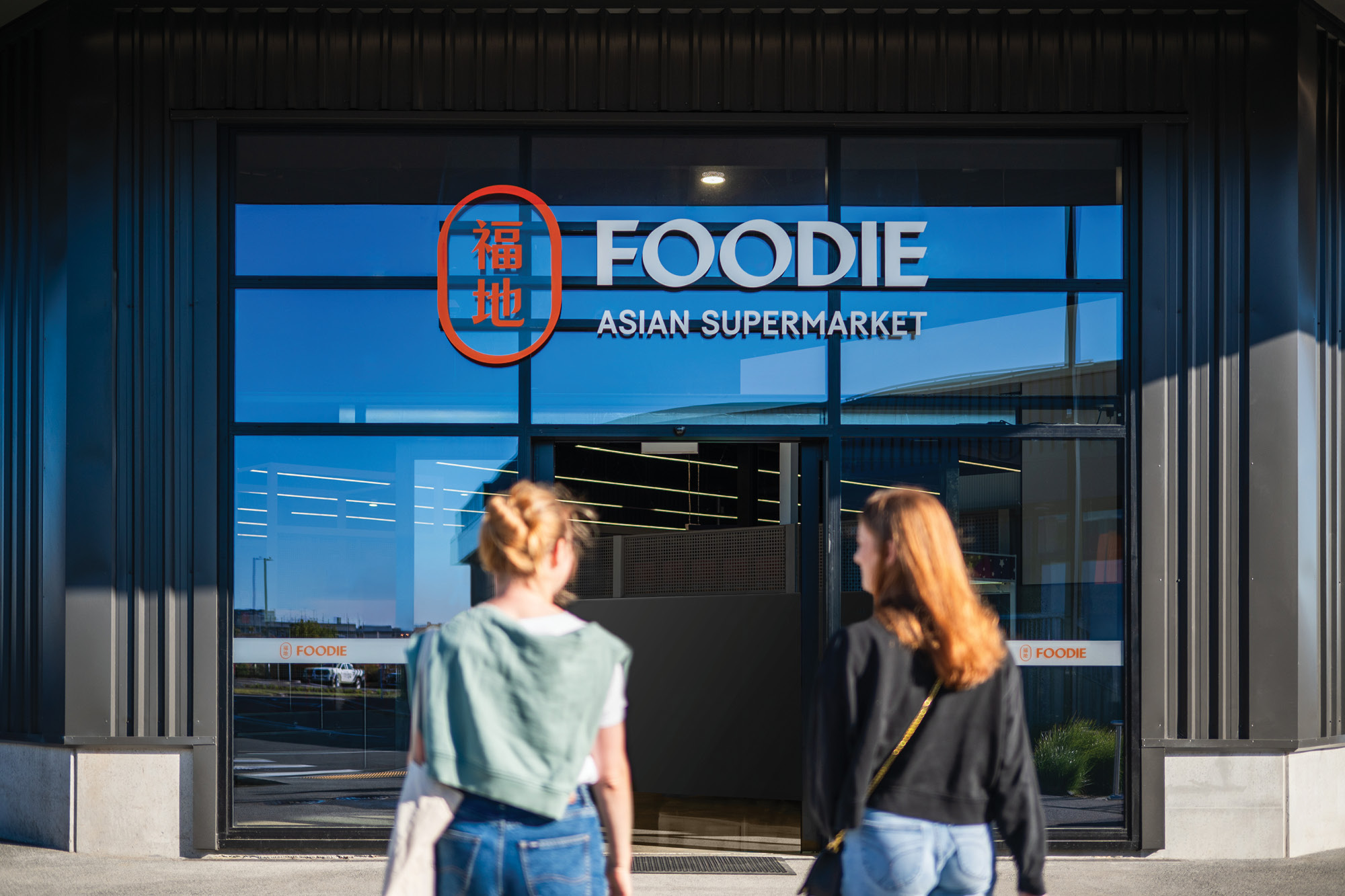
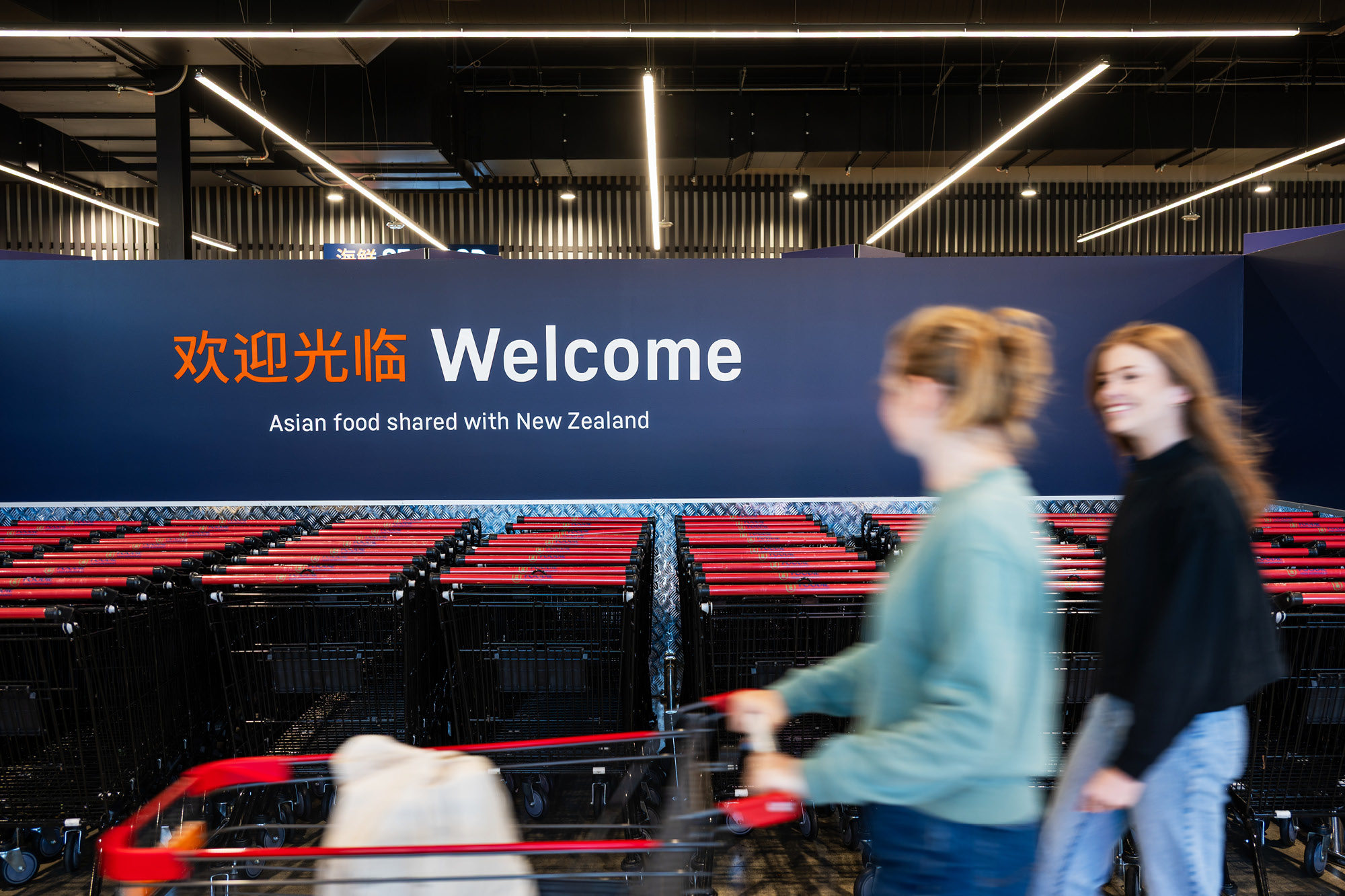
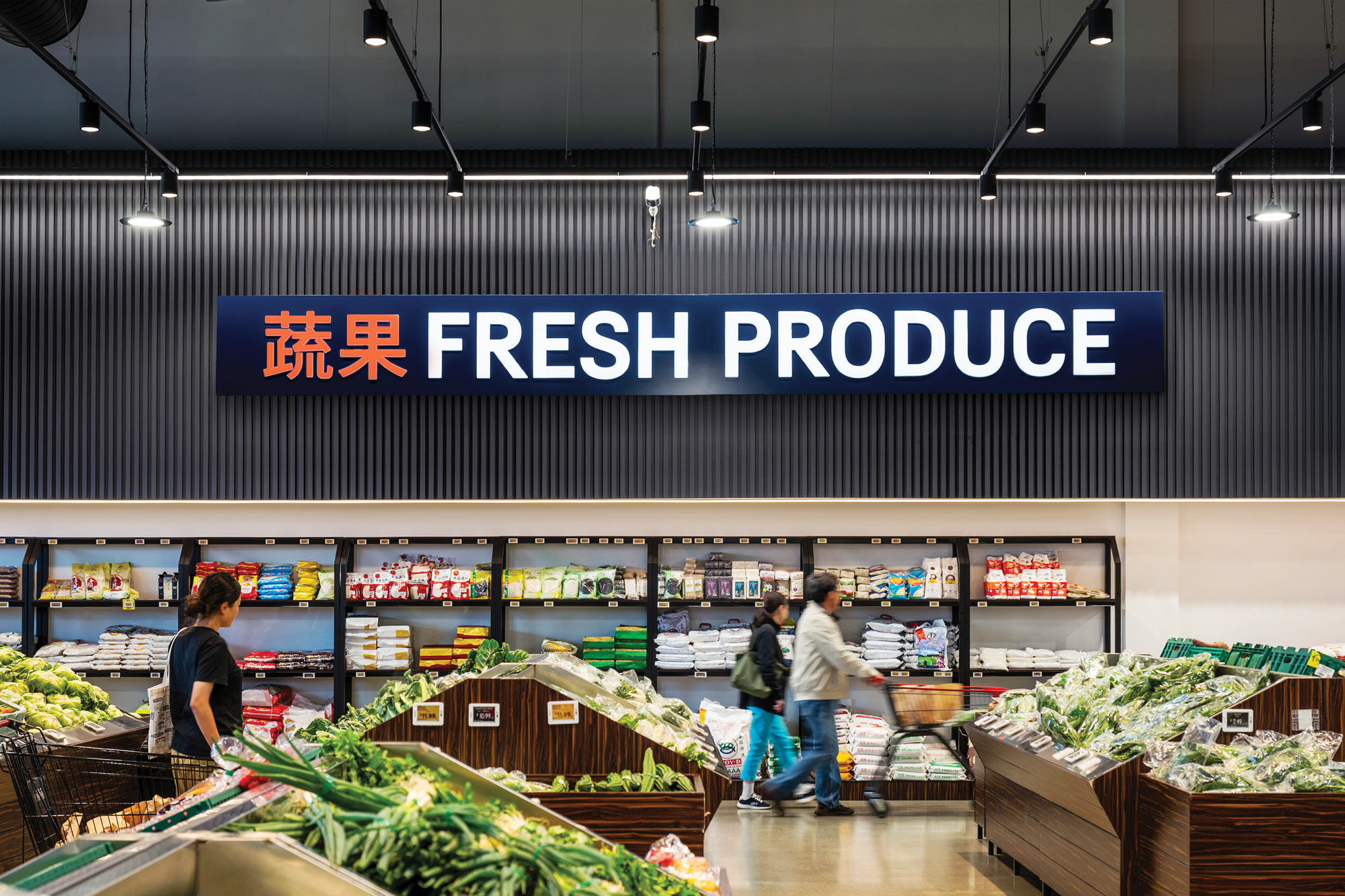
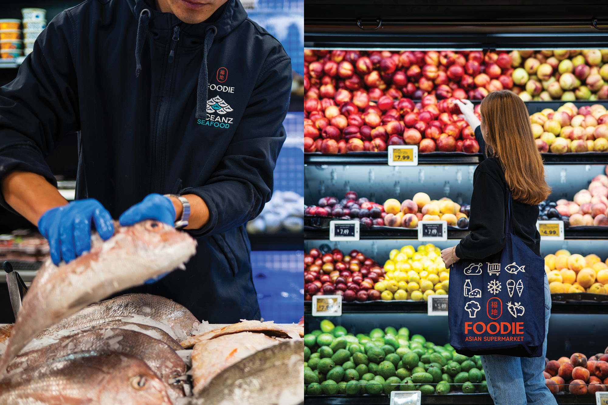
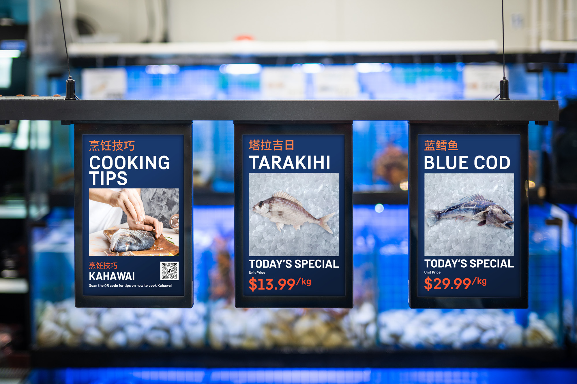
Foodie is New Zealand’s first full-scale Asian supermarket, a modern, one-stop destination uniting products from across China, Japan, Korea, the Philippines and beyond. Created to serve Auckland’s fast-growing Asian community while welcoming curious Kiwis, Foodie bridges cultural and culinary worlds through convenience, authenticity and design excellence.
Positioned between the boutique feel of Farro and the scale of New World, Foodie delivers a sleek, inclusive shopping experience that celebrates Asian culture in a modern, locally relevant way.
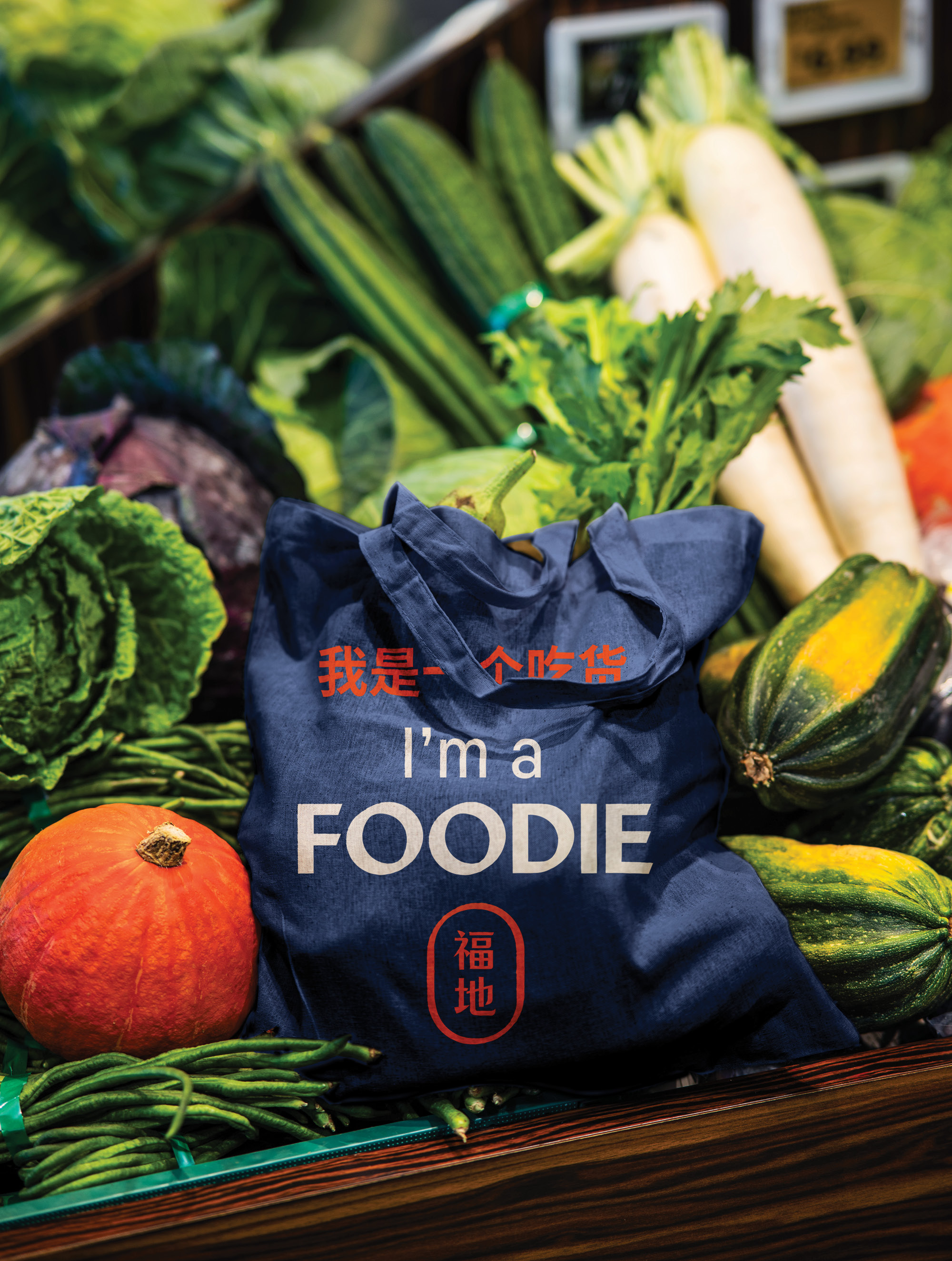
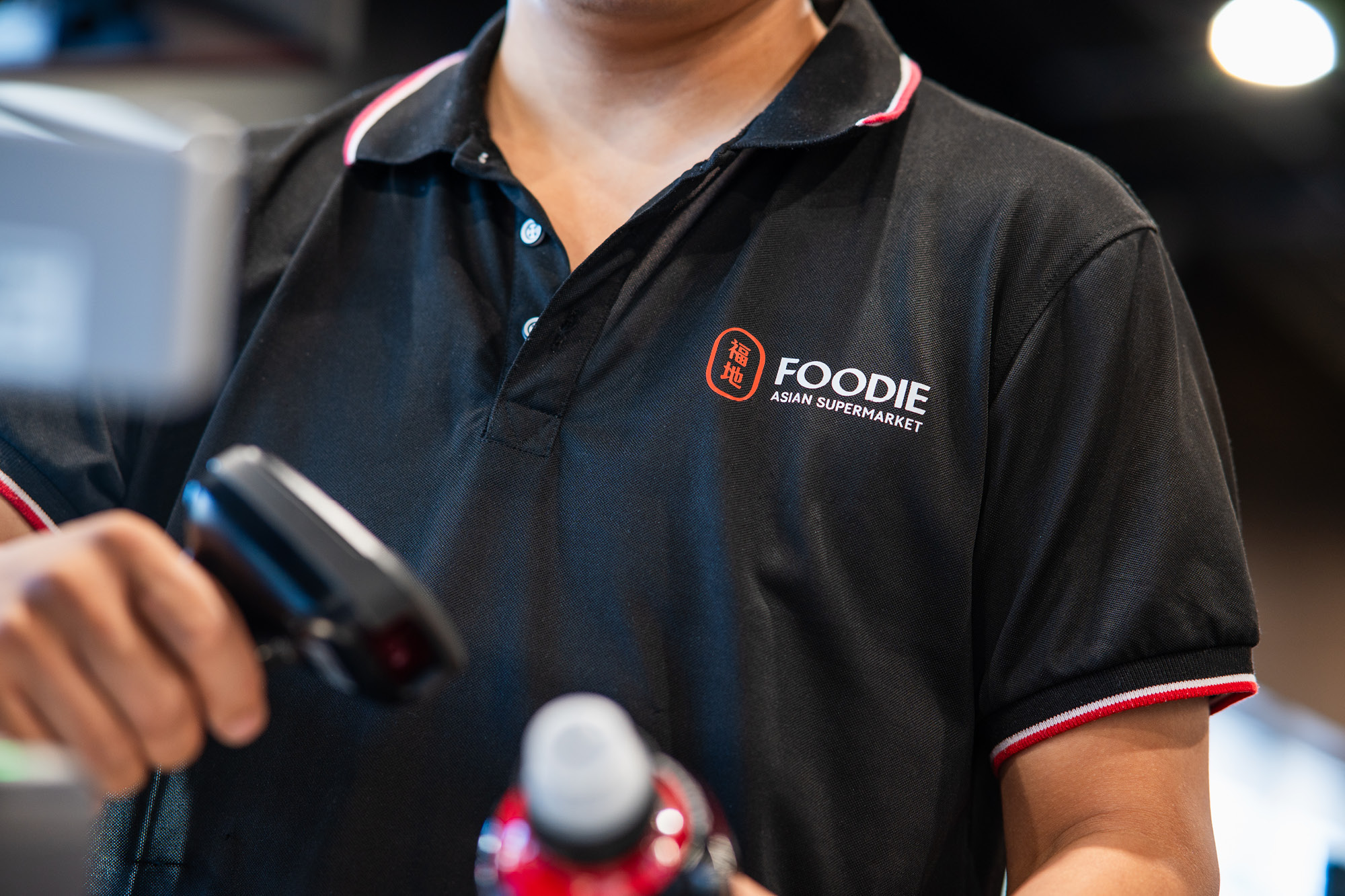
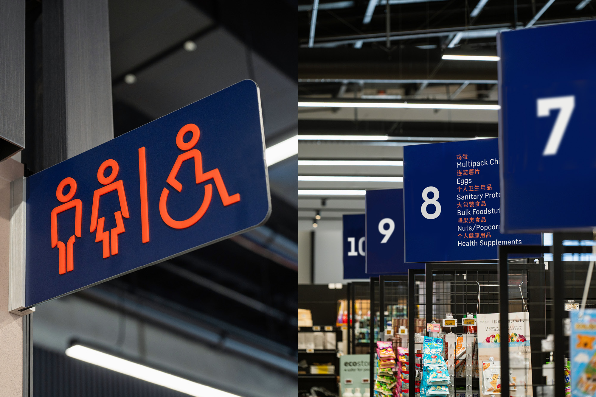
Onfire defined the brand strategy and created a contemporary identity capable of challenging the supermarket duopoly. Anchored in the purpose “to provide a modern, one-stop Asian food shopping experience,” Foodie’s brand fuses authenticity, discovery, approachability and local pride.
The logomark, derived from the Chinese characters 福地 (Fu Di), meaning ‘blessed place’ captures both welcome and good fortune. The modular brand mark and wordmark work seamlessly together and as separate elements depending on application; modern Asian typography informs both elements, contrasting against a simple sans font to ensure legibility. Both fonts work well together throughout the supermarket wayfinding system.
In-store, the system scales across bilingual signage, fresh-food zones and digital touchpoints. A unifying rich blue with warm orange accents and geometric icons, styled on the master Asian typography, injects clarity and provenance, while a clean photographic style balances freshness with quality. The tone of voice is savvy, smart and welcoming, ensuring all messages communicate easily in both English and Chinese, connecting communities with confidence.
The result is a supermarket brand redefining what Asian retail looks like in New Zealand.
© All images are copyright of Onfire Design and cannot be used without prior permission.