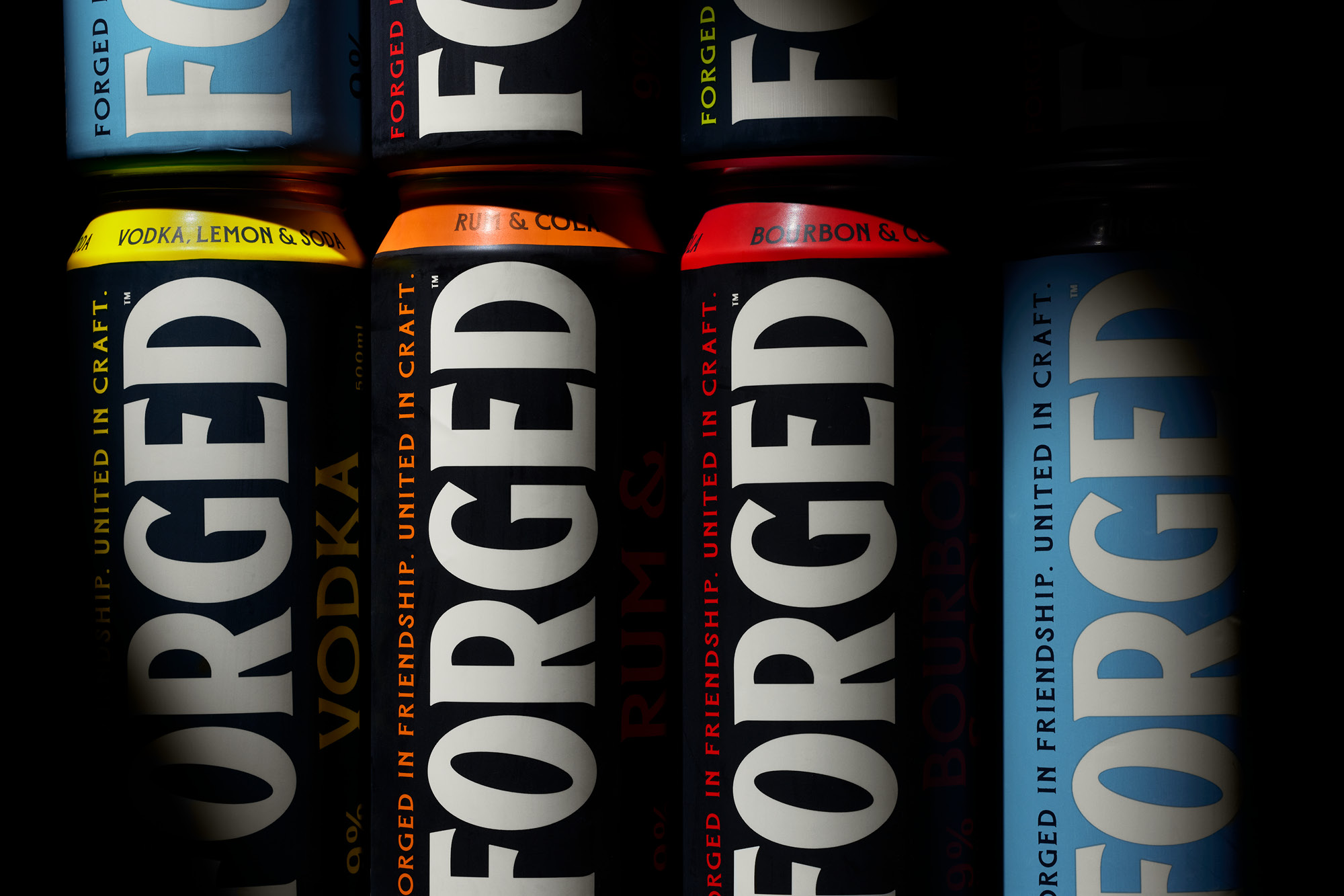
United in Craft

Forged

onfire design Forged packaging design nz2

As a heavily tourist-based economy, the local Fijian alcohol market is skewed towards bigger international brands in resorts, hospitality and retail stores. Occupying higher price points, these were supplemented with cheaper locally made options. The result? A market primed for something better.

Enter Pacific Island Beverages, a Fijian-owned, locally operated start-up brewery in Suva with the sole purpose of serving Fiji with well-crafted, meticulously-made and great-tasting beverages that serviced this gap in the market. We were tasked to create their first brand, a range of dark and light RTD cocktails of well-known mixes but formulated with a distinct Fijian flare. This brand could cut through and compete—on taste, on shelf, and on story.

Deliverables

Brand Strategy
Tone of Voice
Brand Identity
Packaging Design
Communication

onfire design Forged packaging design nz2
onfire design Forged packaging design nz3
onfire design Forged packaging design nz5

The two founders inspired the naming process. Friends first, their bond—and Fiji’s deep-rooted culture of kinship—inspired the name Forged. It speaks to strength, loyalty, and something made to last. Visually, the brand draws inspiration from category language – dark colour palettes and heritage cues, but adds a modern twist; minimising embellishments, oversized typography and strong use of pop colours. The Forged wordmark is bold, heavy and proud;with soft-serifs that nod to knowledge and craft. In contrast, the secondary font is historical with its own set of quirks. Flared serifs, subtly rough edges and slightly imperfect add character and flare to the tone. Colour palettes are minimised – used to differentiate dark and light mixes and work strongly in retail. Retail boxes amplify this language, using typography size and colour contrast to maximise impact.

onfire design Forged packaging design nz7
onfire design Forged packaging design nz8
onfire design Forged packaging design nz9

Off-pack, the eccentricity of the typography, colour, and story-telling is used as a pattern device to contrast the colours of the cans.

Forged launched with four flavours and quickly found traction. More flavours followed. It’s now a standout local alternative to the big names, with growing export interest across the Pacific and range extensions on the way.

onfire design Forged packaging design nz10
onfire design Forged packaging design nz11
onfire design Forged packaging design nz12
onfire design Forged packaging design nz13

© All images are copyright of Onfire Design and cannot be used without prior permission.