Go Forth and Conquer

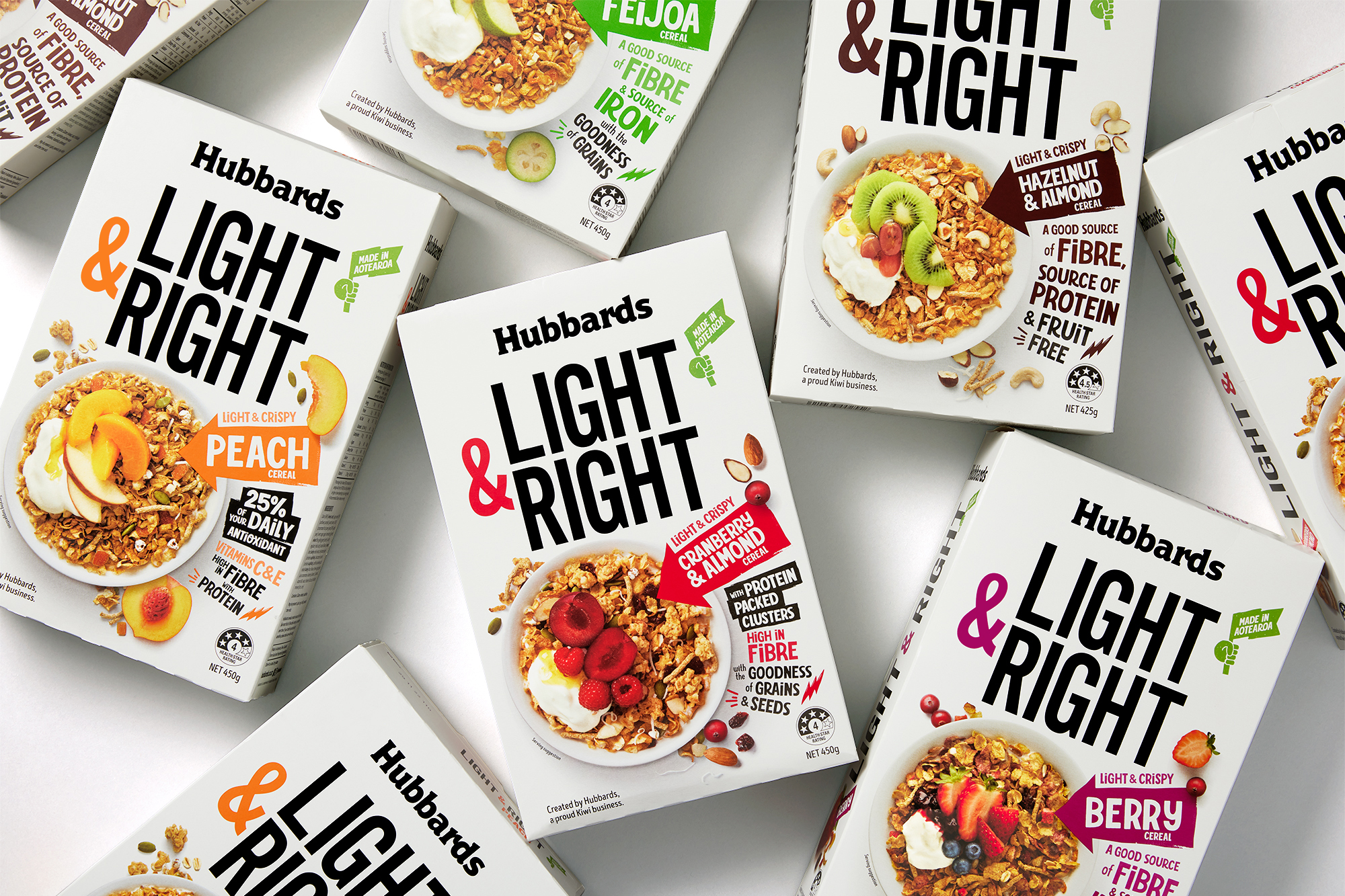
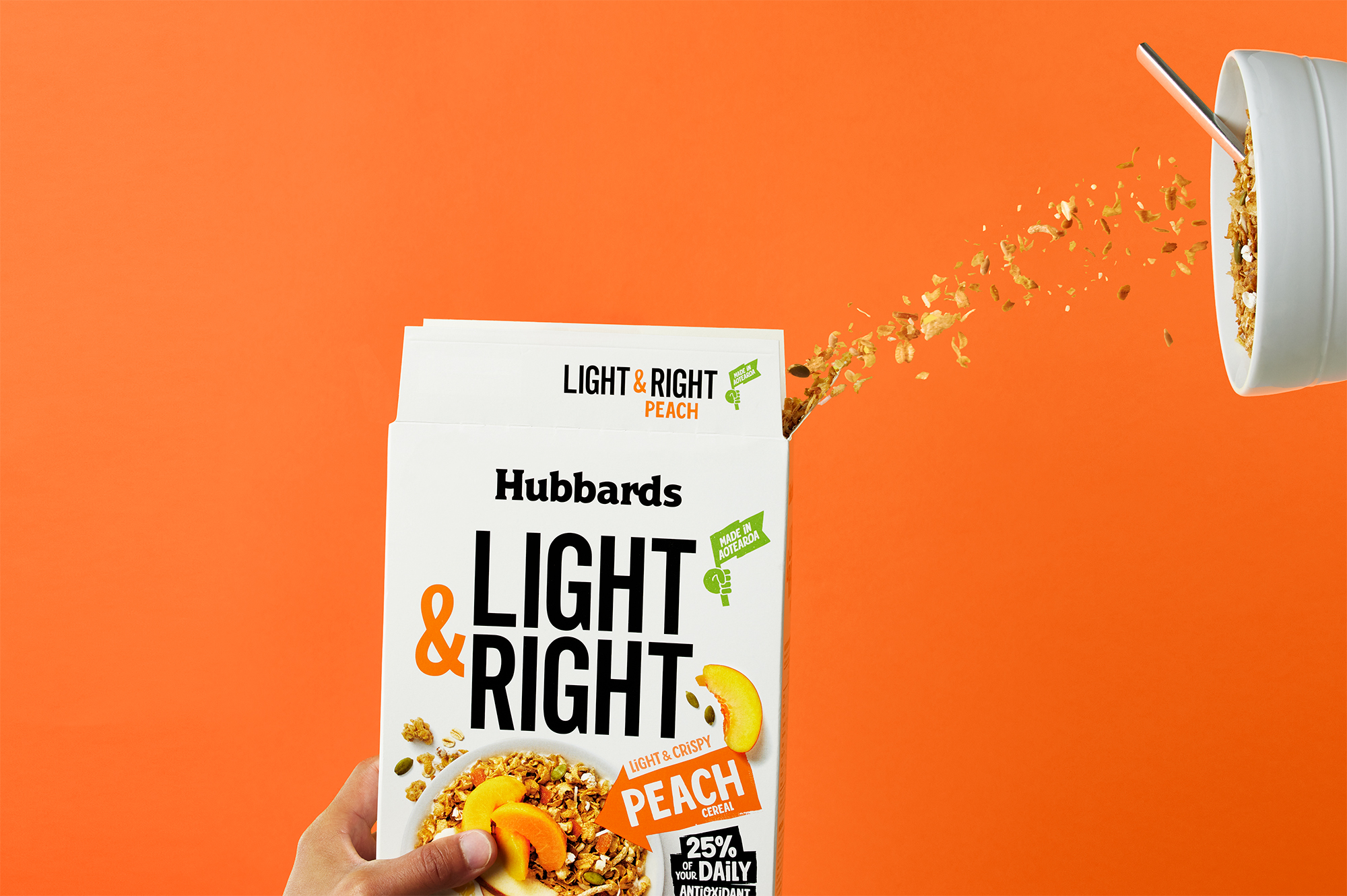
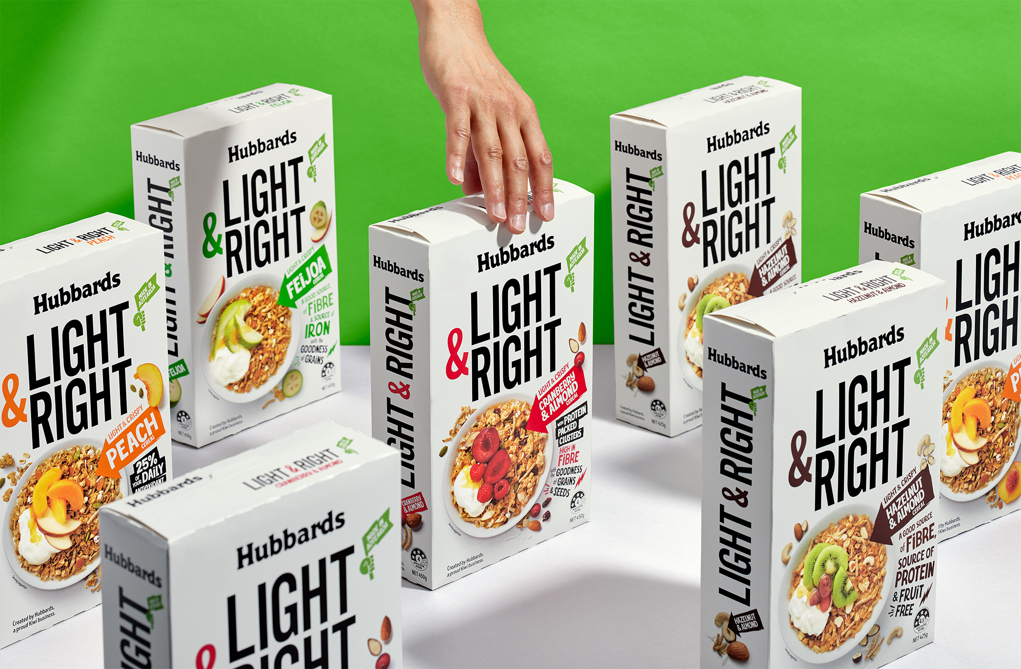
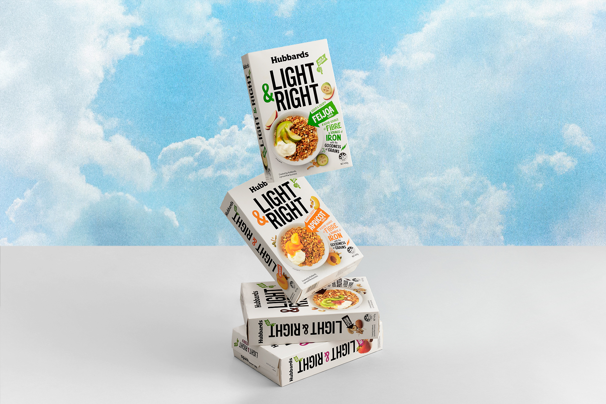
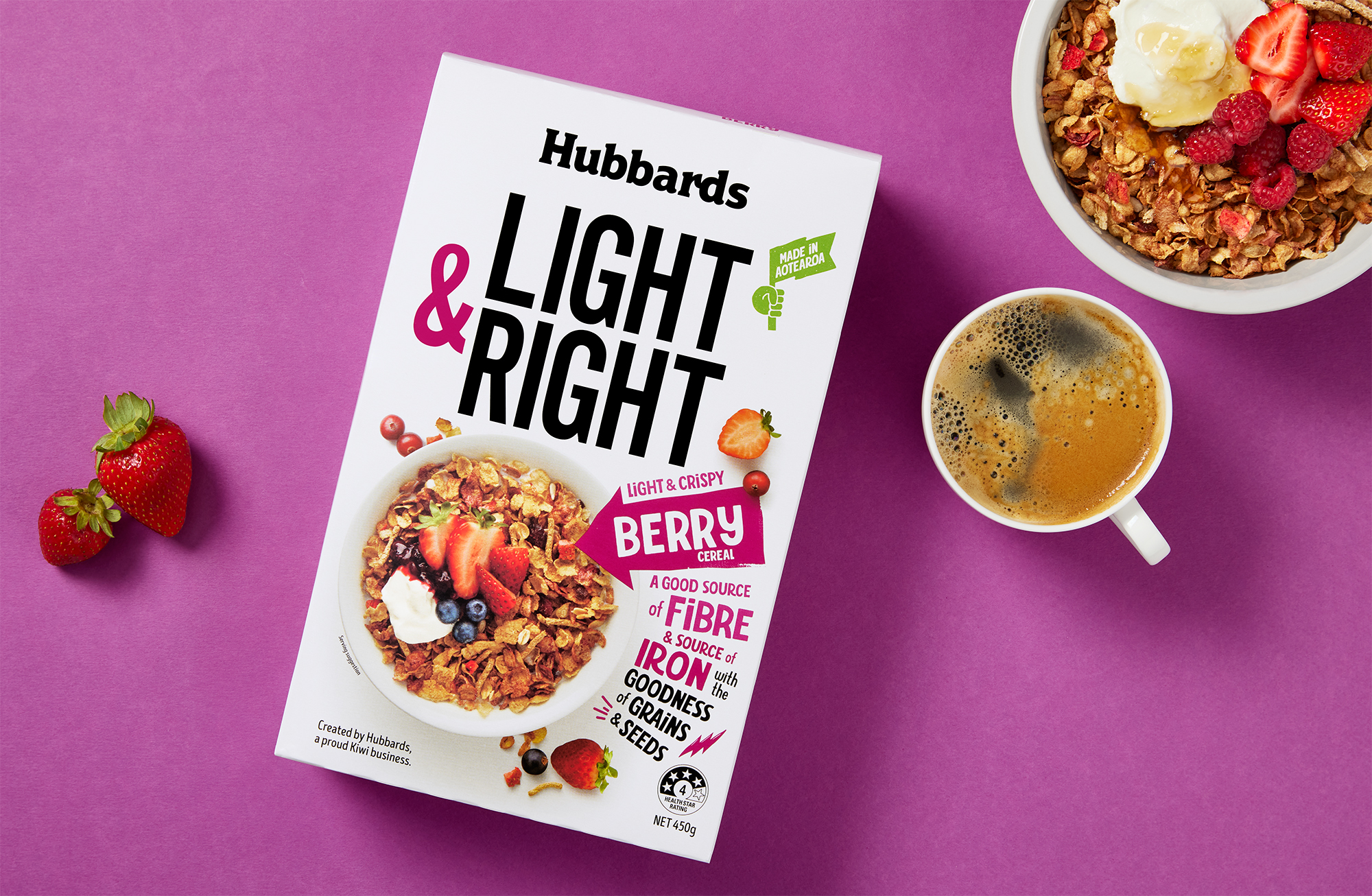
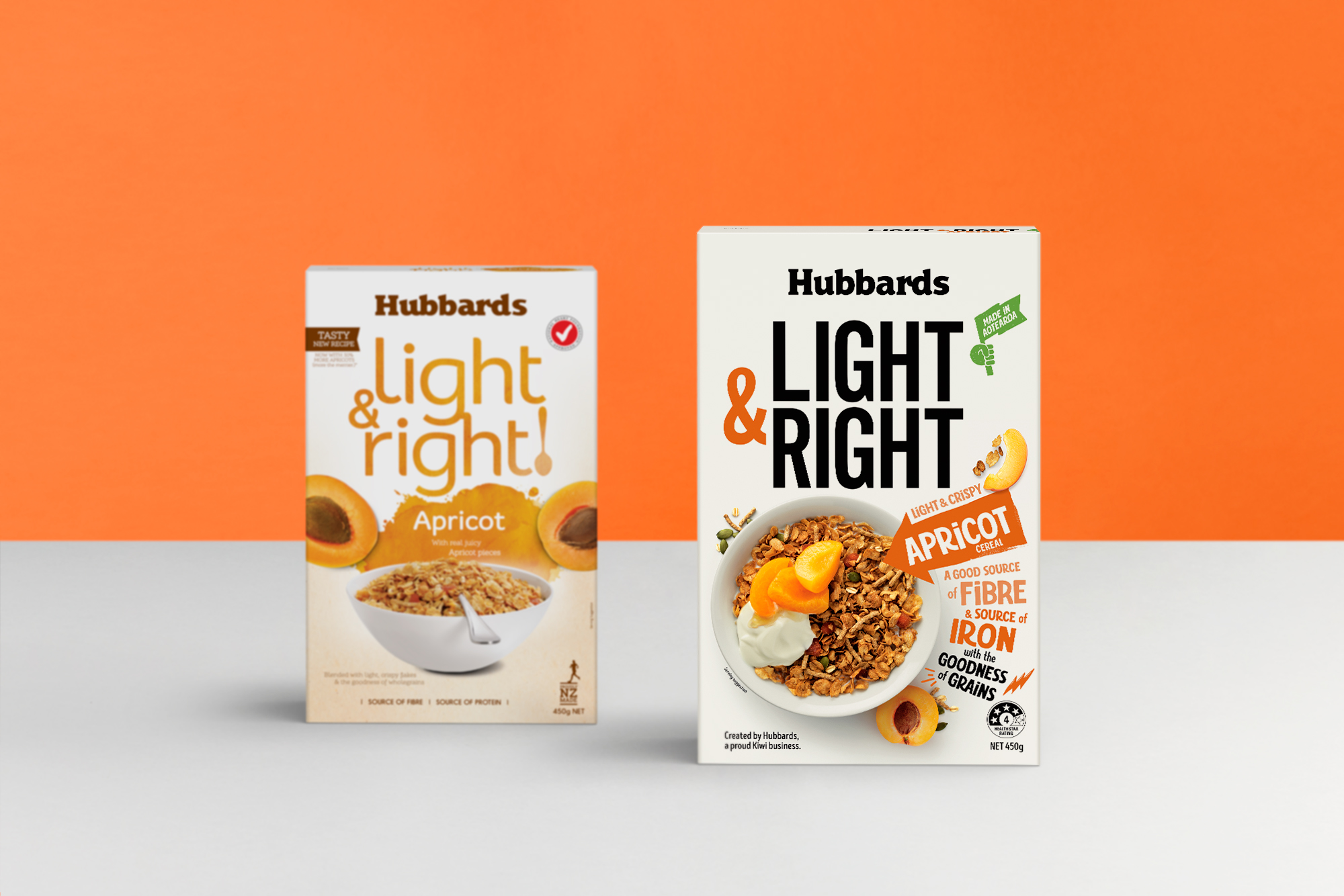
Hubbards Light & Right Cereal

Onfire 04AUG21 32120 R4

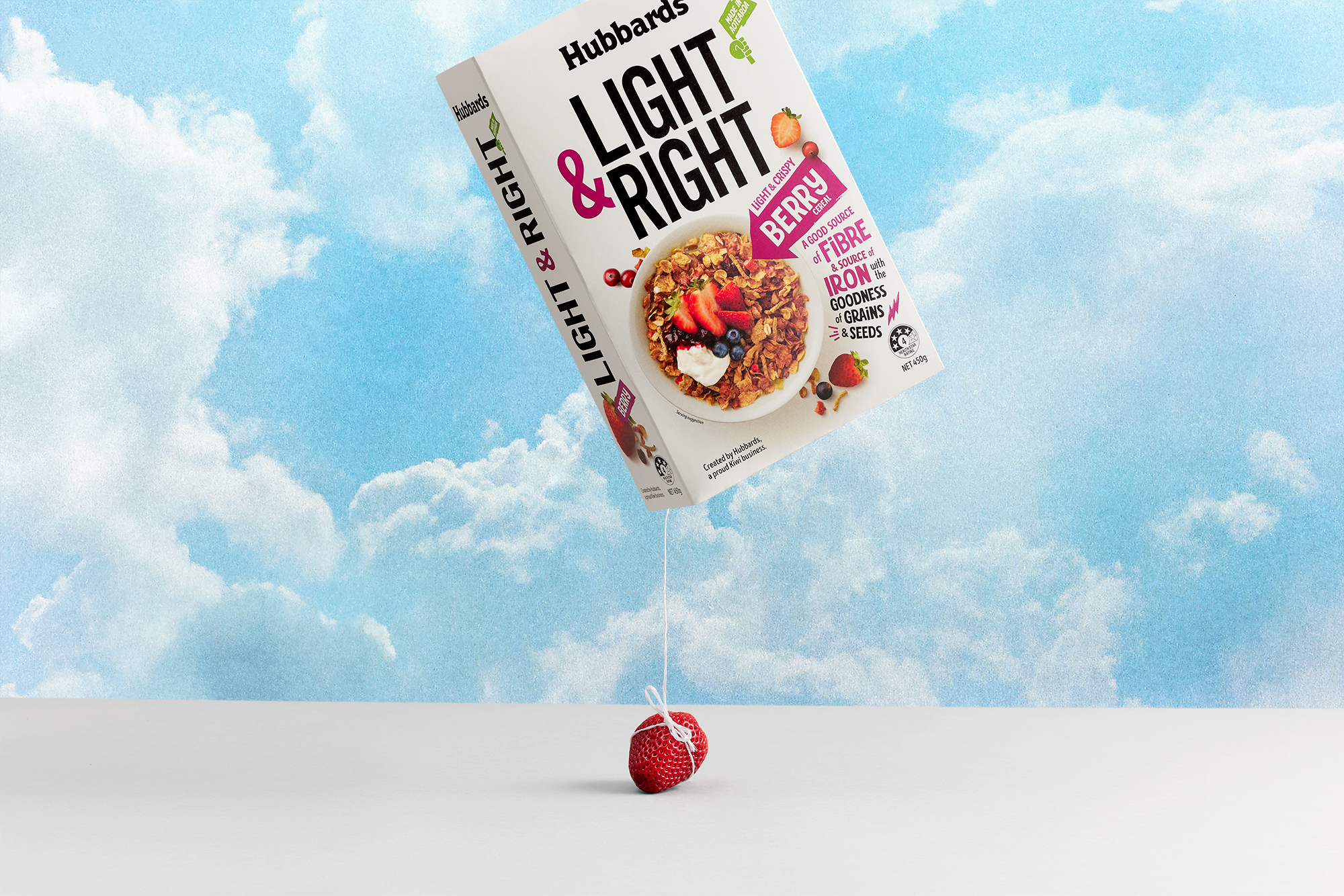
Light & Right is a core product within the Hubbards portfolio. As the first brand to release a range perfectly balanced between good-for-you ingredients and the right sort of fuel to power Kiwis through their day, this has become a firm consumer favourite.

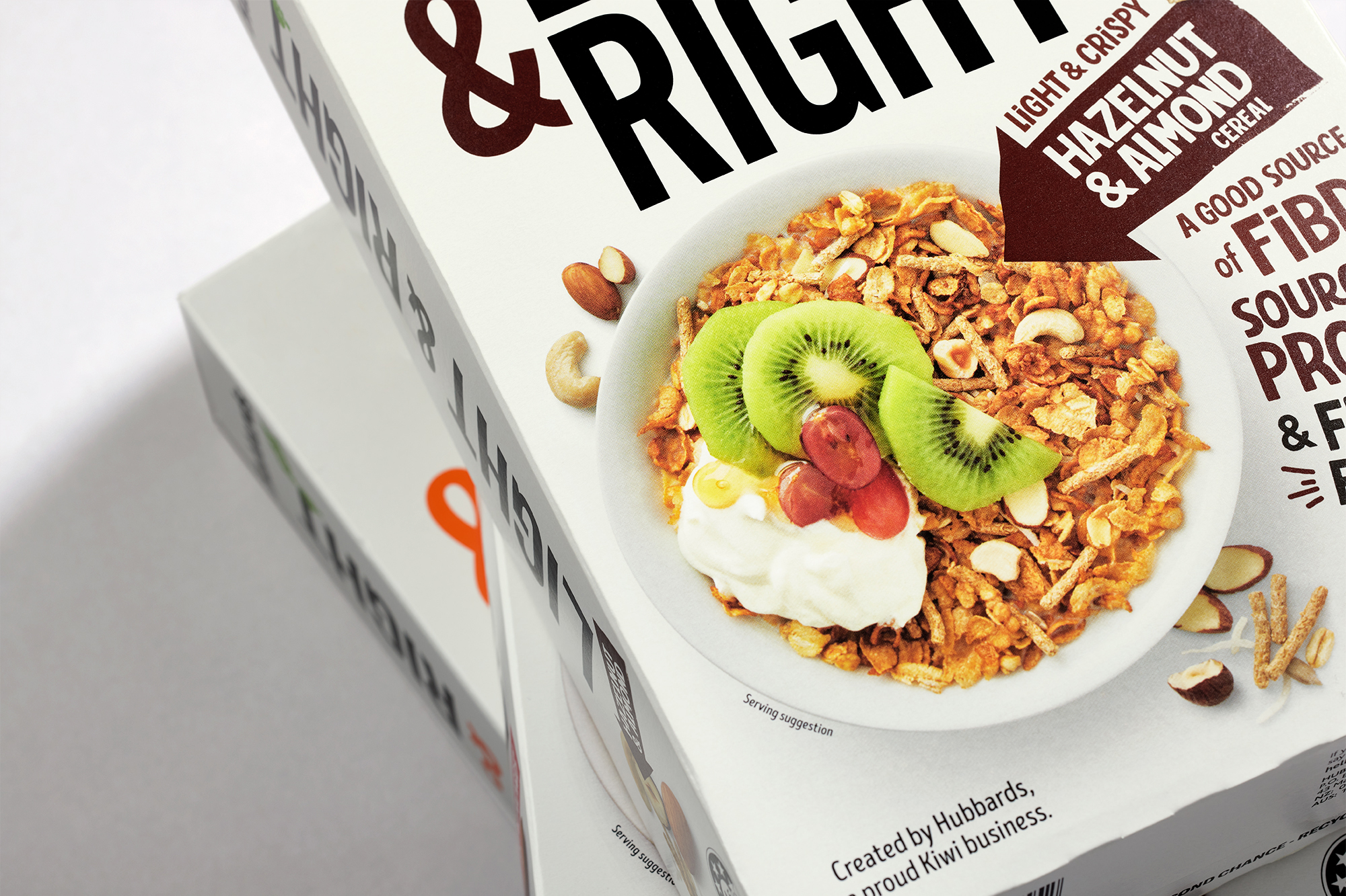
As part of our overall brand refresh for Hubbards, Light & Right is reinvigorated. As a dramatic change from the soft, earthy colour palette and photography of its previous incarnation, the new packaging is bold, bright and confident.

Deliverables

Brand Strategy
Tone of Voice
Brand Identity
Packaging Design
Communication

Light Right 007 R2
Light Right 021 R
Light Right 005 R

Sub-brand typography is now oversized, simplified and loud, with playful secondary typography adding movement. Top-down cereal photography adds the all-important yum factor. This is Light & Right for the active, creative, go-getting New Zealander!

Light Right 003 R
Onfire 04AUG21 32130 R2
Light Right 008 R
Light Right Before After R

© All images are copyright of Onfire Design and cannot be used without prior permission.