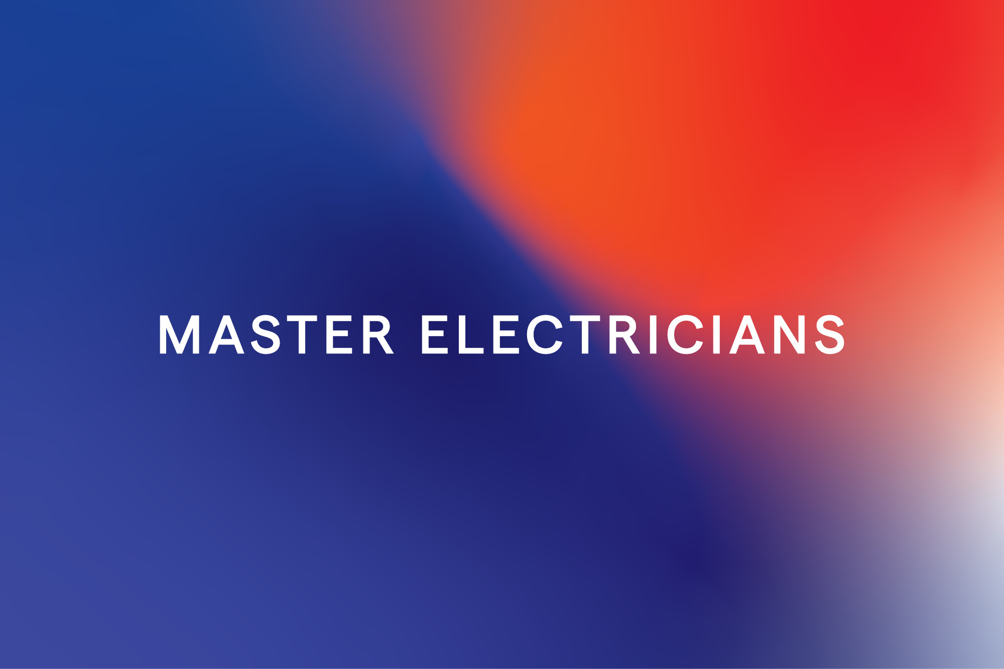
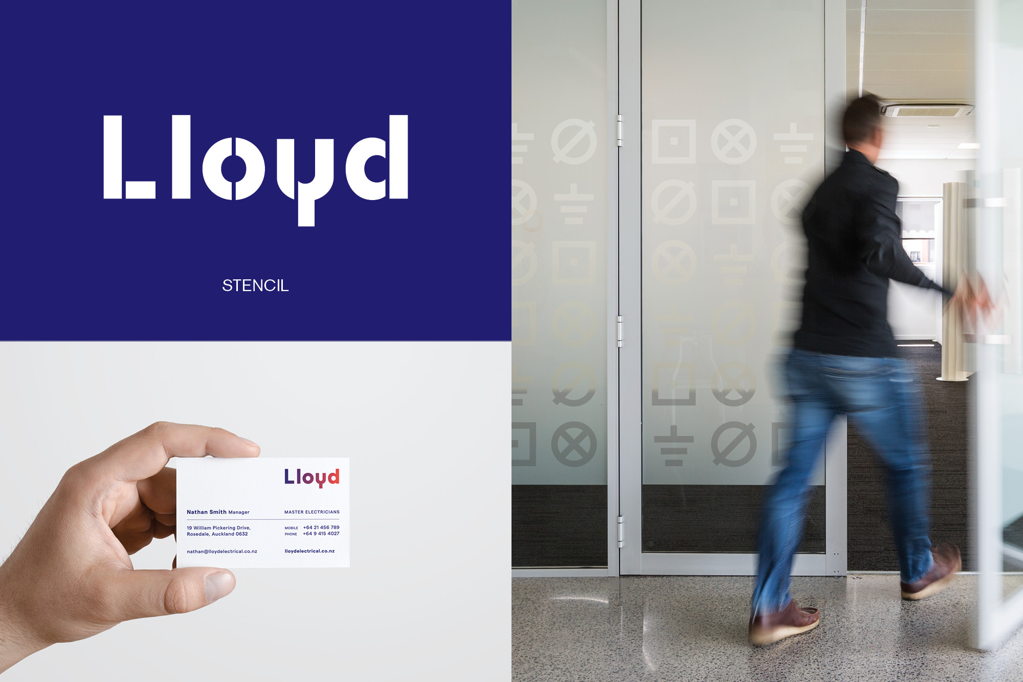
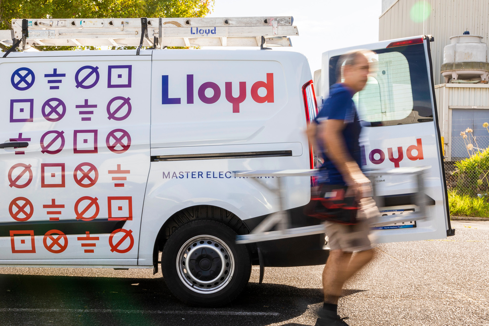
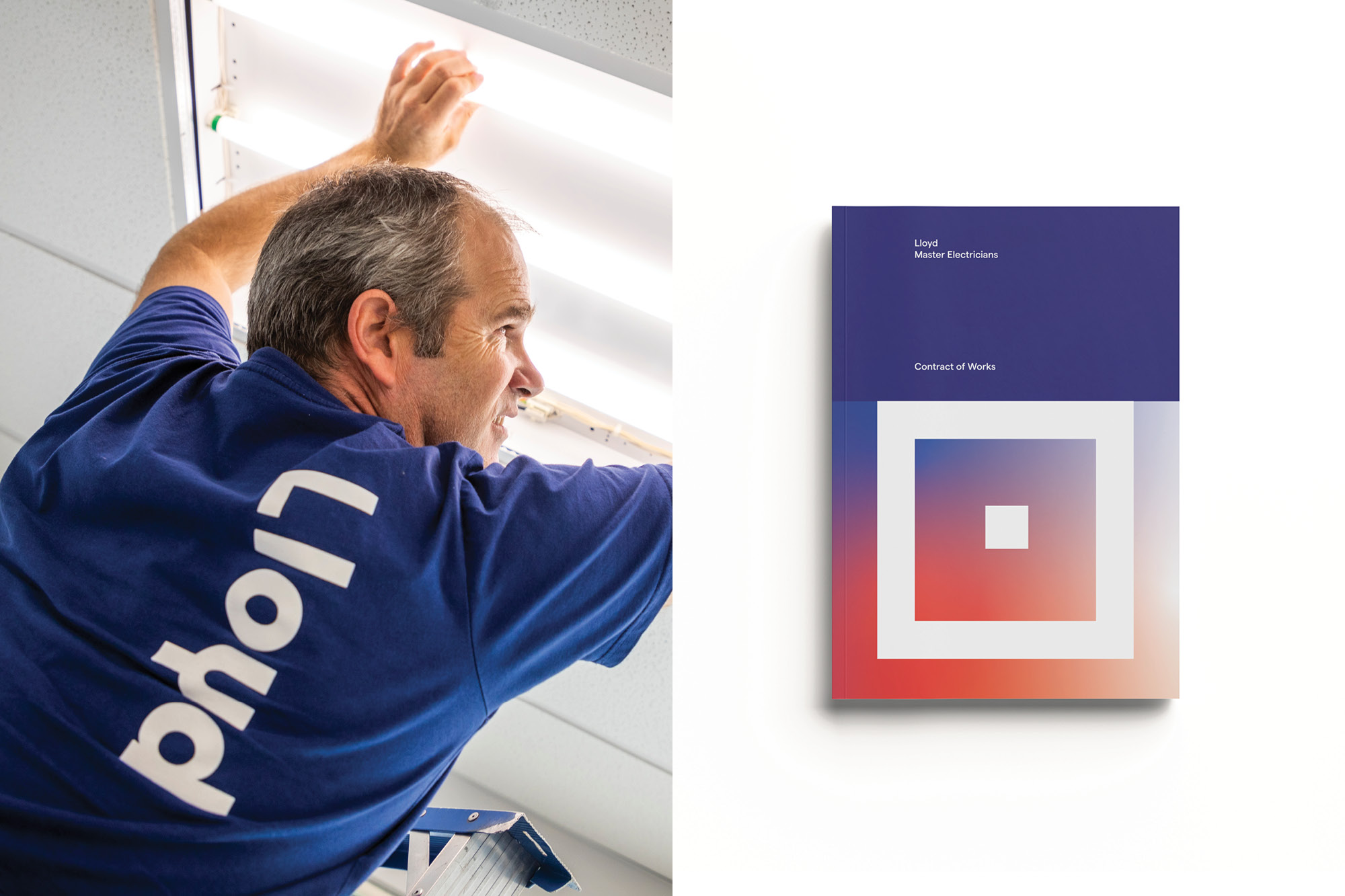
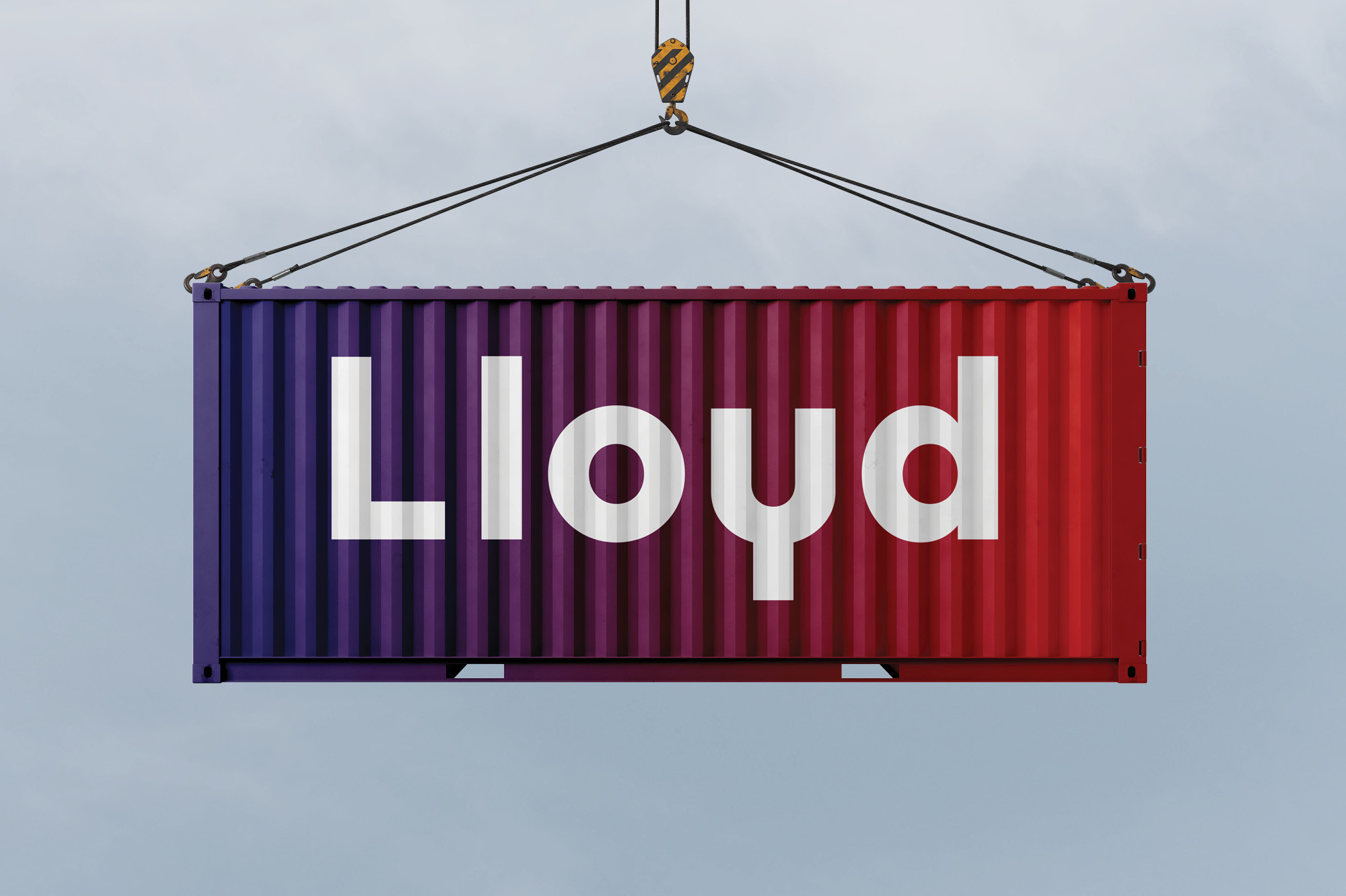
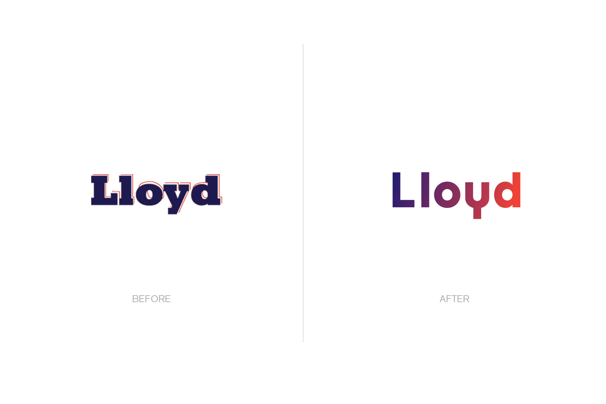
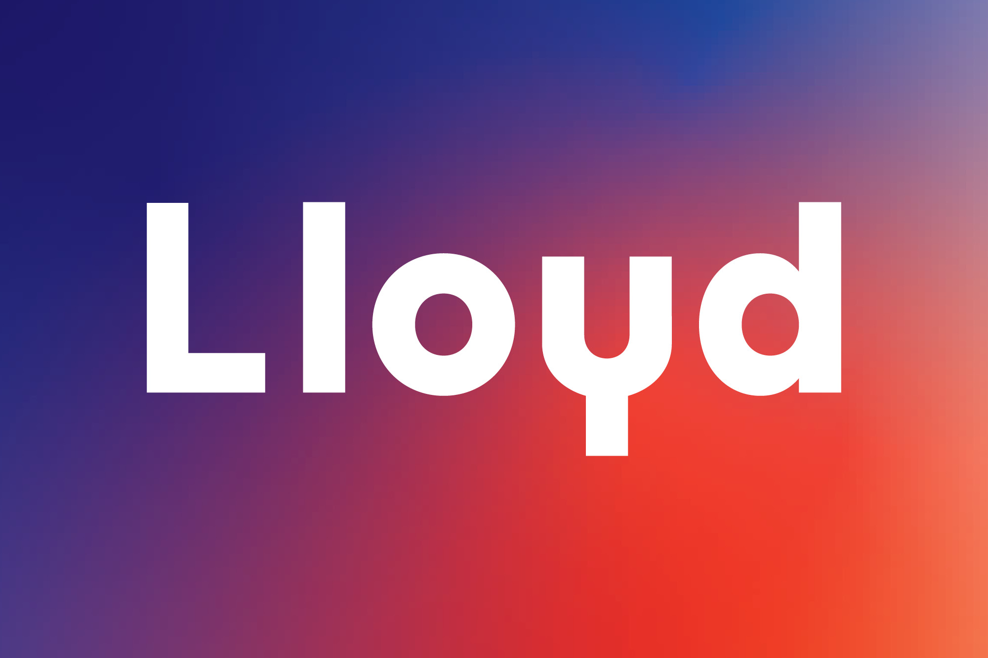
Lloyd

Master Electricians

Challenge
With an increased focus on delivering high tech electrical solutions it became apparent Lloyds previous brand identity and messaging no longer aligned with their offering.

Solution
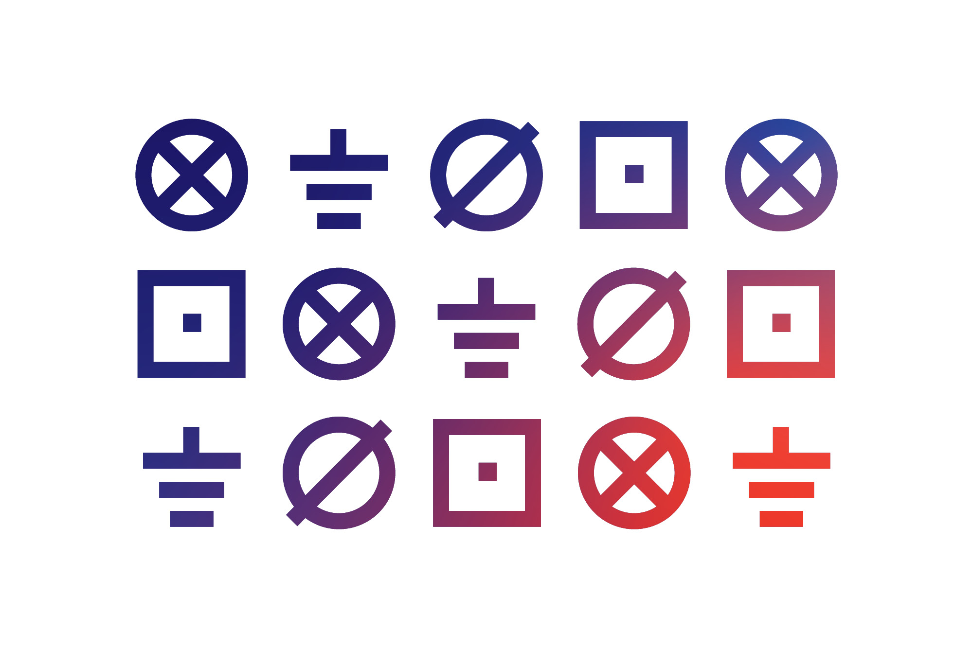
Onfire was tasked with modernising the companies identity. To better reflect Lloyds new focus, a bold new minimalist logotype was crafted, along with secondary design system based on electrical schematic diagrams. The companies long standing core blue was woven into an exciting new abstract colour system that morphed across various assets. Employing only qualified skilled tradesmen, Lloyds point-of-difference was their staff. A new brand positioning was introduced to reflect this. The new identity was rolled out across multiple touch points, from vans, uniforms to office and site signage. Lloyds new identity helps future-proof them, injecting energy via a system that works across all parts of their business.

© All images are copyright of Onfire Design and cannot be used without prior permission.

Lloyd Branding Auckland NZ1
Lloyd Branding Auckland NZ2
Lloyd Branding Auckland NZ3
Lloyd Branding Auckland NZ4
Lloyd Branding Auckland NZ5
Lloyd Branding Auckland NZ6
Lloyd Branding Auckland NZ7
Lloyd Branding Auckland NZ8
Lloyd Branding Auckland NZ9
Lloyd Branding Auckland NZ10