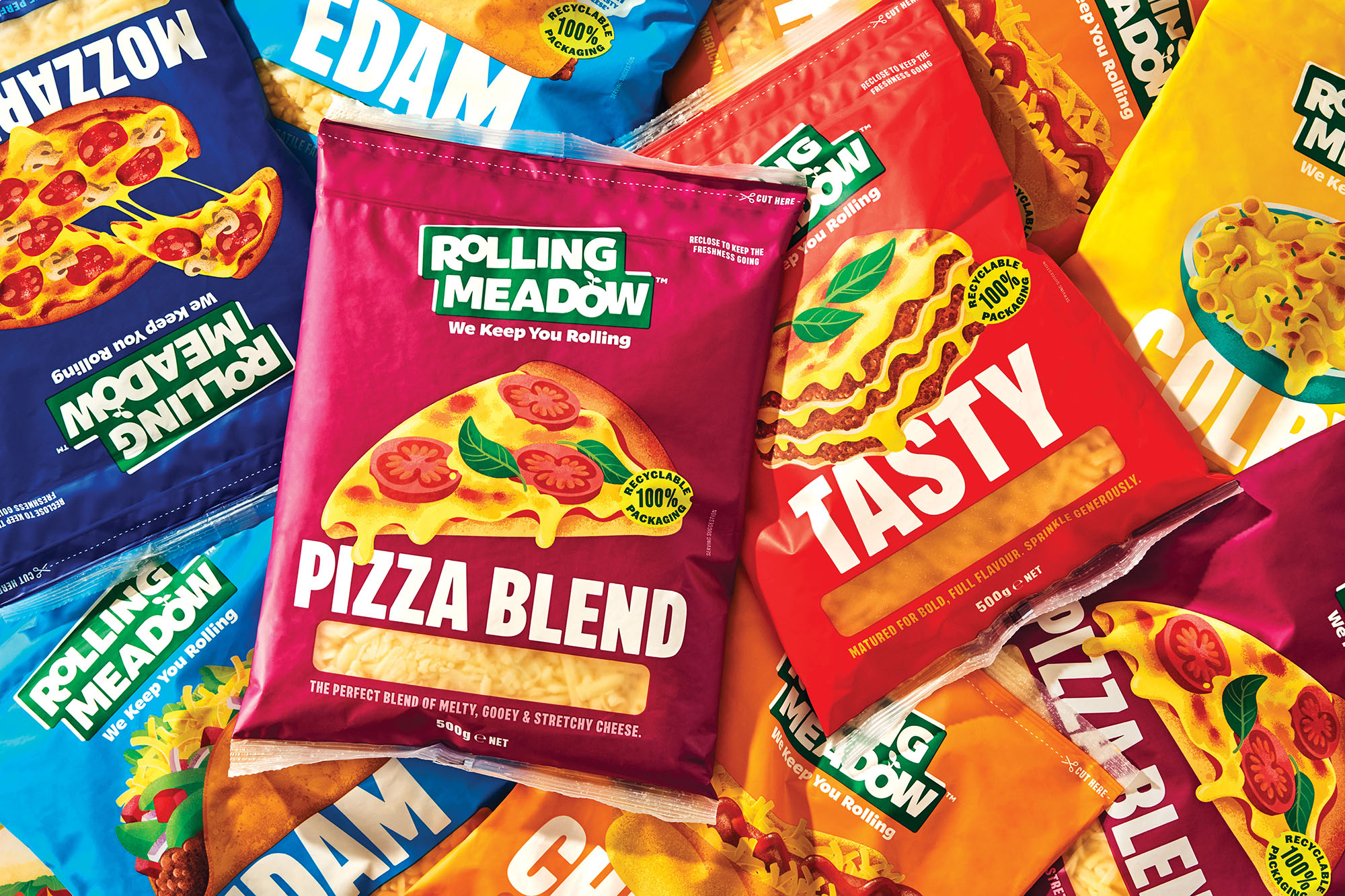
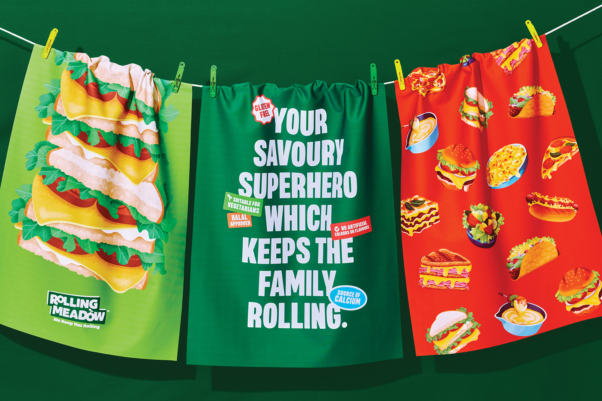
We Keep on Rolling

Rolling Meadow

onfire design rolling meadow packaging design nz7

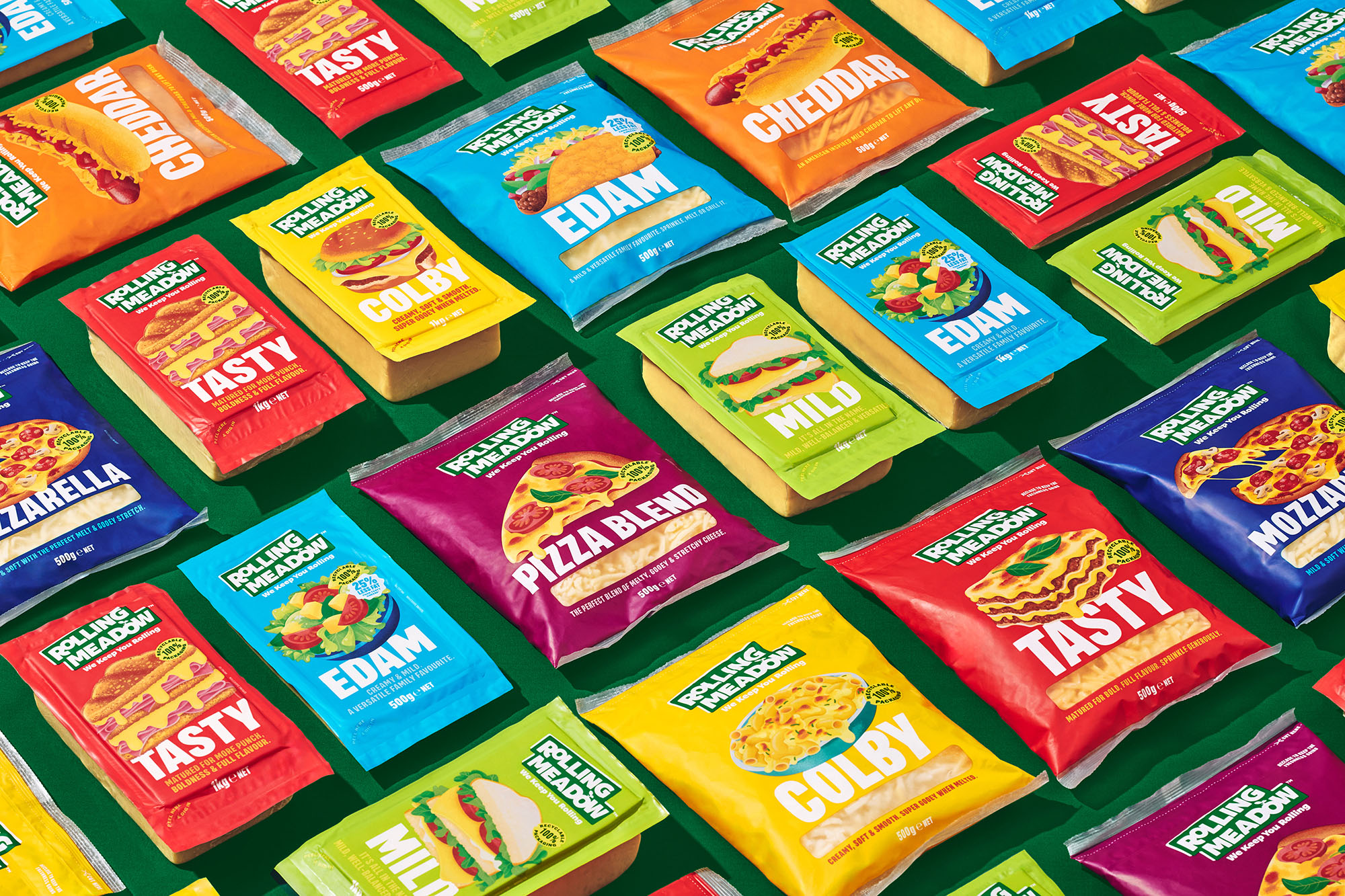
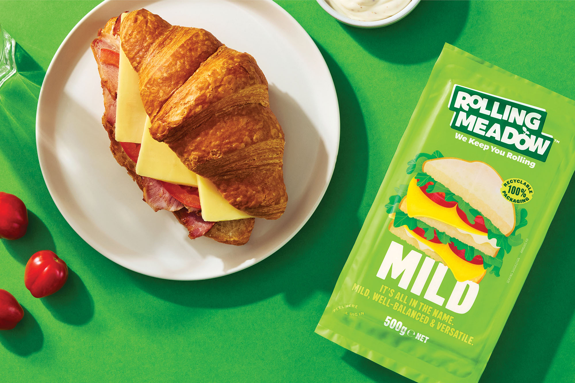
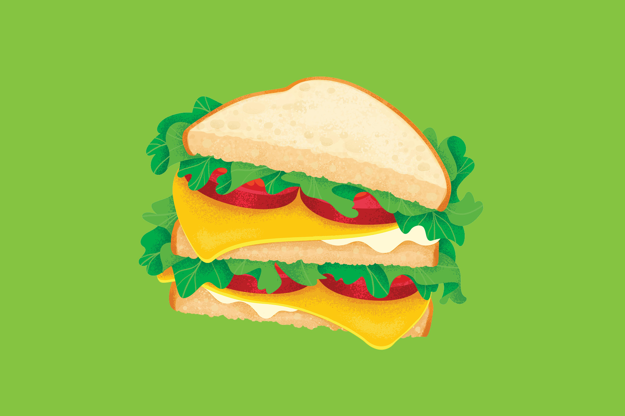
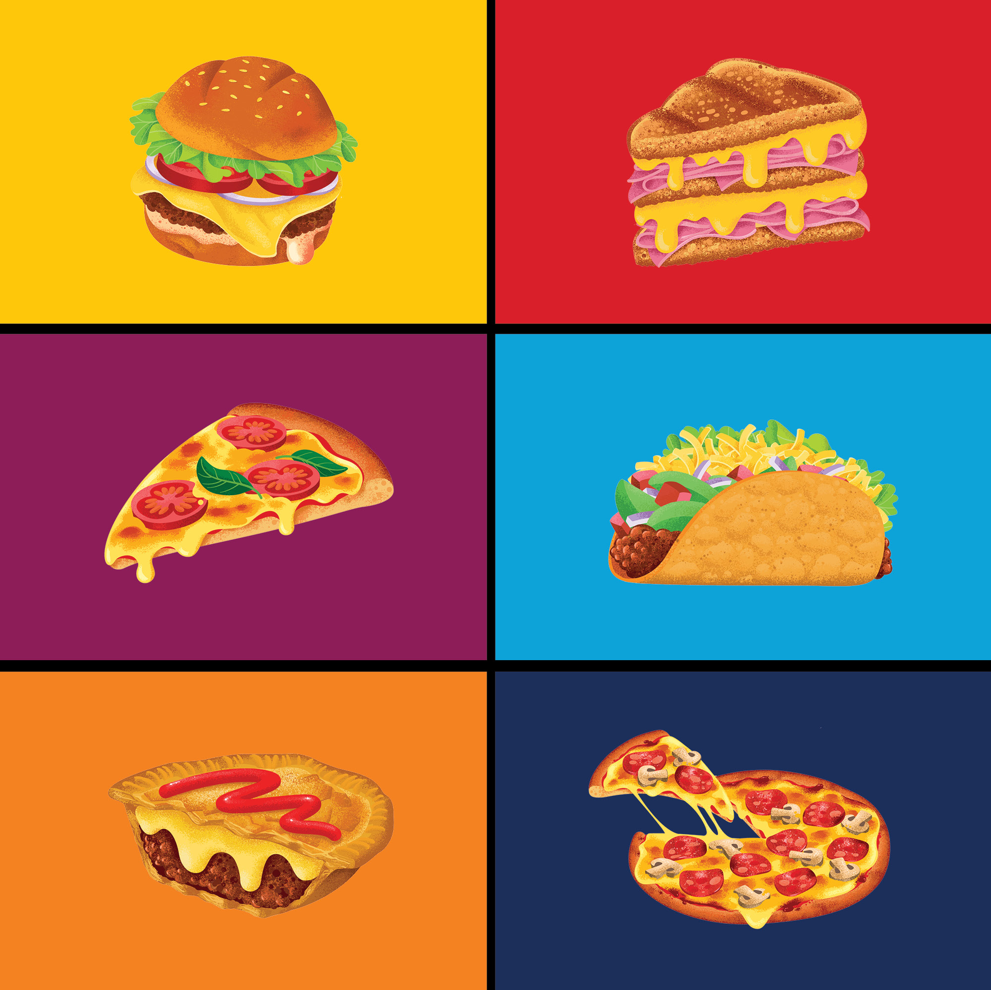
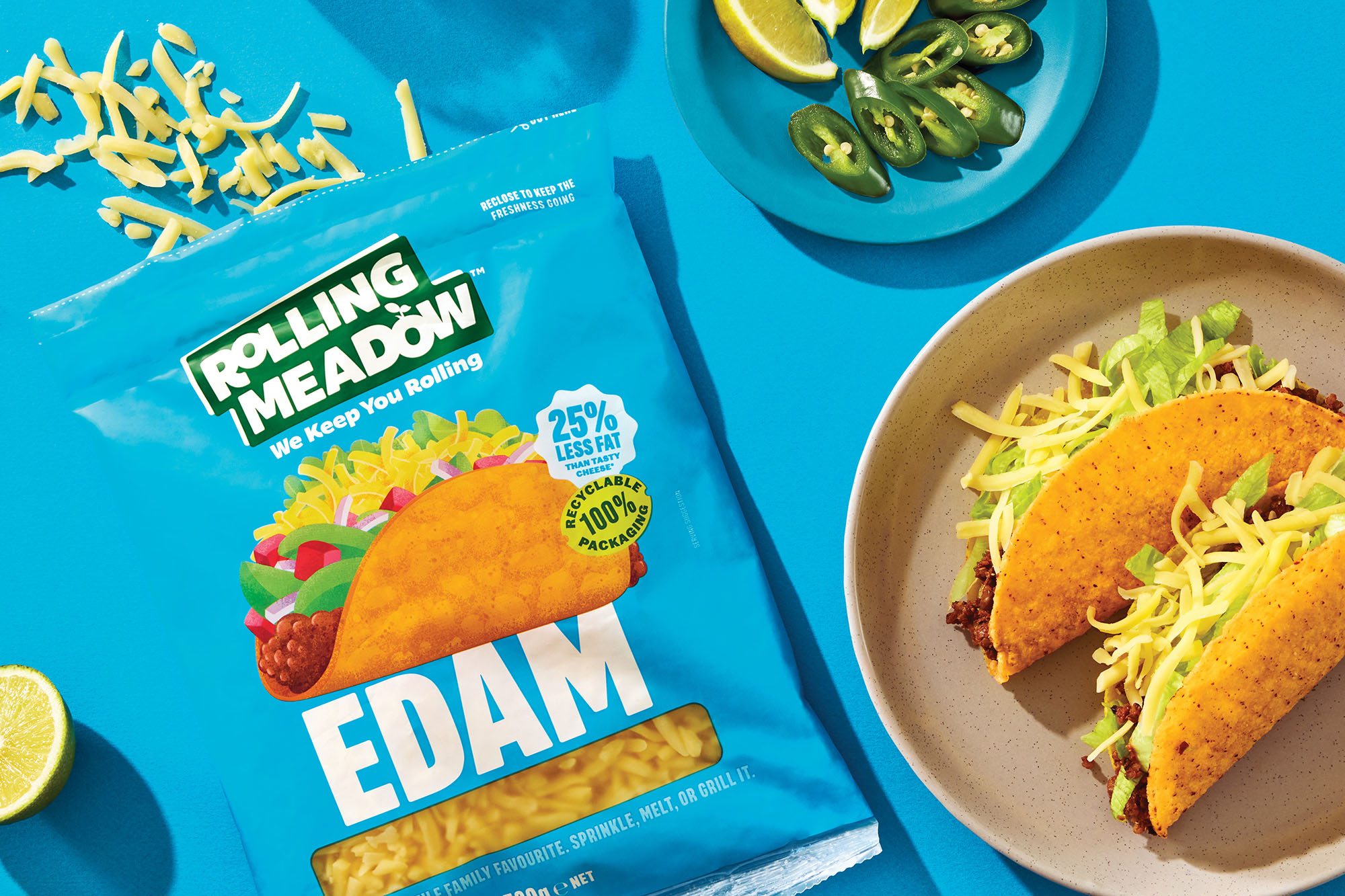
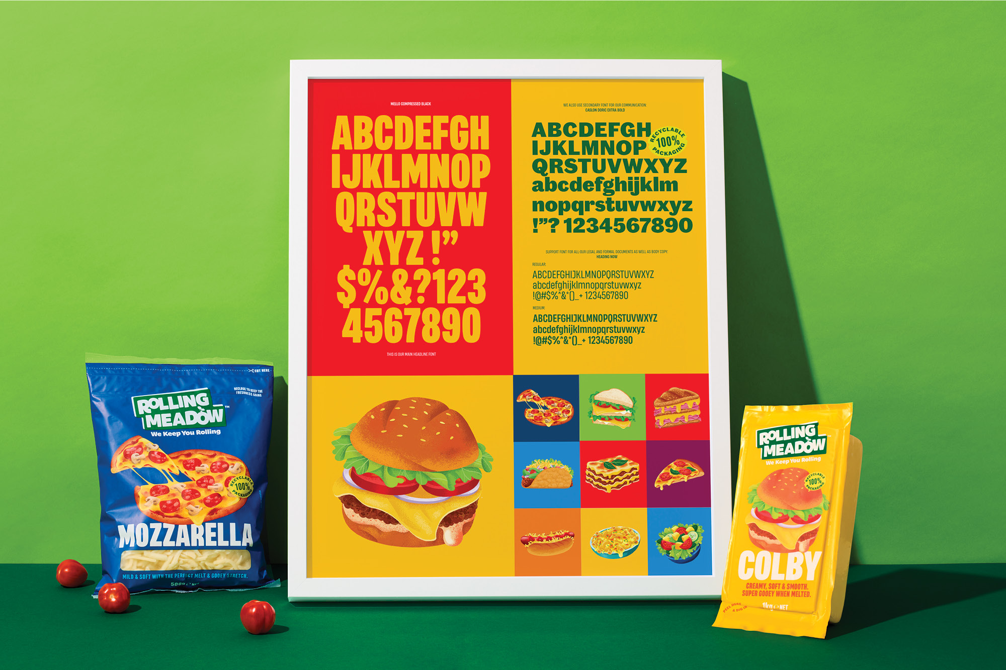
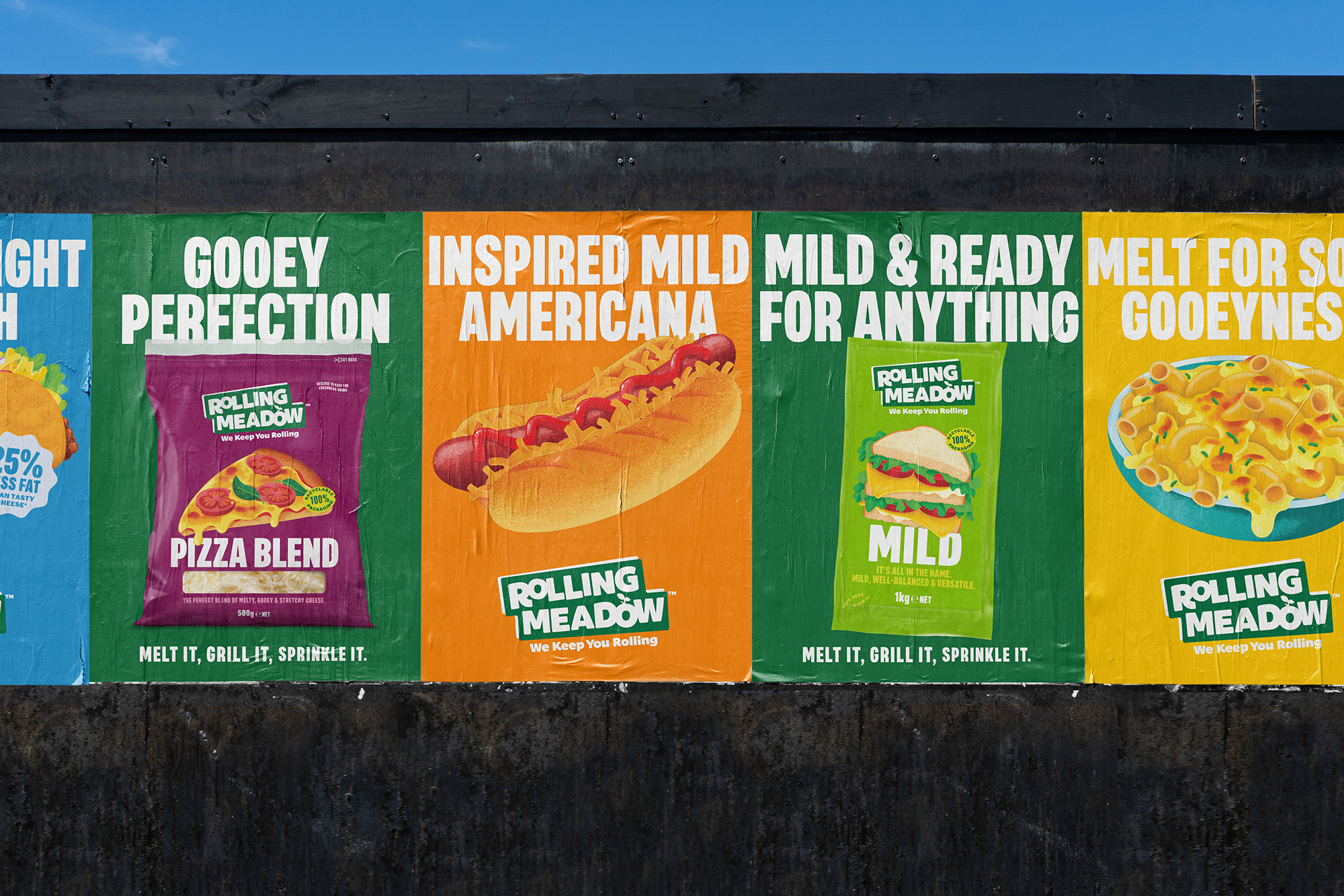
As an existing cheese brand in New Zealand supermarkets, Rolling Meadow is an everyday mainstream range of grated and block cheeses. Its accessible price points made it a go-to Kiwi family staple. However, the brand lacked any ownable brand or visual assets which led to the range losing its impact instore and lacking a compelling proposition for the consumer.

Awards

Finalist, Best Awards 2024 →
Finalist, AGDA Awards 2024 →
2 x Bronze, World Brand Design Society Awards 2025 →


Deliverables

Brand Strategy
Tone of Voice
Brand Identity
Packaging Design
Communication


onfire design rolling meadow packaging design nz4
onfire design rolling meadow packaging design nz28

At this mainstream price point and variety of cheese options, the gap for Rolling Meadow to own was real, and great tasting cheese for busy New Zealand families. Cheese is the perfect food and ingredient for them, whether that be for a quick snack, a weekday meal or something more special. Aligning with the brand name, the core brand idea became 'We keep you Rolling.' This created a new personality with a big heart, energy, relentless positivity, and straight-talking.

onfire design rolling meadow packaging design nz9
onfire design rolling meadow packaging design nz5
onfire design rolling meadow packaging design nz 14

The brand's visual language underwent a significant transformation to align with its new positioning and driving ideas of big energy, healthy fuel, and versatility. The new visual assets, anchored by food illustrations, are bold and vibrant. The highly stylized, colourful, and textured new illustrations showcase the various foods that can be created with each cheese variant. The graphic style of illustration was deliberately distorted, with playful angles and dimensions, to create a visually striking impact.

onfire design rolling meadow packaging design nz 15
onfire design rolling meadow packaging design nz30
onfire design rolling meadow packaging design nz31

The new brand logo and messaging system are based on a sticker-style aesthetic, representing the idea of 'good everyday value'. The new typography is big and bold, acting as a balance to the illustrations.

The result is a brand that now understands its role for today's consumer, is bold, energetic and always on hand to make epic dairy-powered food.

onfire design rolling meadow packaging design nz13
onfire design rolling meadow packaging design nz34
onfire design rolling meadow packaging design nz35

© All images are copyright of Onfire Design and cannot be used without prior permission.