Hunter Gatherer Gourmet
Julena is a home baker on a mission. A love of baking came from her Croatian mama and she has developed her skills, recipes and ideas over the years ever since. Originally, the aim was to get herself and her family healthier and feeling better. This resulted in Julena researching diets and sampling nutritious whole foods, Paleo and even cutting out dairy. Inevitably, these ideas soon found their way into her baking. It was through her trials and tests with various ingredients that the idea of Hunter Gatherer Gourmet was born. After all, everybody deserves a treat now and then, no matter what your health or lifestyle choices.
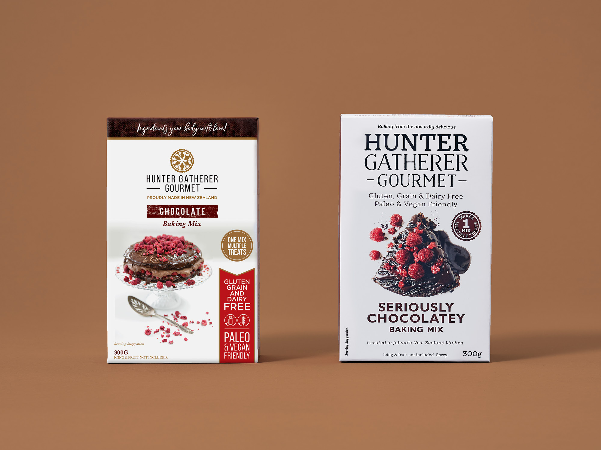
As a tight-knit, premium range of easy to use baking mixes that were free from…everything, the brand was unique. But in the supermarket aisle, its ‘me-too’ packaging approach limited shelf appeal. Up against the bigger and more recognisable everyday brands, following a design formula of ‘fitting in, not standing out' just wasn’t working. With a premium price point, the brand needed to challenge the status quo.
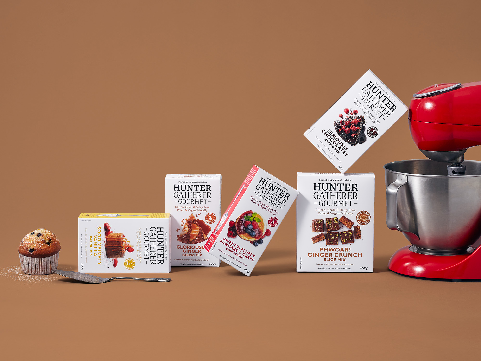
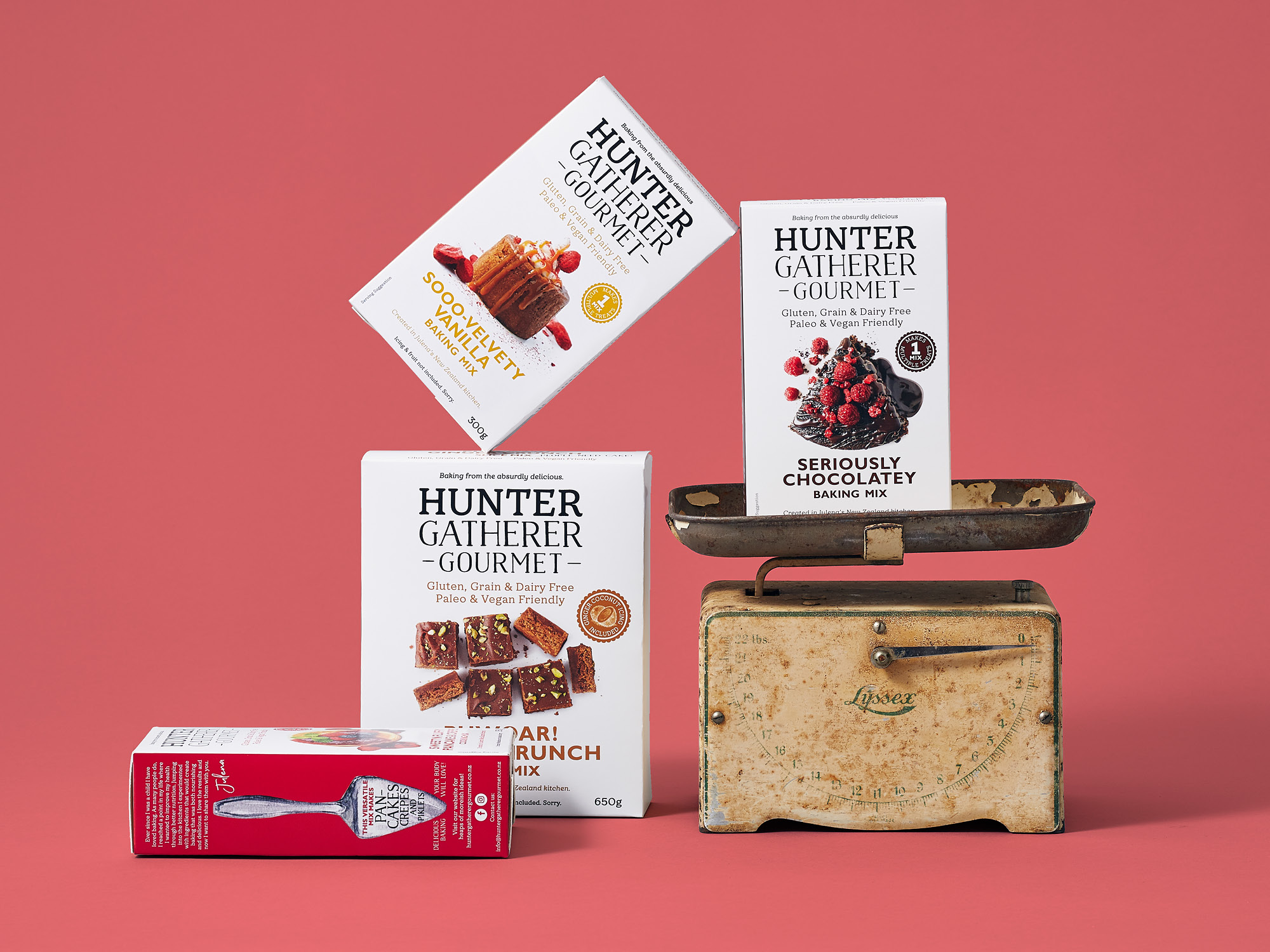
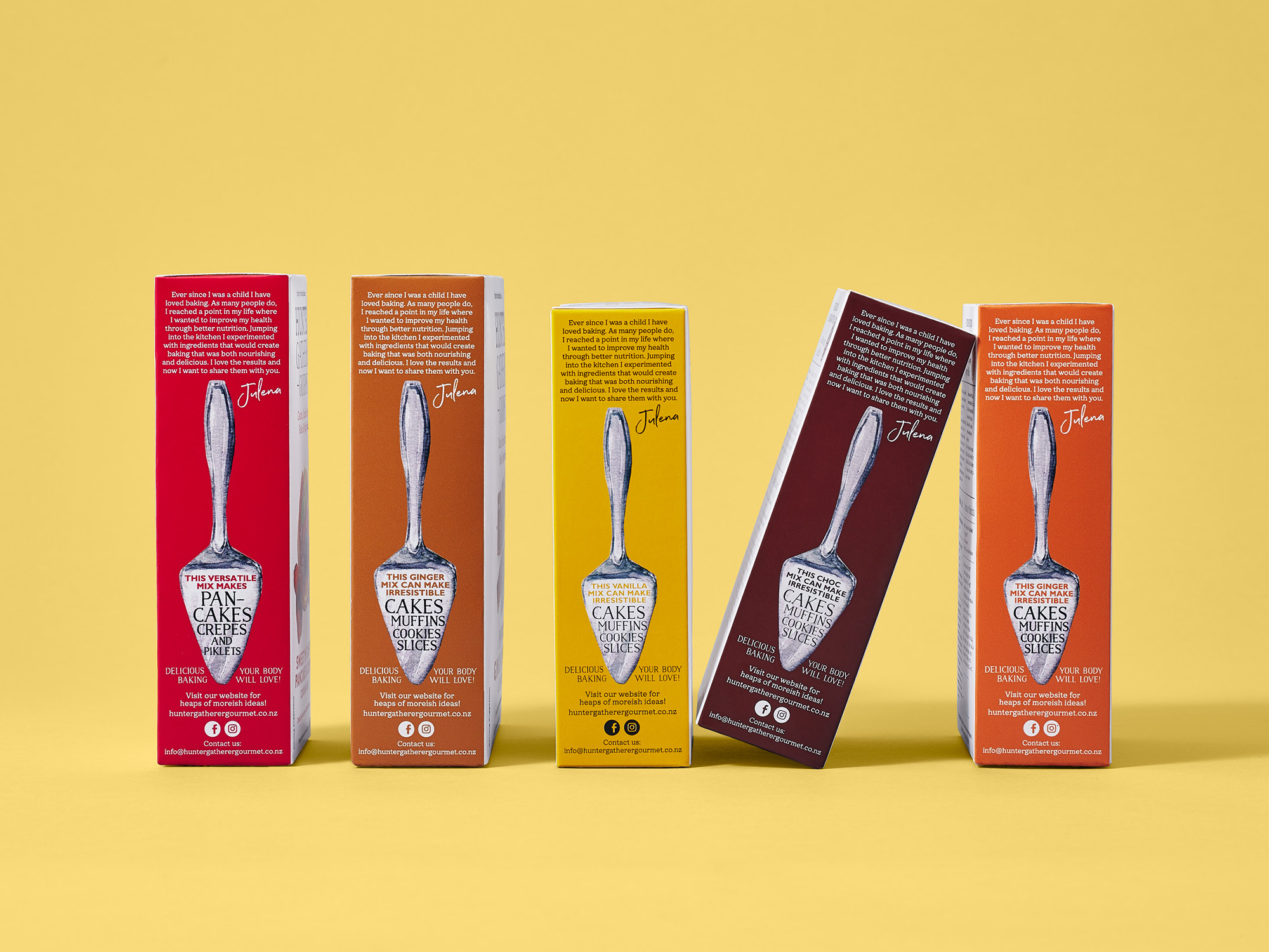
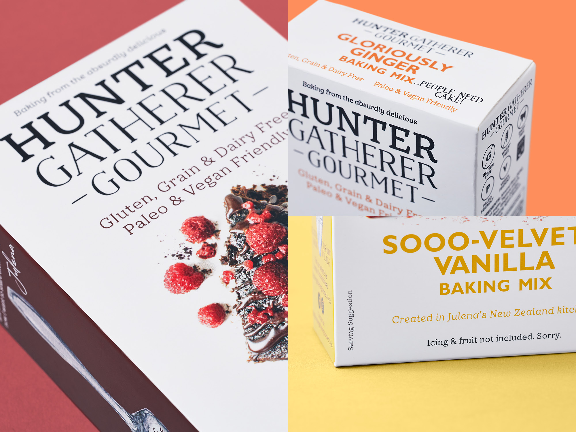
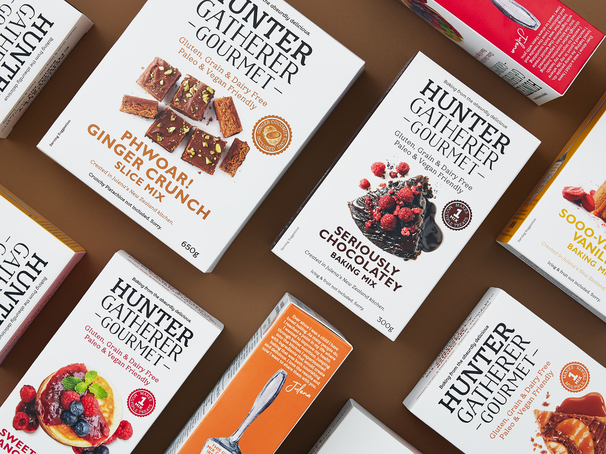
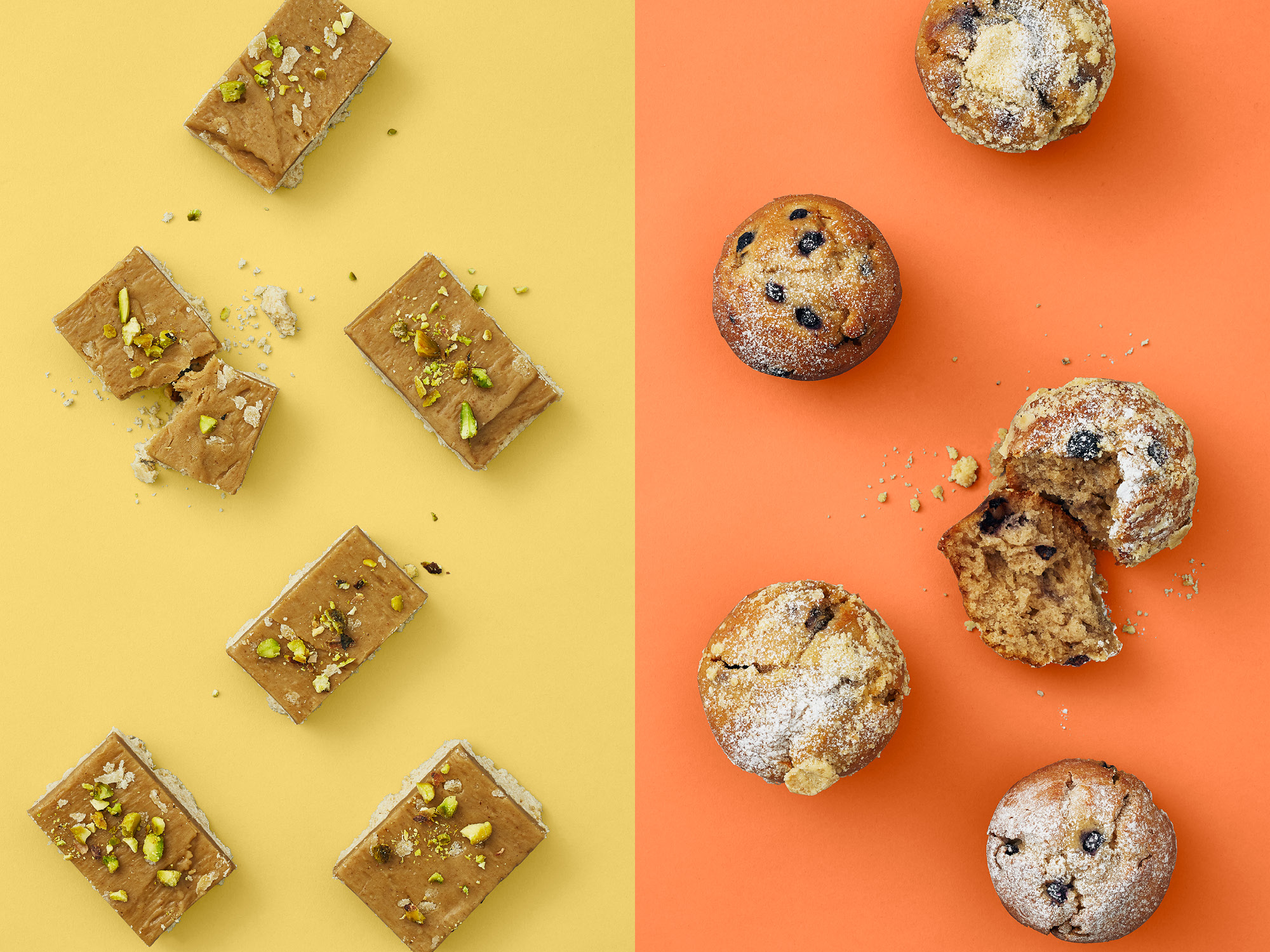
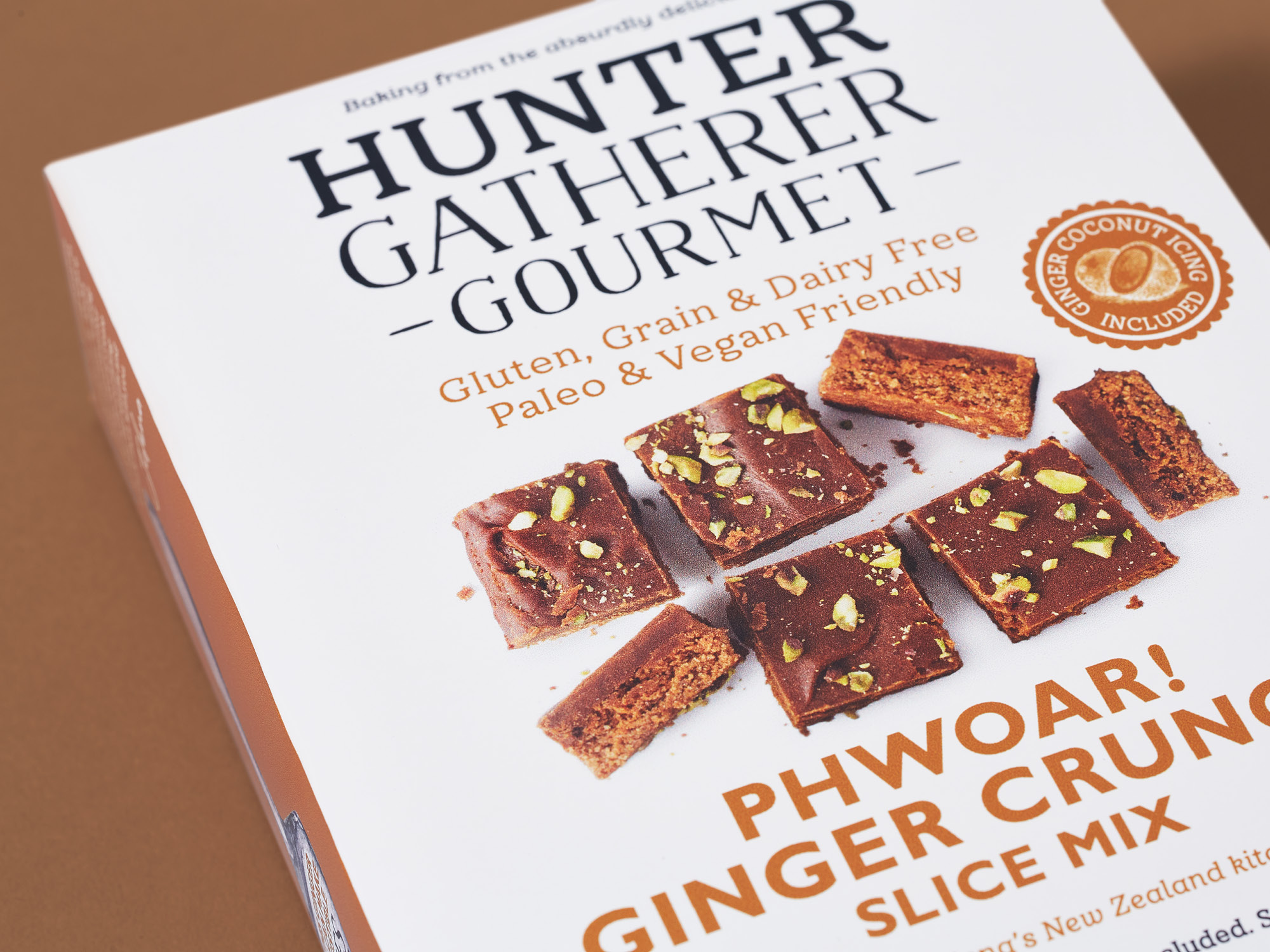
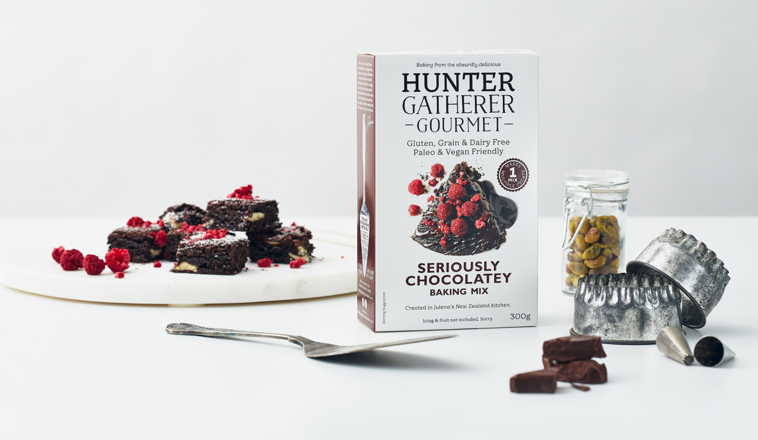
Taking inspiration from the boutique, artisan food producers who frequent delis, patisseries and emporiums, Onfire reworked the brand and packaging to stand out by doing less. Redeveloping the brand mark to capture Julena's quirky approach to baking, and simplifying messaging across packs to highlight the ‘free-from’ premise, created a strong premium aesthetic. A white pack was a brave but considered move. While all other brands in the segment are bright and colourful, the white background of Hunter Gatherer amplifies the yum food photography while ‘pops’ of colour stand out on shelf in a busy environment.
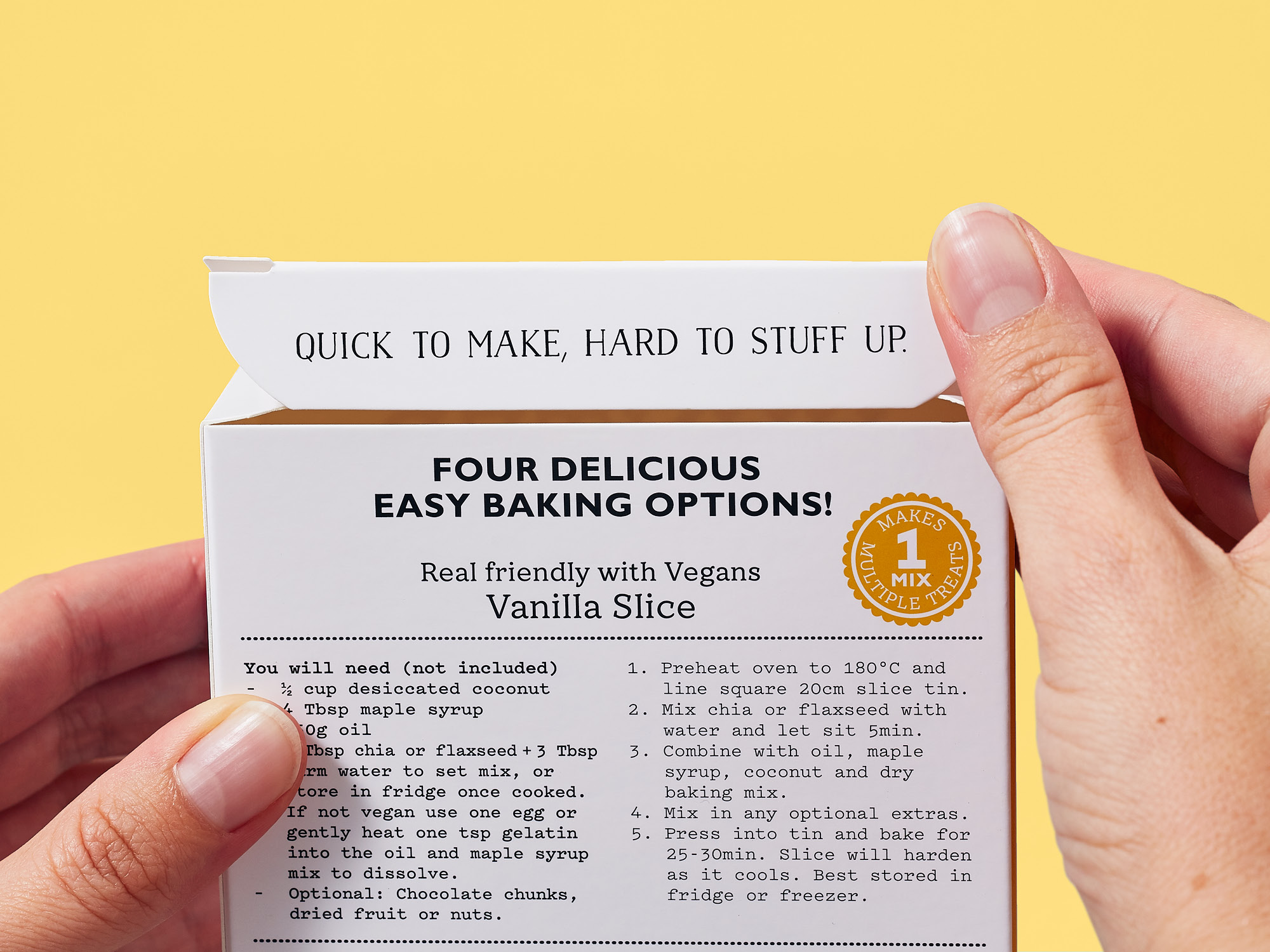
Messaging and callouts that were previously hidden on pack, or were lifted from social media posts, were given more prominence to bring character, warmth and delight as the box is read and opened. This brings Julena’s mantra of ‘People need cake’ full circle. With a little help from Onfire, the brand now demands attention from baking enthusiasts and challenges the idea that being ‘free from’ means lacking taste.
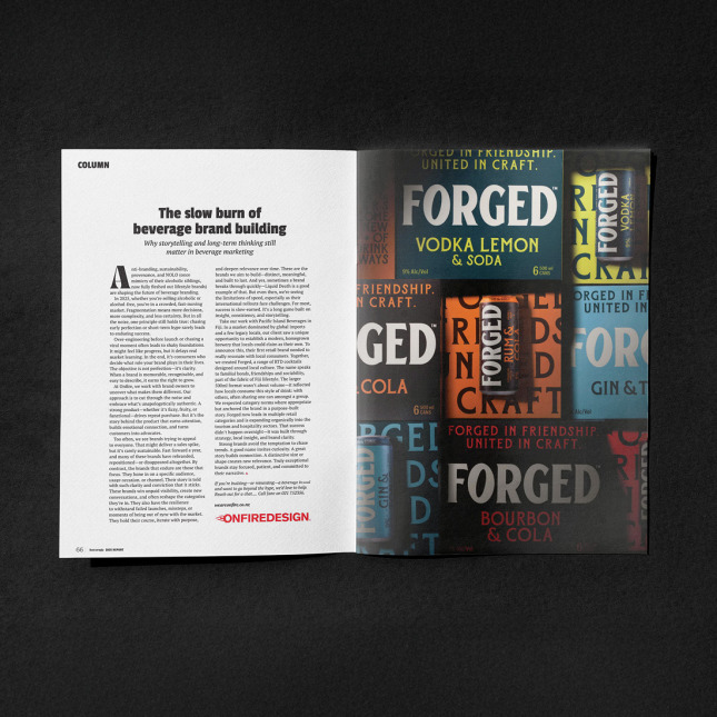
As featured on:
