Property, Development, Construction

Ryder Brothers
onfire design ryder brothers brand identity nz 01

Property, Development, Construction

As three brothers, the Ryders have accumulated 90 years of experience in various aspects of the construction industry. The opportunity arose for them to start a new venture together.

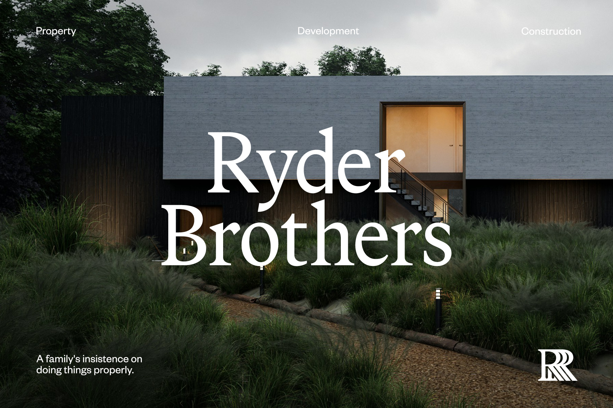
Auckland's construction market is dominated by faceless, transactional corporates; cookie-cutter branding, tender-driven work, layers of management between the client and the person actually accountable. Ryder Brothers works the other way: family ownership and direct involvement at every stage, Projects won through reputation and relationships rather than the lowest tender. While construction would be the main operation, the brothers also set up a property development arm to apply the same rigour across the whole processes from land purchase to project sign-off.
Brand Identity
Logo Design
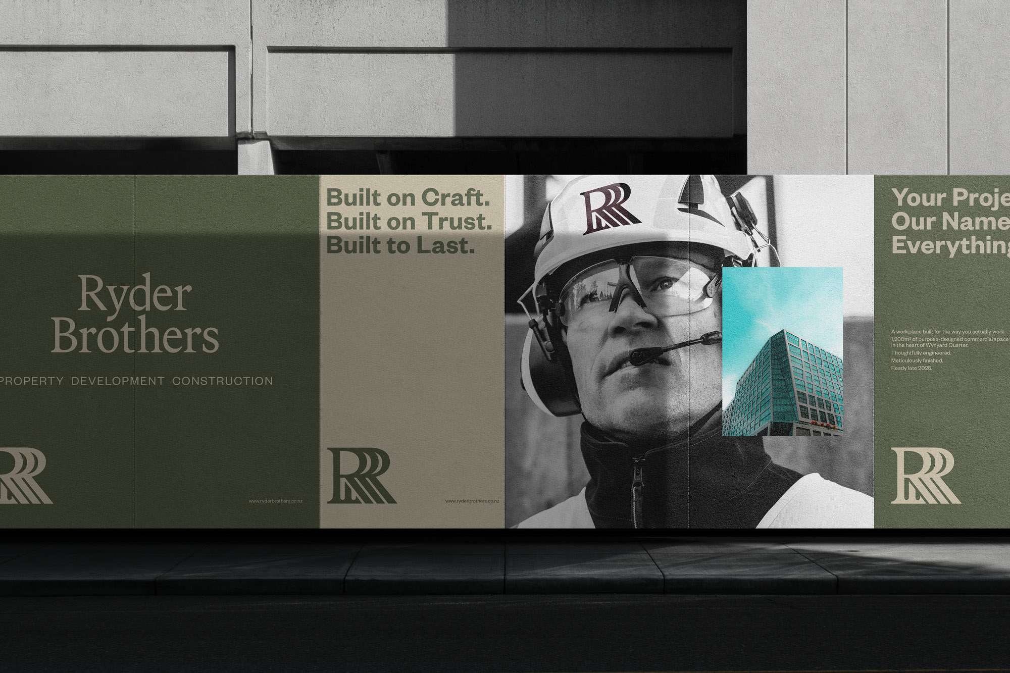
Brand Collateral
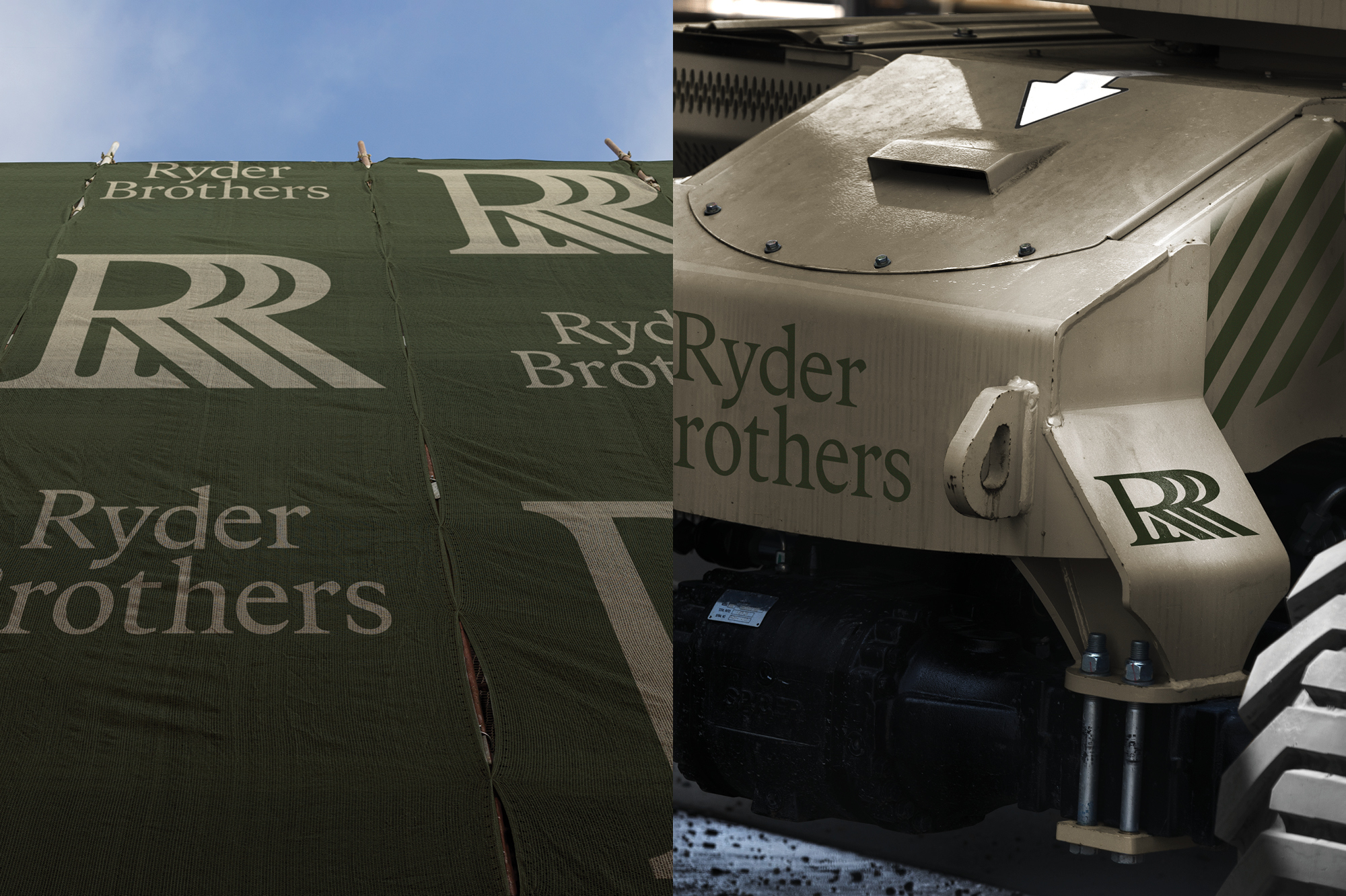
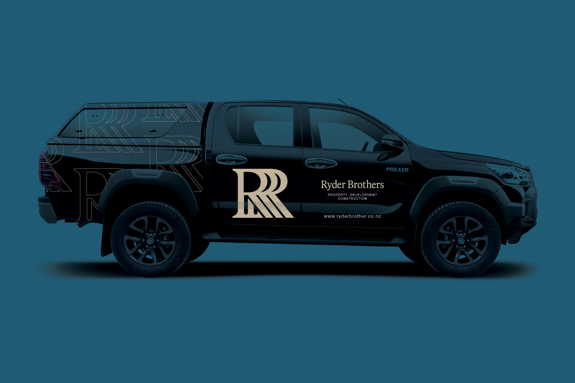
Vehicle Livery
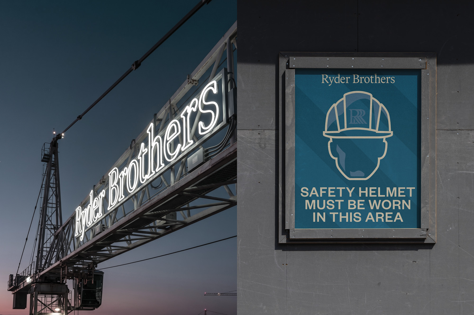
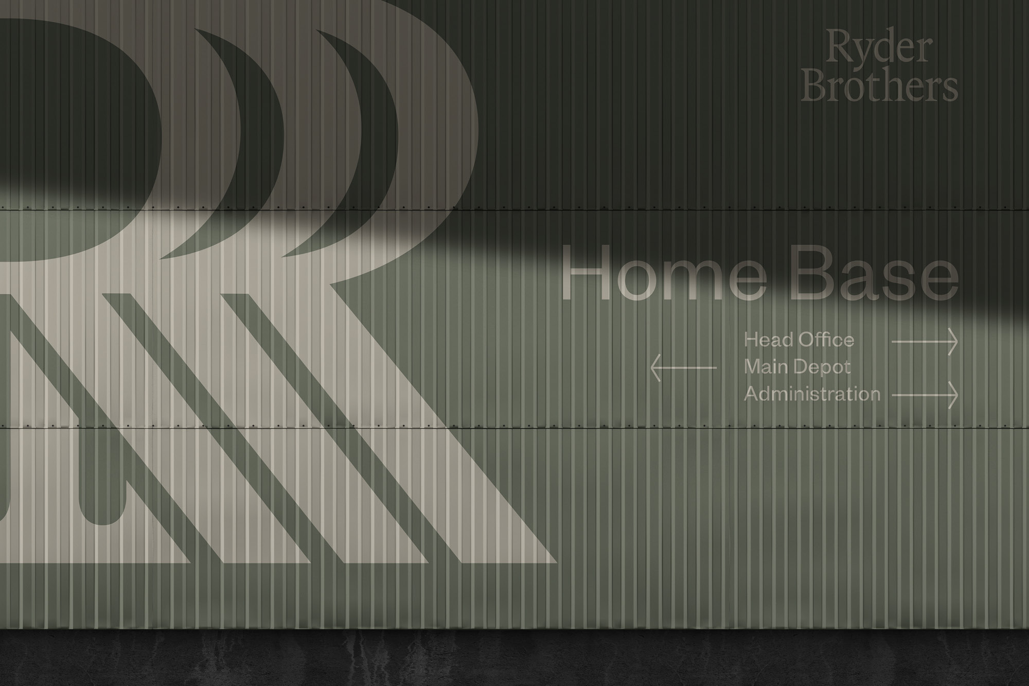
Site Signage

onfire design ryder brothers brand identity nz 02
onfire design ryder brothers brand identity nz
onfire design ryder brothers brand identity nz2
onfire design ryder brothers brand identity nz 05

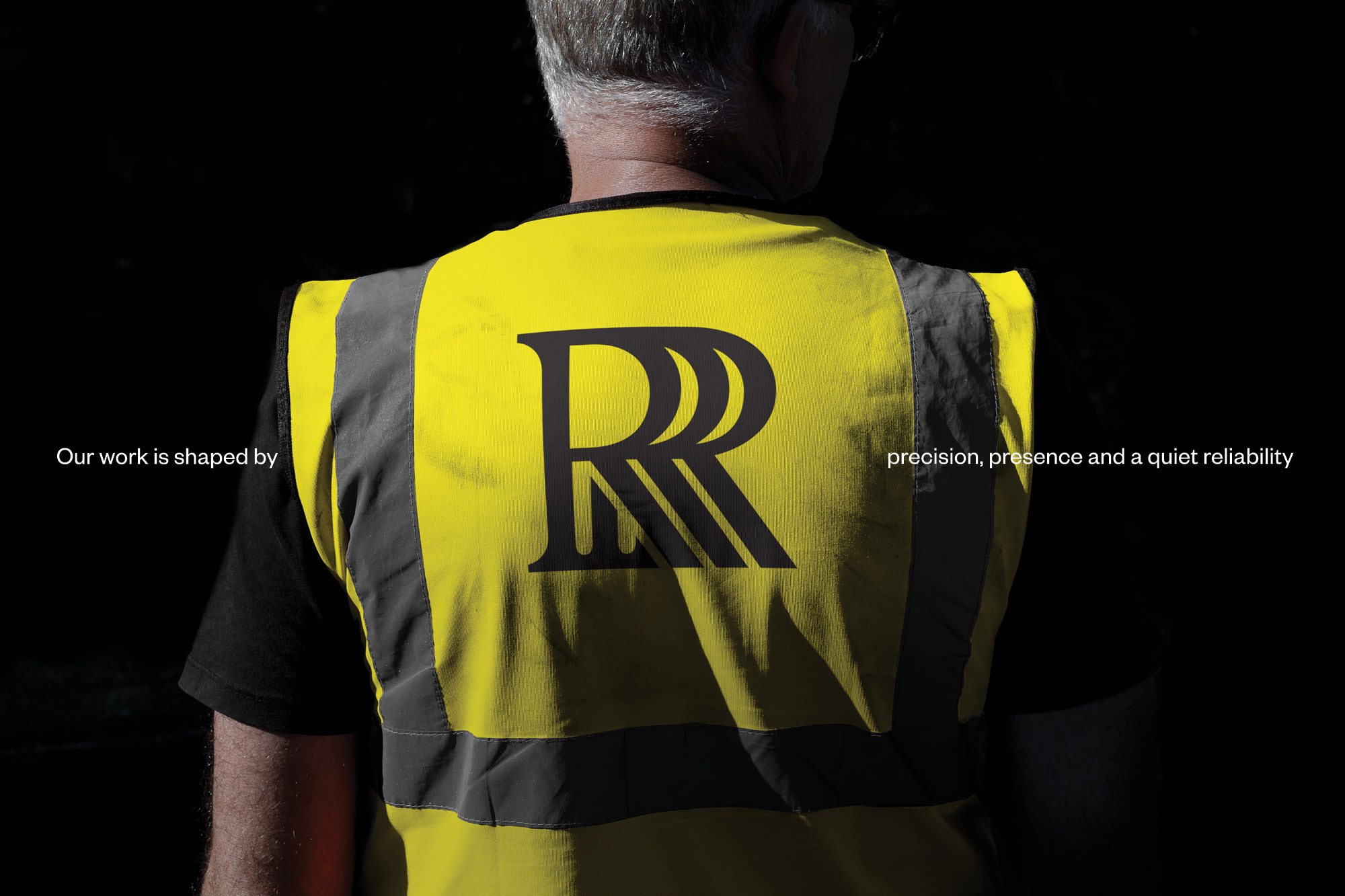
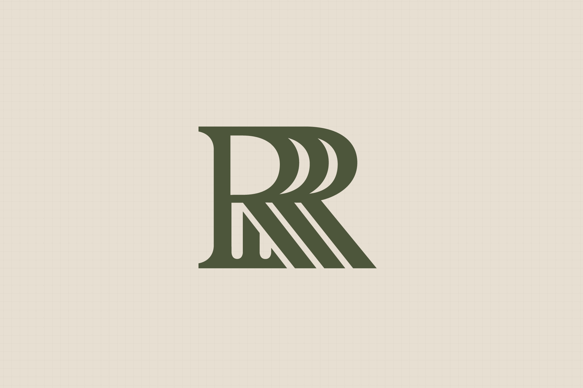
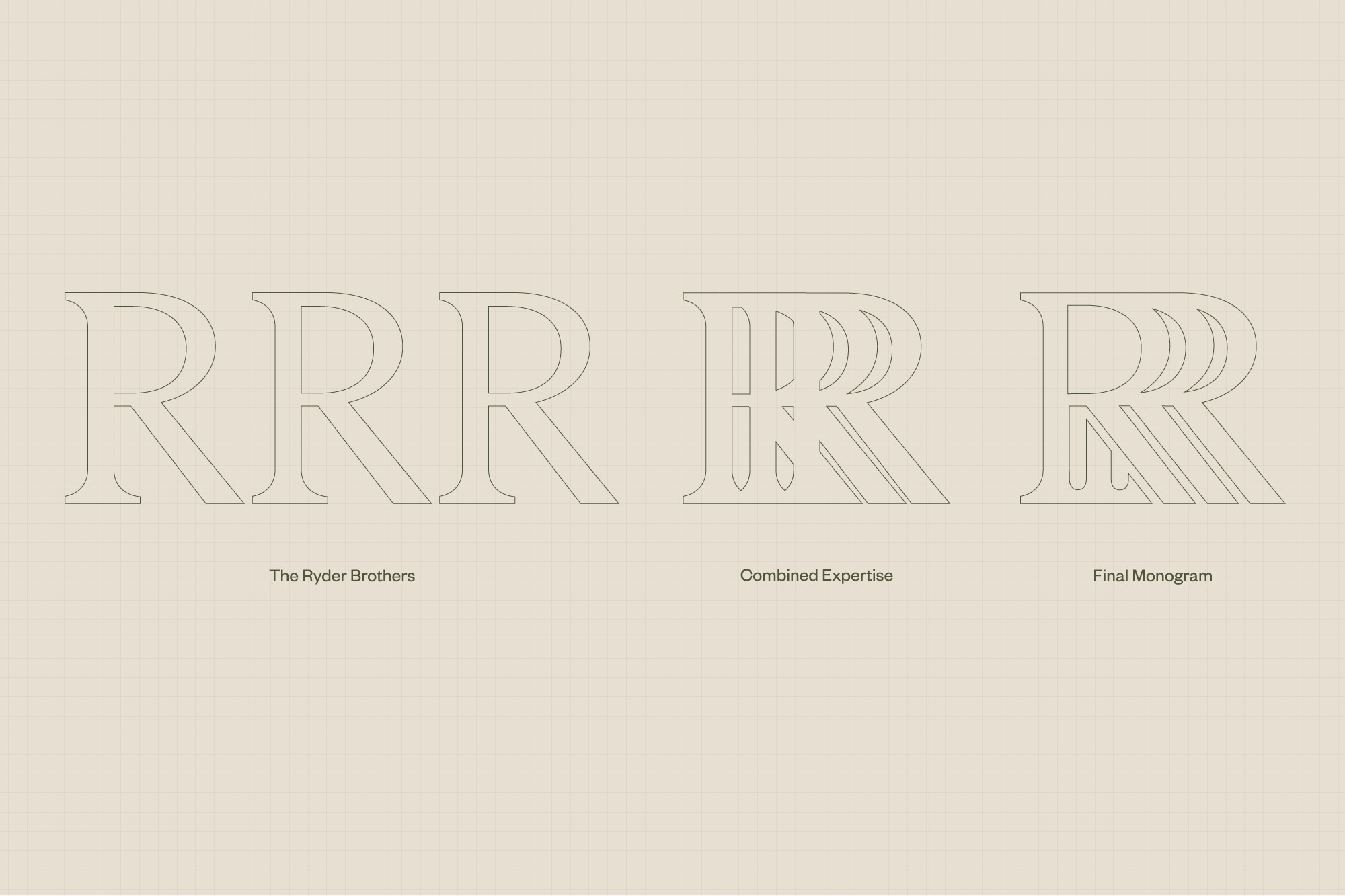
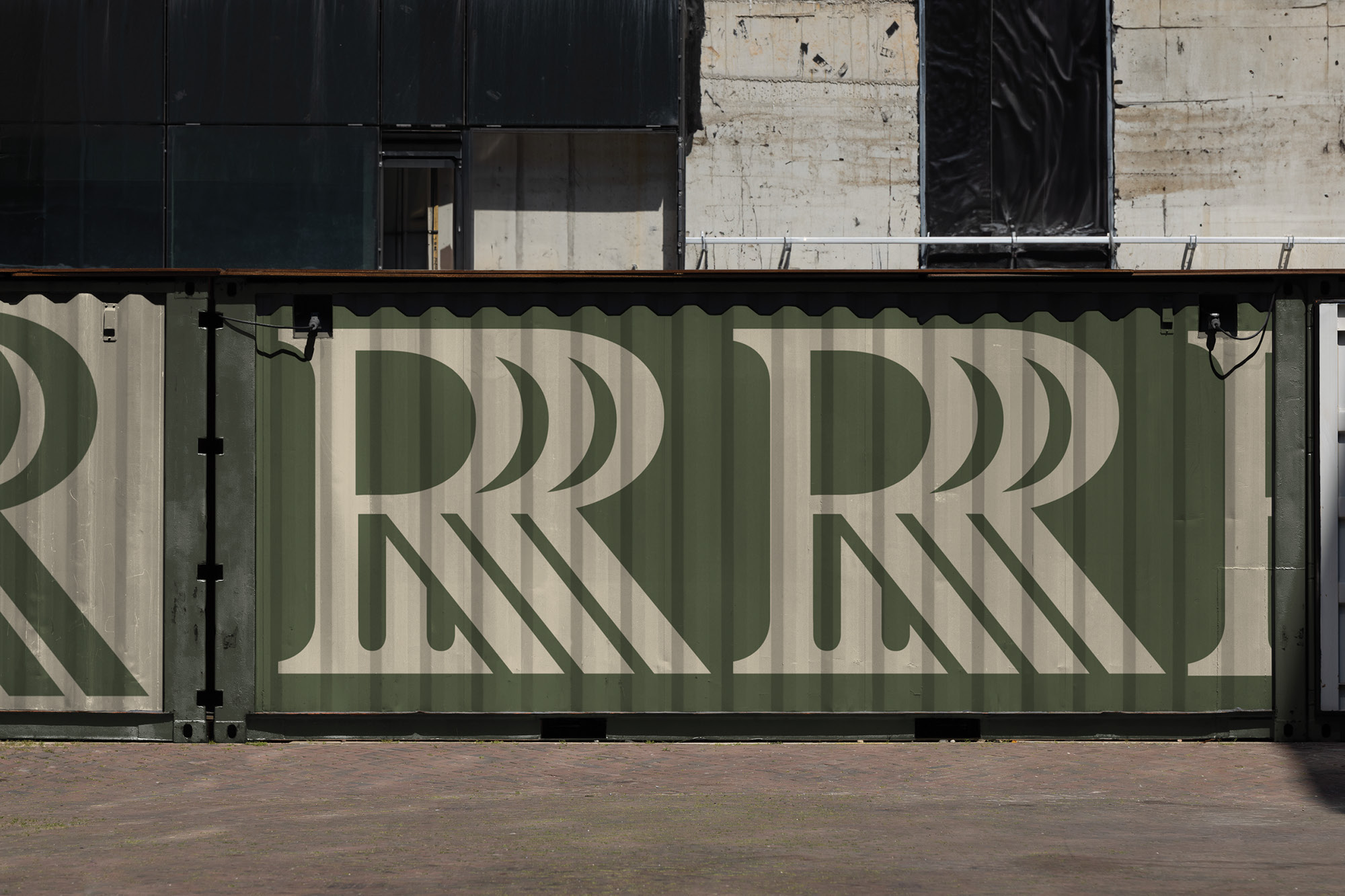
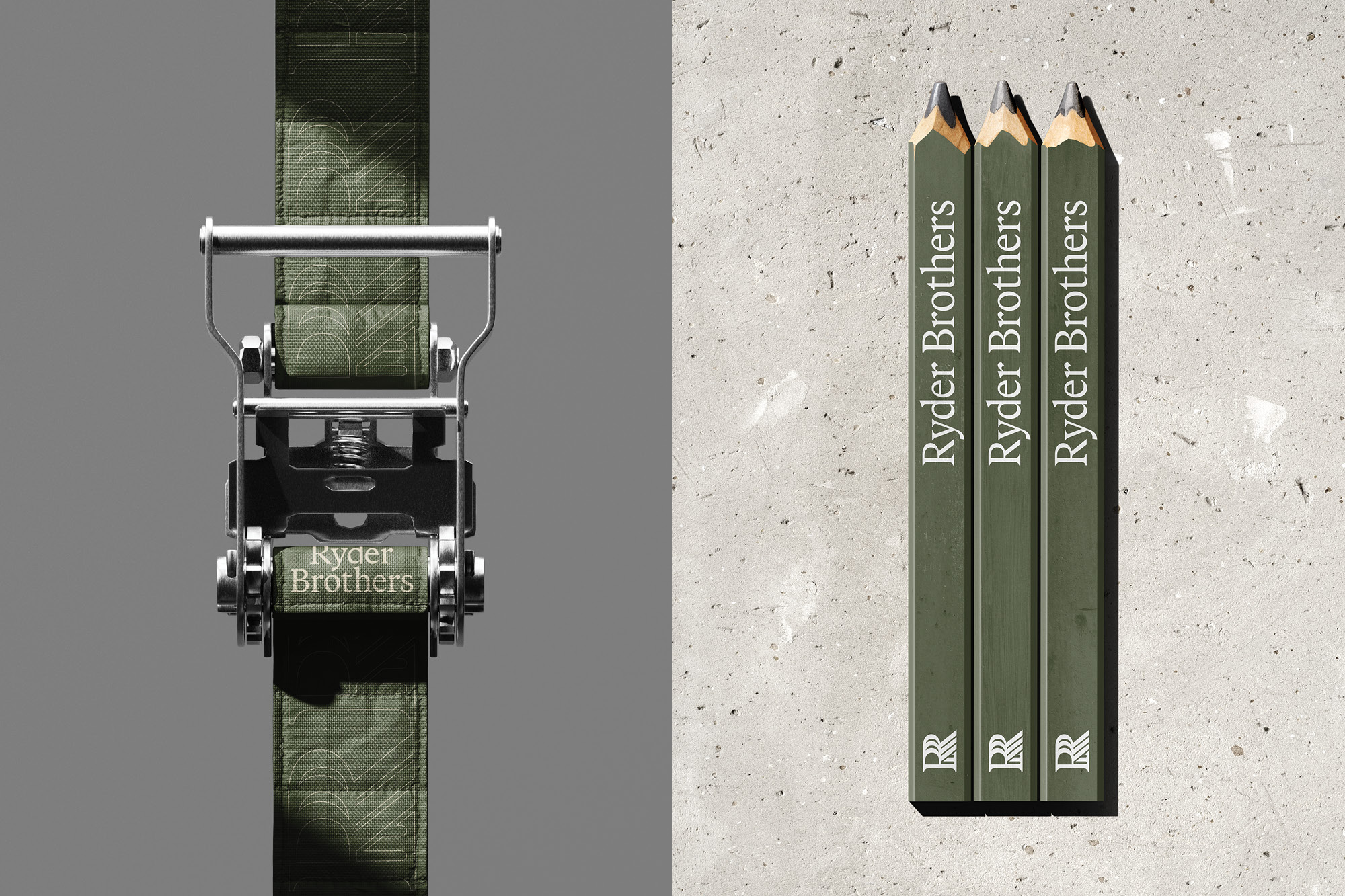
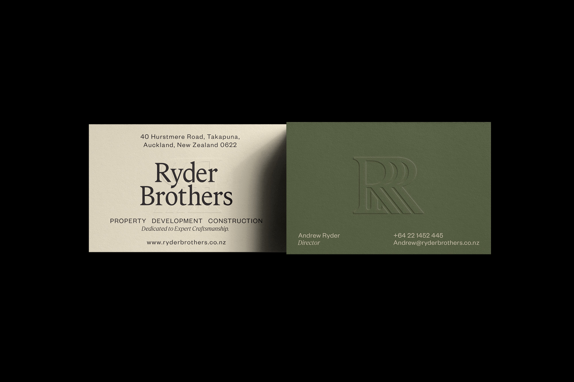
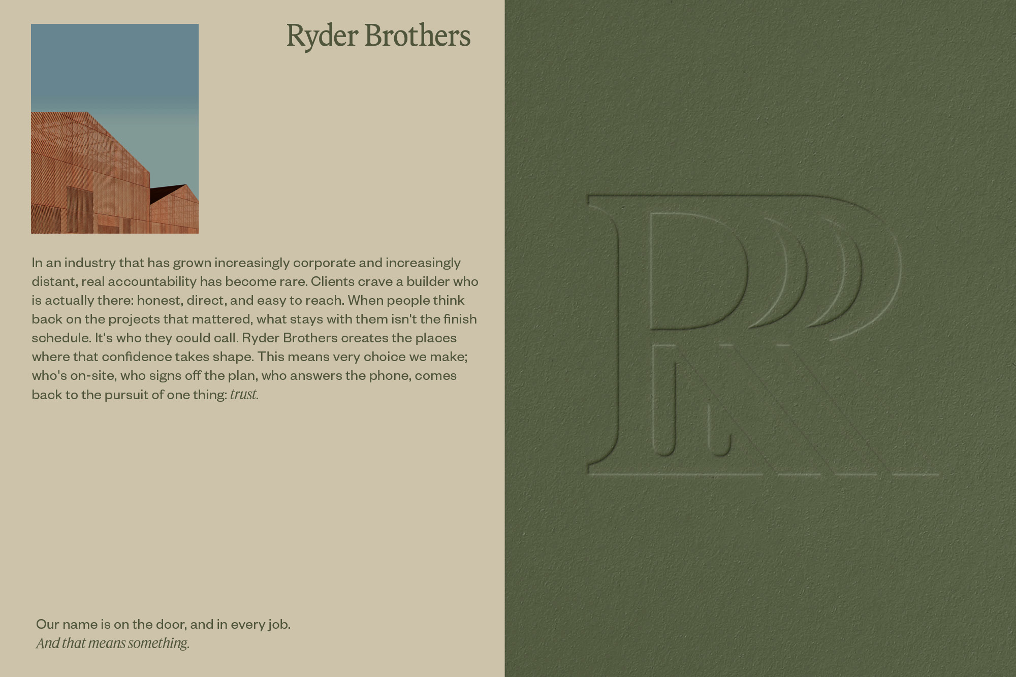
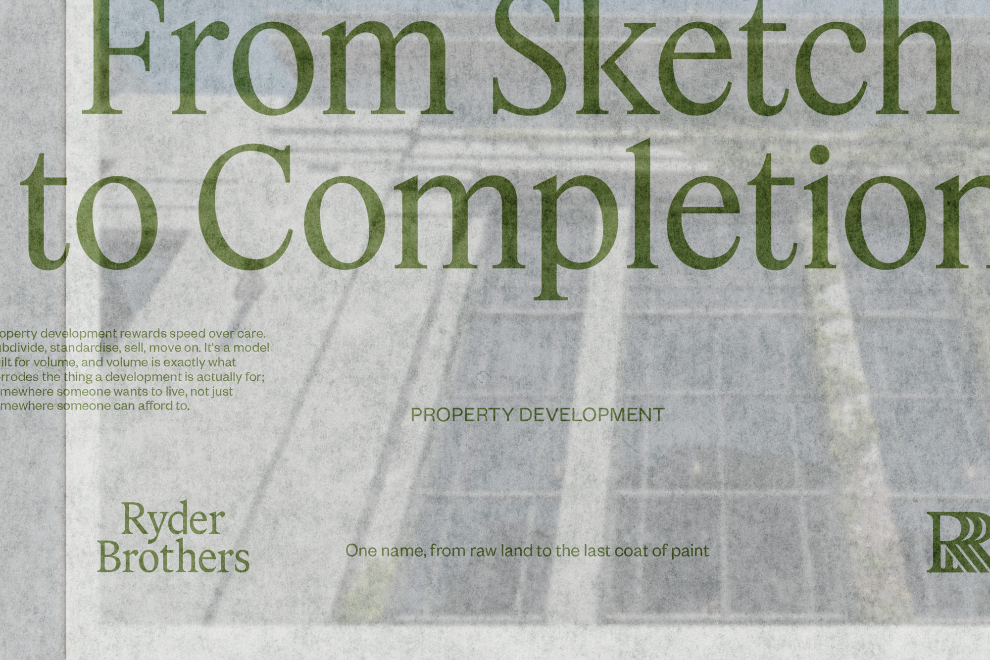
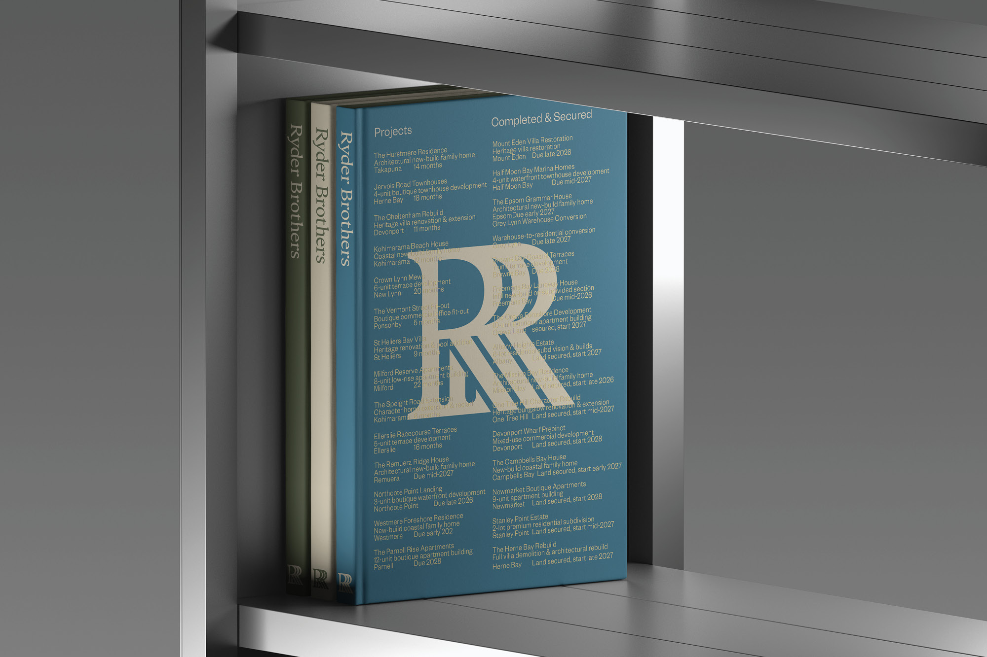
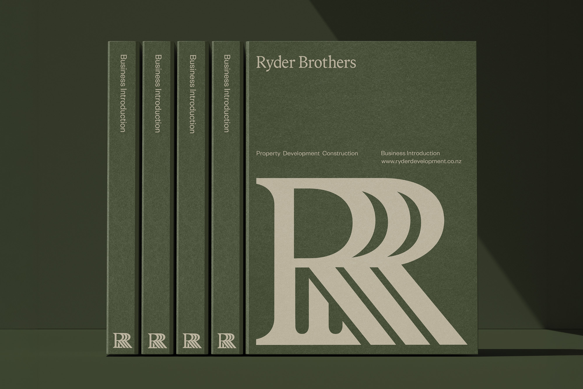
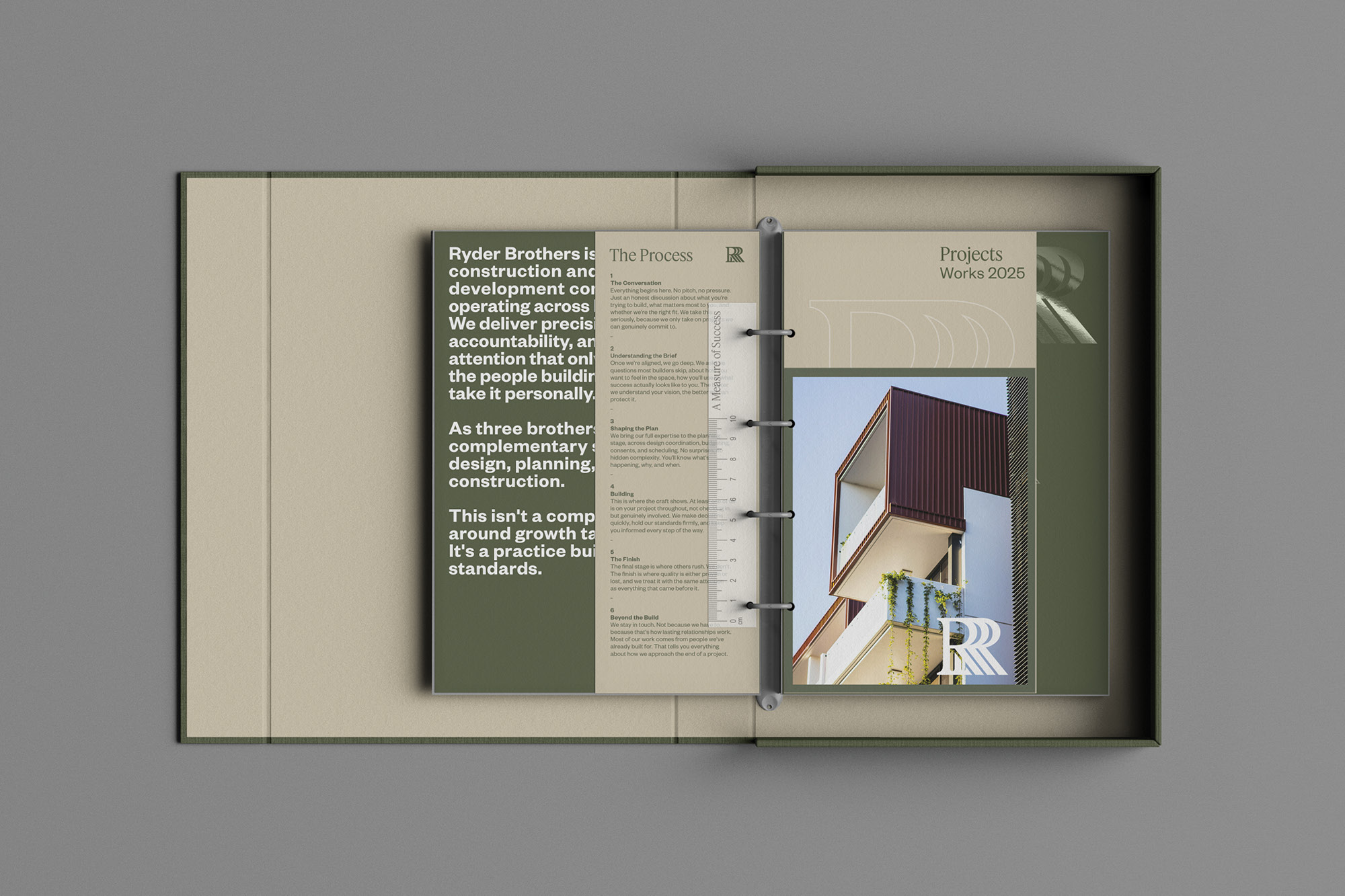
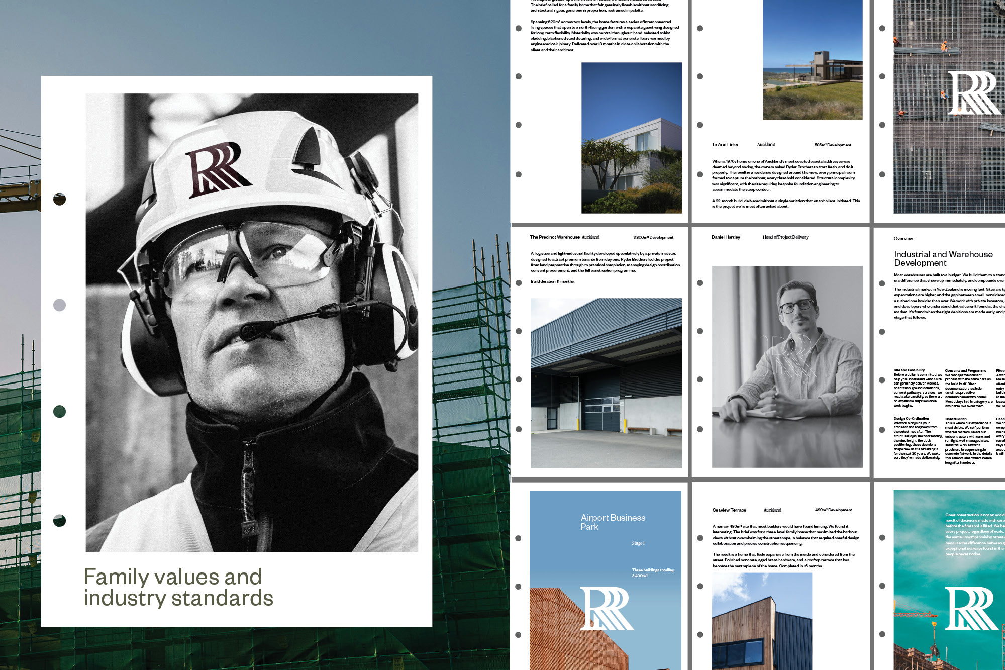
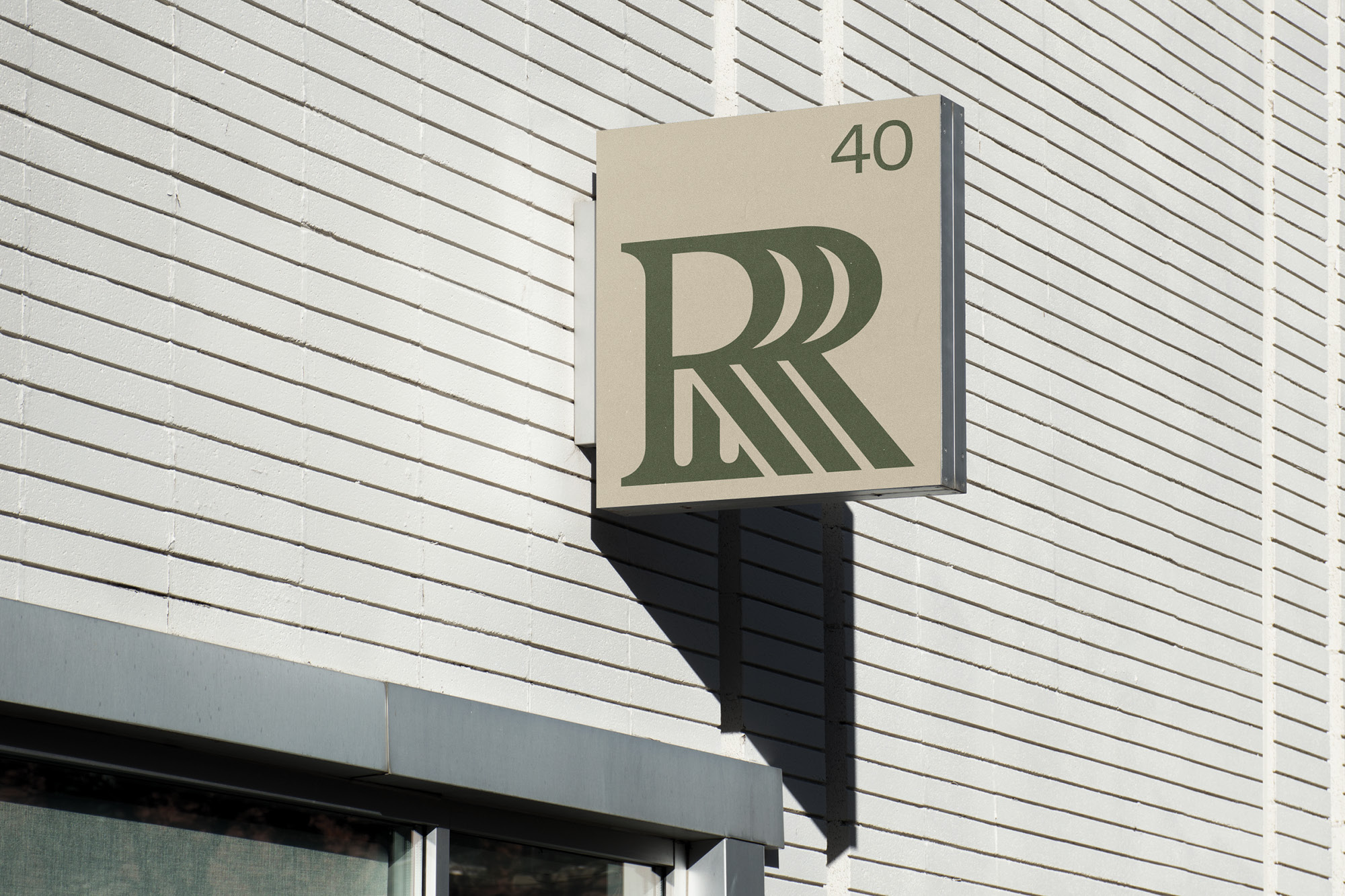
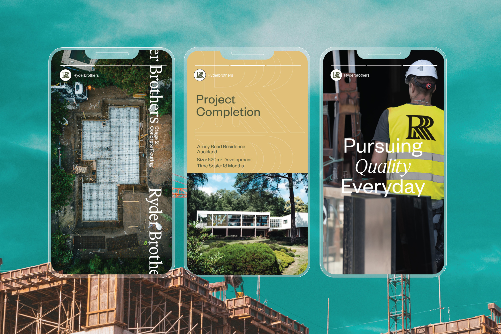
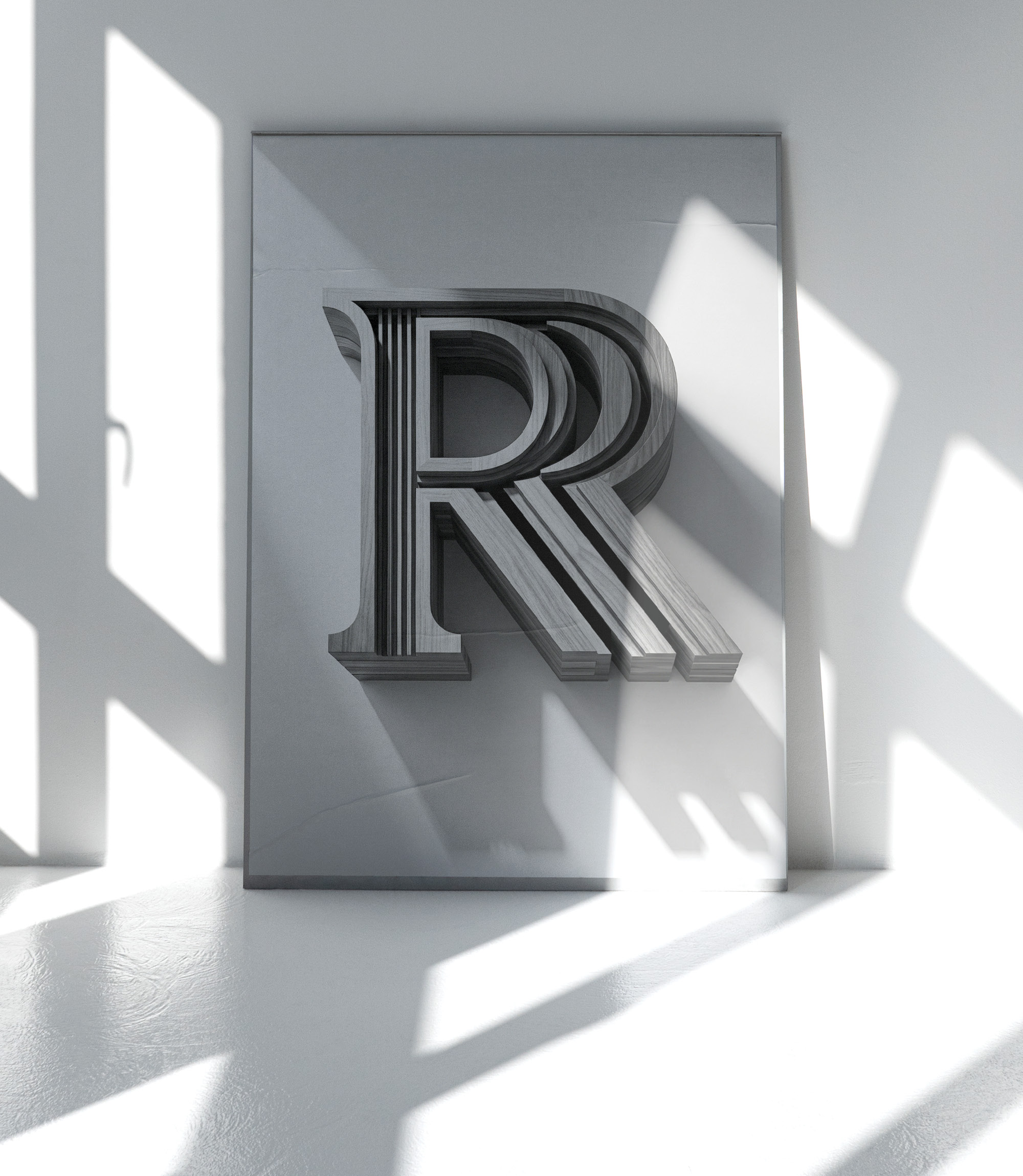
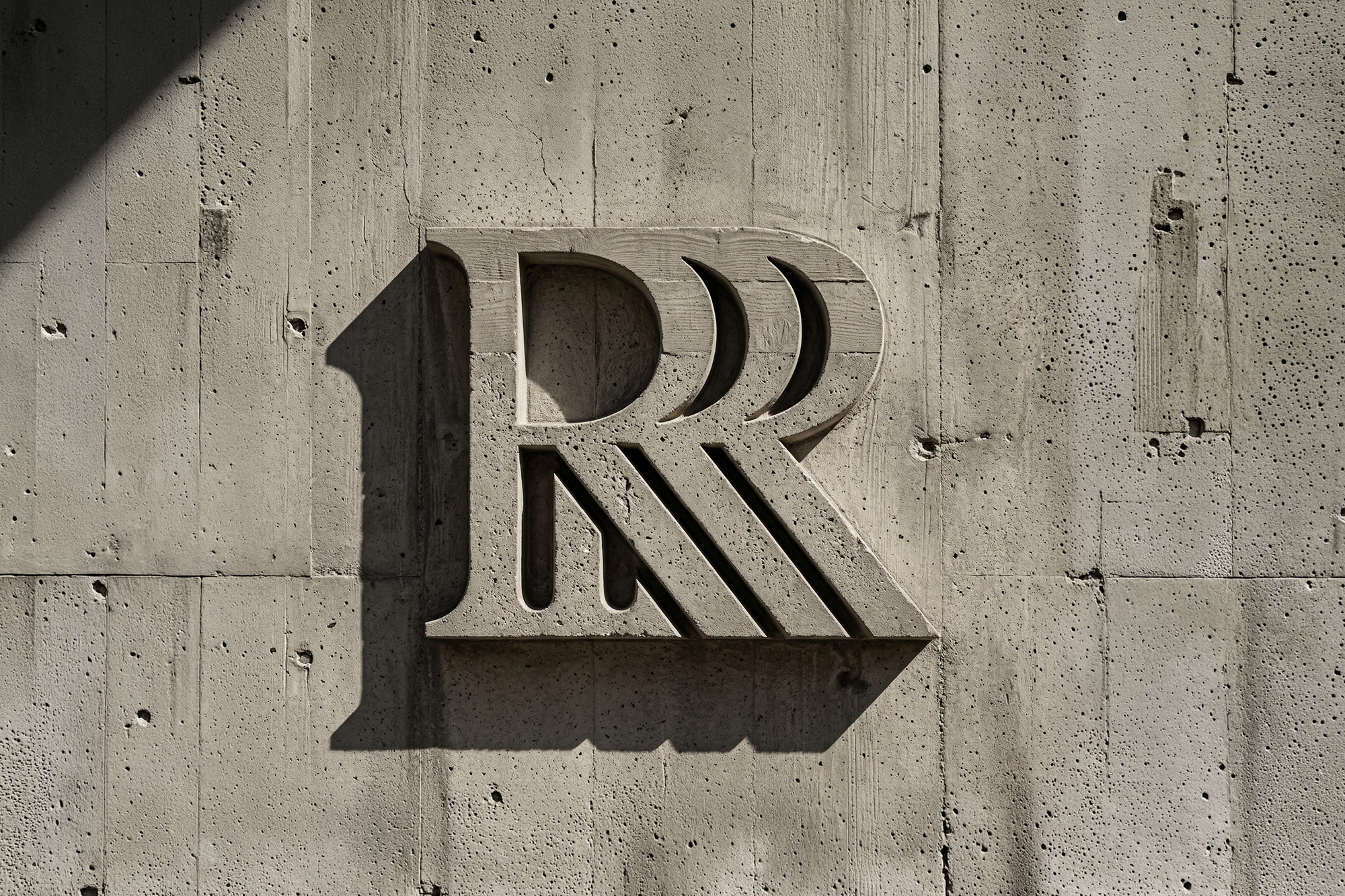
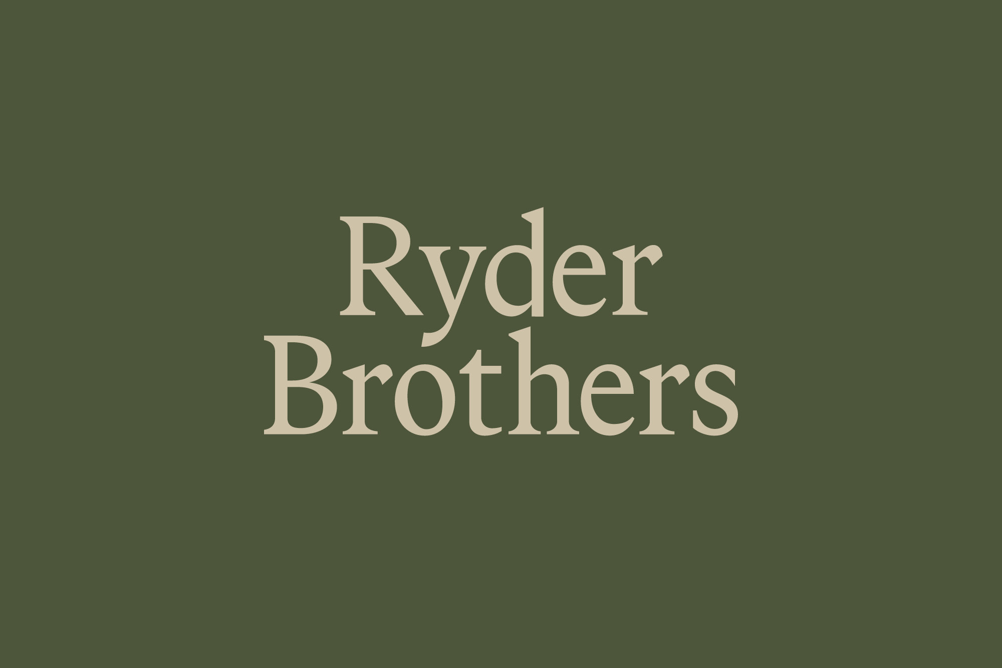
The identity draws on the language of craft and artisanship, more akin to an atelier than a construction company. At the core of the identity is a unique monogram, a literal coming together of the three brothers in a considered and chiselled serif. It is a signal of a common, familial language and belief system that the brothers apply to every part of the business. In its purest form, like a maker's mark on pottery or handmade furniture, it is a unique stamp of quality. The wordmark is equally considered, refined and bespoke. These are applied on a wide variety of touchpoints and sales materials - from oversized worksite hoardings, hi-vis vests through to small digital favicons.

onfire design ryder brothers brand identity nz 06

The colour palette eschews the category norms, instead pulling from their formative years in Mangahwai Heads, North of Auckland. Category-norm colours are replaced by tussock greens, sandy yellows, and deep sea blue; earthy, opposed to manmade. Stationery, proposal documents, website and project presentations are built around restraint and a confident tone of voice that comes from their shared experience.

onfire design ryder brothers brand identity nz3
onfire design ryder brothers brand identity nz4
onfire design ryder brothers brand identity nz5

For the family, Ryder Brothers is the culmination of years of hard work, learning, and experience. More importantly, it is their stamp on the industry, working their way and delivering projects that match their family values.

onfire design ryder brothers brand identity nz 12v2
onfire design ryder brothers brand identity nz 13
onfire design ryder brothers brand identity nz6
onfire design ryder brothers brand identity nz7
onfire design ryder brothers brand identity nz 25
onfire design ryder brothers brand identity nz8
onfire design ryder brothers brand identity nz9
onfire design ryder brothers brand identity nz10
onfire design ryder brothers brand identity nz11
onfire design ryder brothers brand identity nz 27
onfire design ryder brothers brand identity nz12
onfire design ryder brothers brand identity nz 20
onfire design ryder brothers brand identity nz 28
onfire design ryder brothers brand identity nz 23