Move by Jackson
Jackson has been a trusted name in Australasian electrical products for nearly four decades, building its reputation on quality, reliability and practical innovation.
Travel has changed. Phones, laptops, cameras and earbuds now go everywhere we do, making travel adaptors as essential as passports. With demand for smarter charging solutions growing, Jackson recognised an opportunity to rethink how its products showed up in retail. The existing packaging was utilitarian, lacking in personality, distinctive brand blocking and shelf impact. Confusing product information and an inconsistent visual hierarchy added to the complexity which is prevalent across the entire category. The challenge was to turn complexity into simplicity, transforming a traditionally overlooked product into a distinctive, relevant brand.
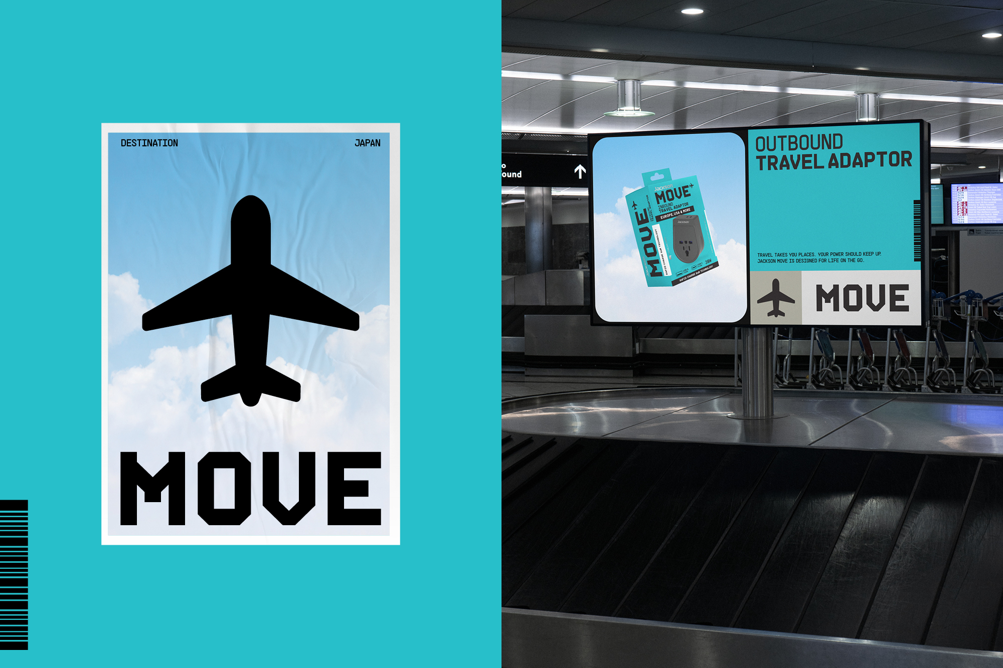
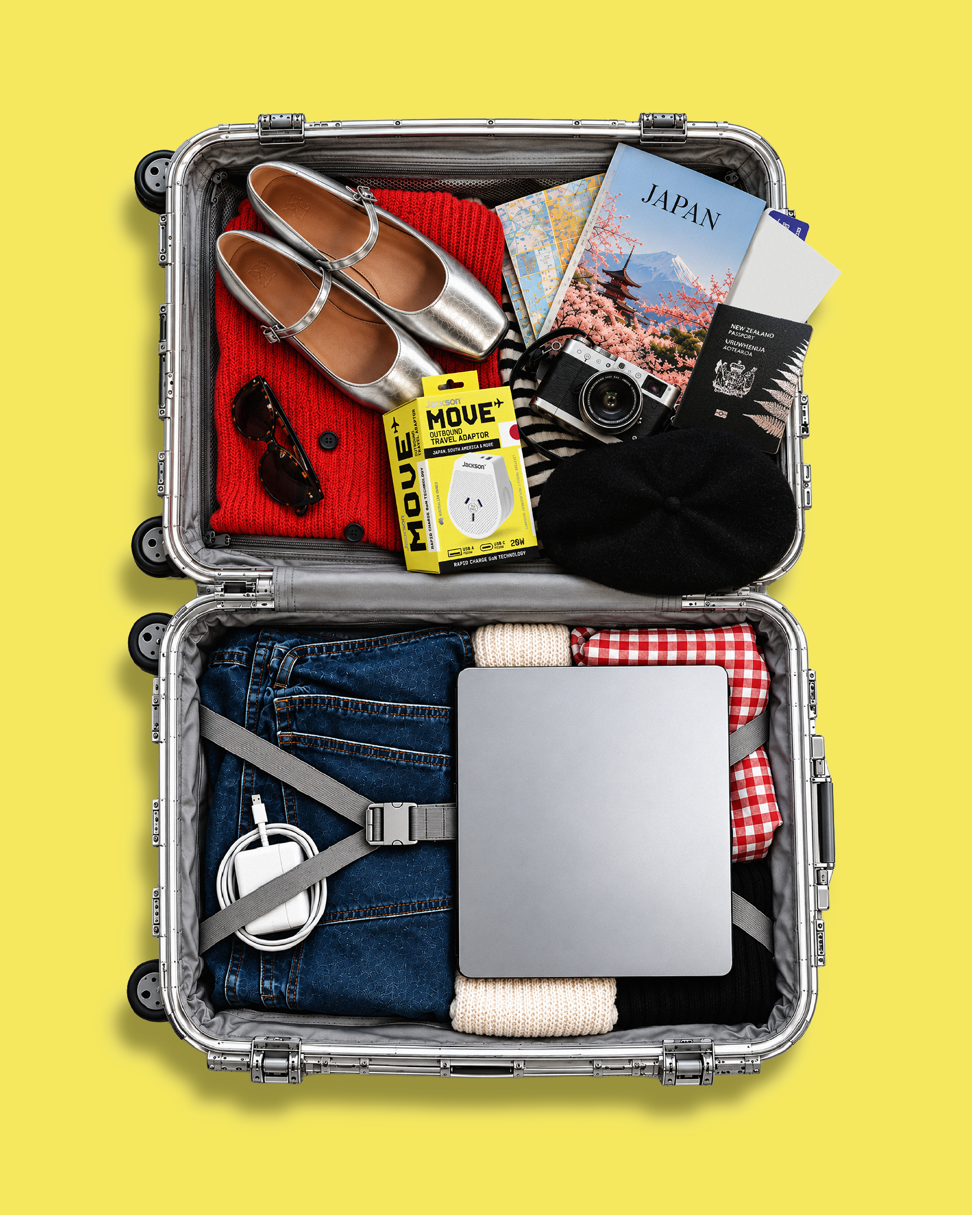
Onfire’s response was Move, built around a simple brand idea: ‘Power Your Adventure’. Rather than focusing purely on technology, we tapped into the excitement, anticipation and freedom of travel. Boarding passes, luggage tags and airport departure boards inspired the graphic language that connects the products to the journeys they enable.
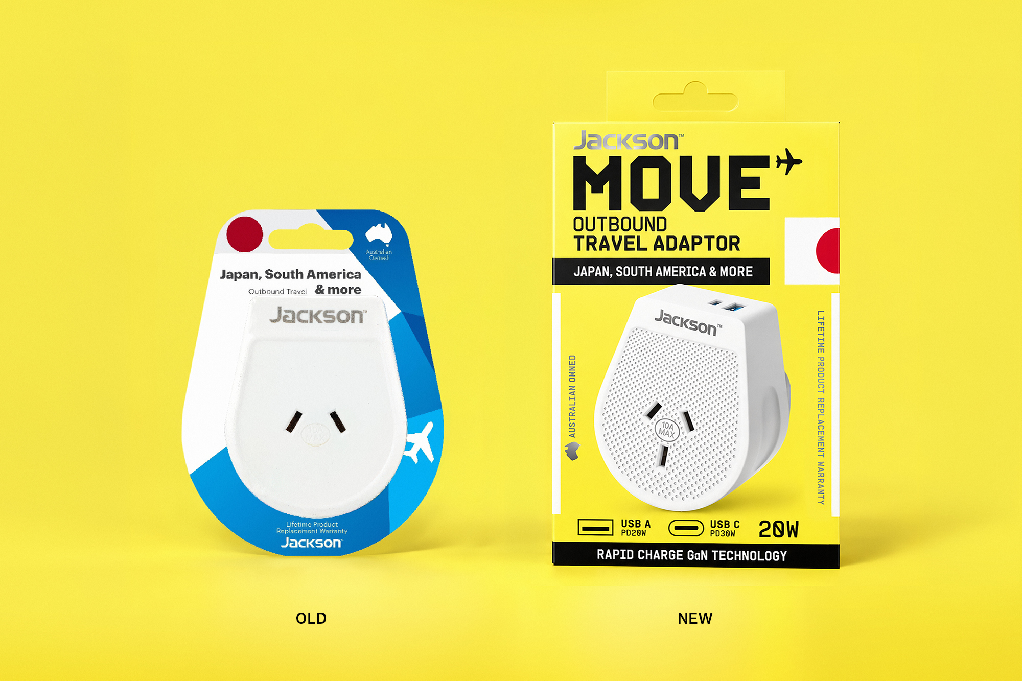
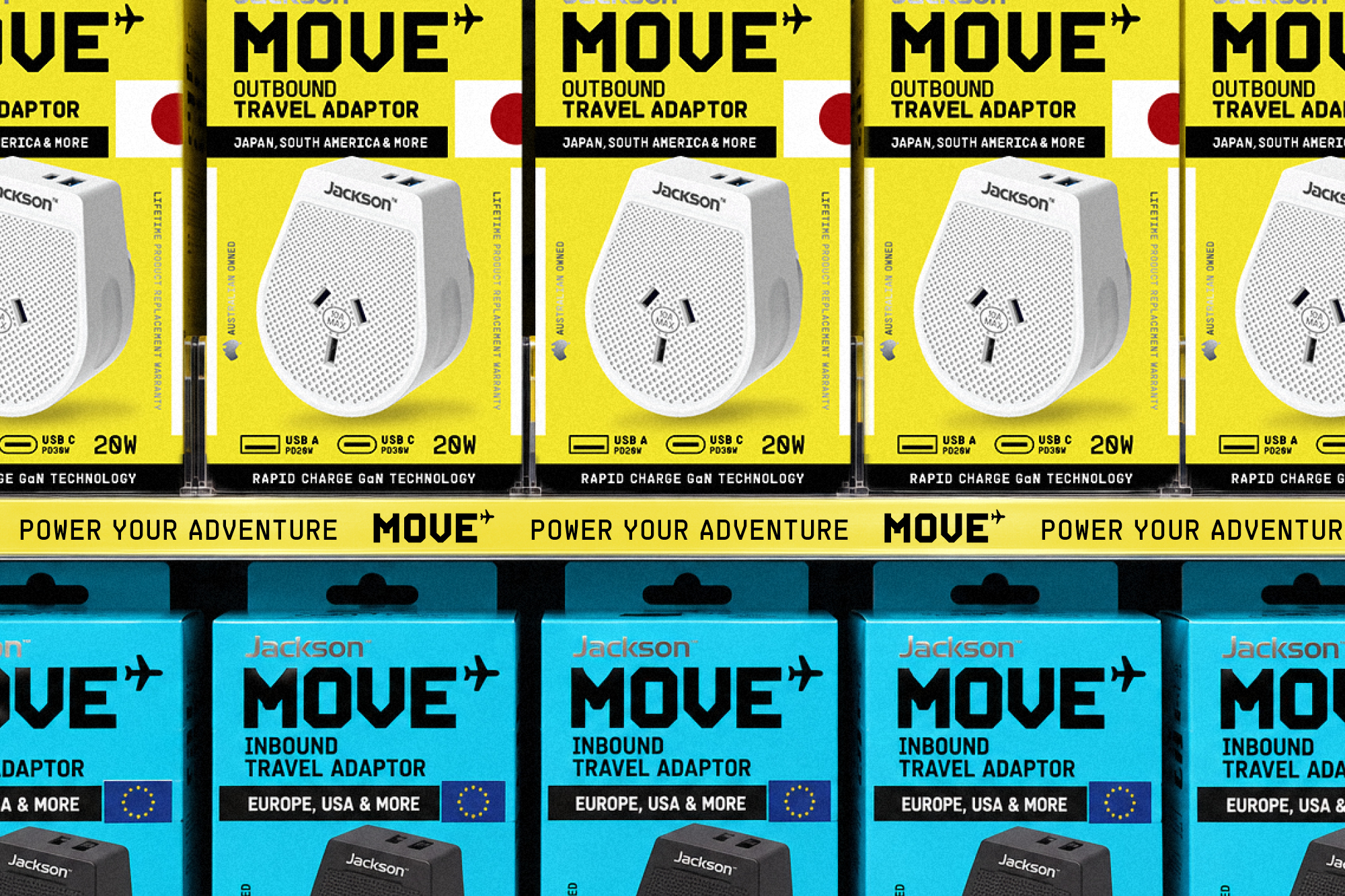
At the heart of the identity is a bespoke wordmark inspired by the lettering found on travel tickets. Bold, digital inkjet-inspired characters give the brand a confident, recognisable presence, while a small aircraft taking flight adds a playful sense of movement and adventure. This travel-inspired aesthetic carries through to a distinctive brand toolkit, where bold colour blocking, destination-inspired graphics and considered information hierarchy bring the packaging to life. Clear visual cues make navigating the range intuitive, helping consumers quickly identify the right adaptor for their destination and taking the guesswork out of the purchase – a key consumer pain point.
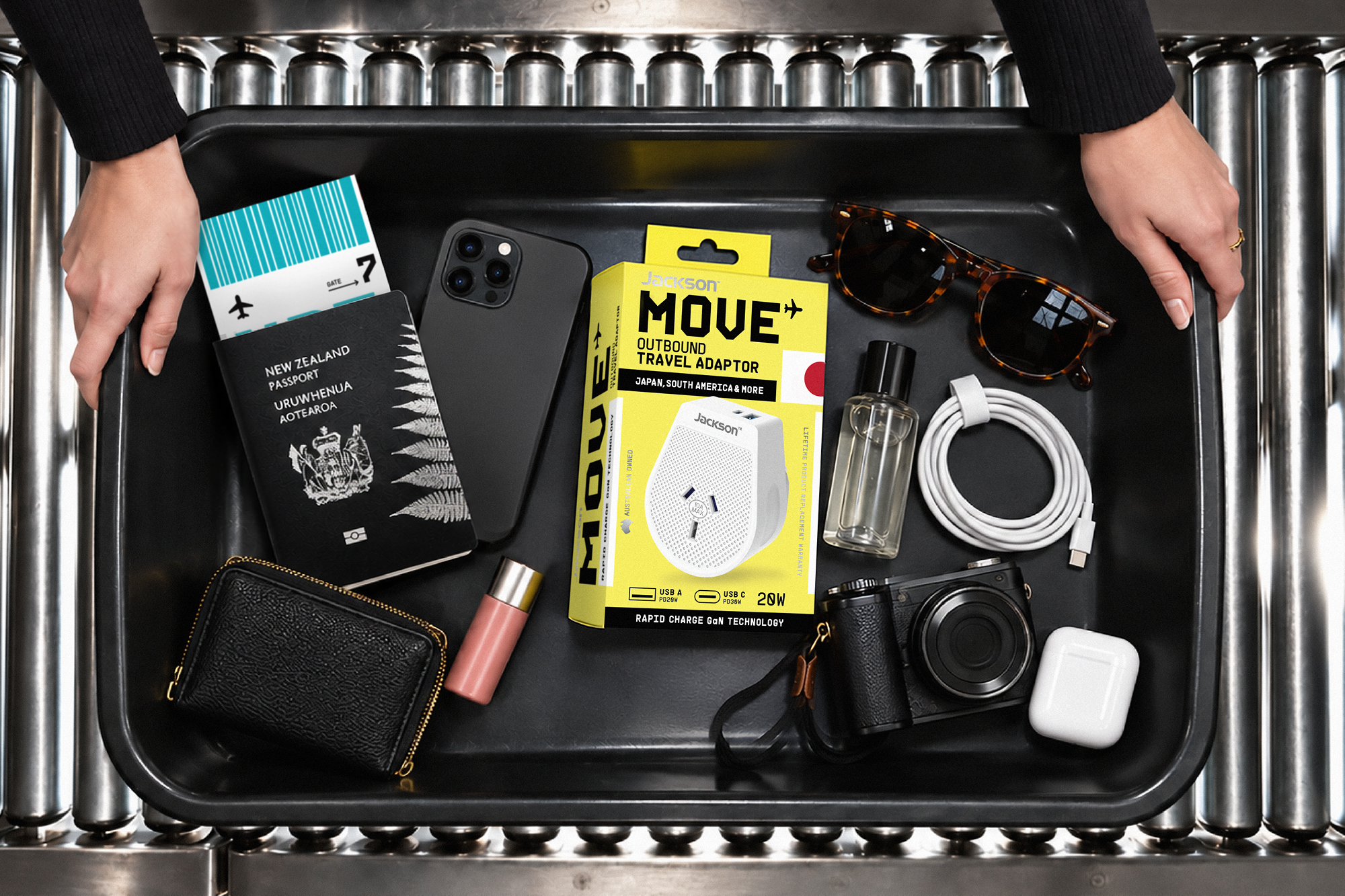
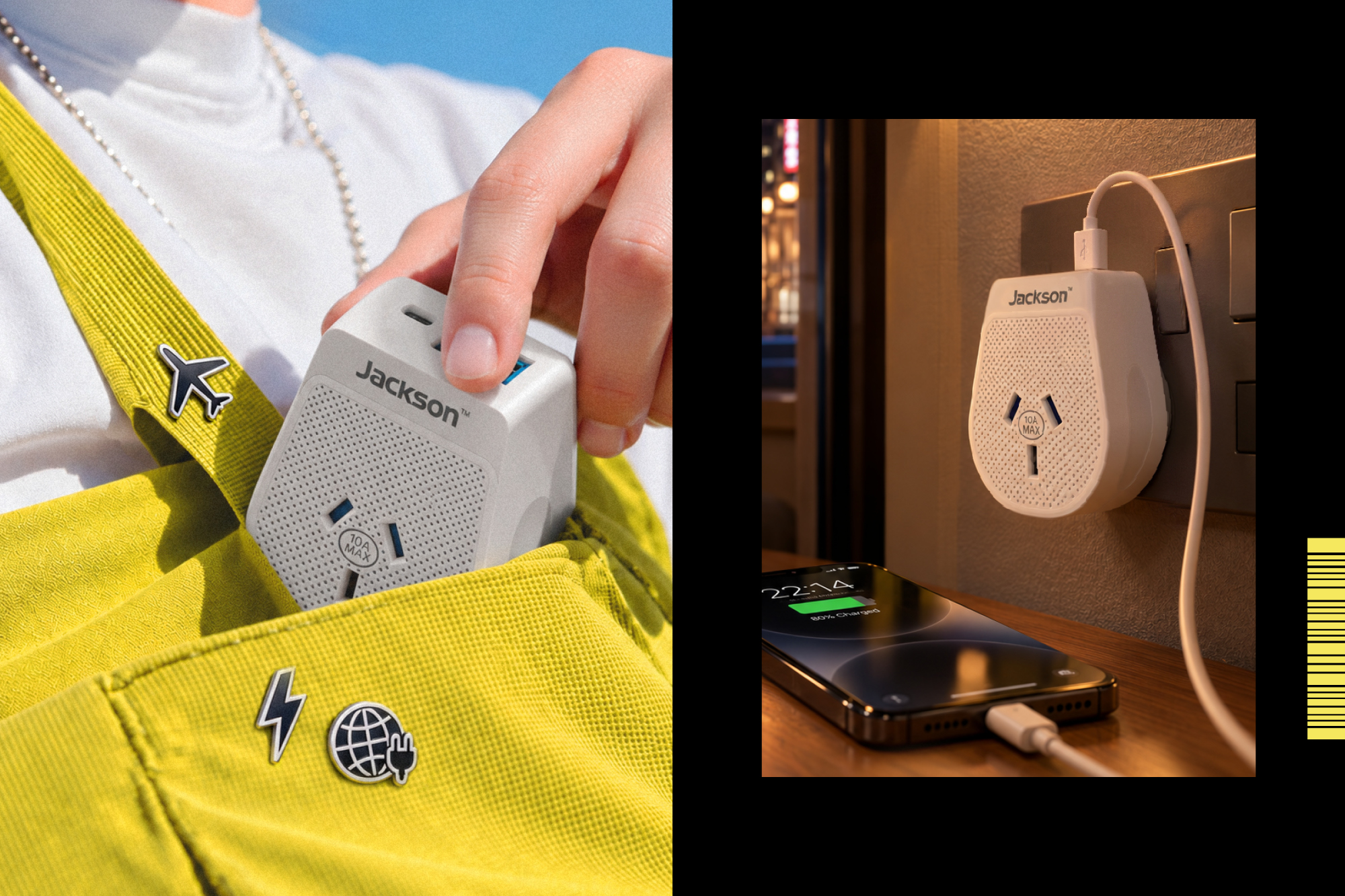
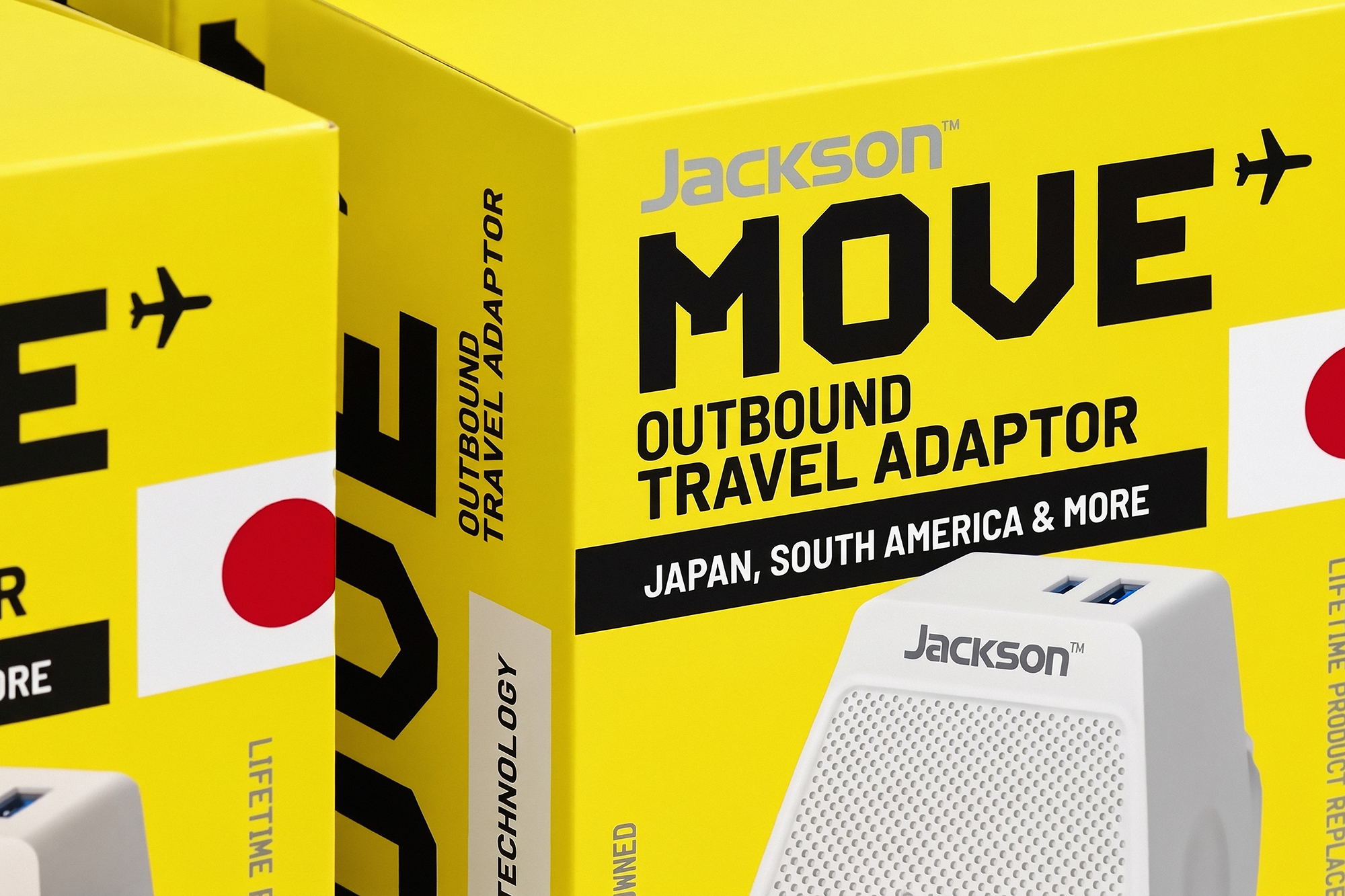
Inspired by the visual language of travel tickets, we developed a distinctive brand toolkit that brings personality, energy and impact to the packaging. Bold colour blocking, and a considered information hierarchy work together to create a cohesive system that’s as intuitive as it is engaging. Clear visual cues make navigating the range effortless, helping consumers find the right adaptor for their destination without the guesswork.
More than a packaging refresh, Move’s flexible design system creates a unique presence in retail and extends seamlessly into the brands wider portfolio or power banks, charging cables and future accessories.
The result is a brand that turns an everyday travel essential into a desirable and essential item. Distinctive on shelf, easy to navigate and ready to go wherever the next adventure leads.