Mako Construction are a specialist commercial, industrial and residential construction business set up as the main service provider for Matvin Group property developers.
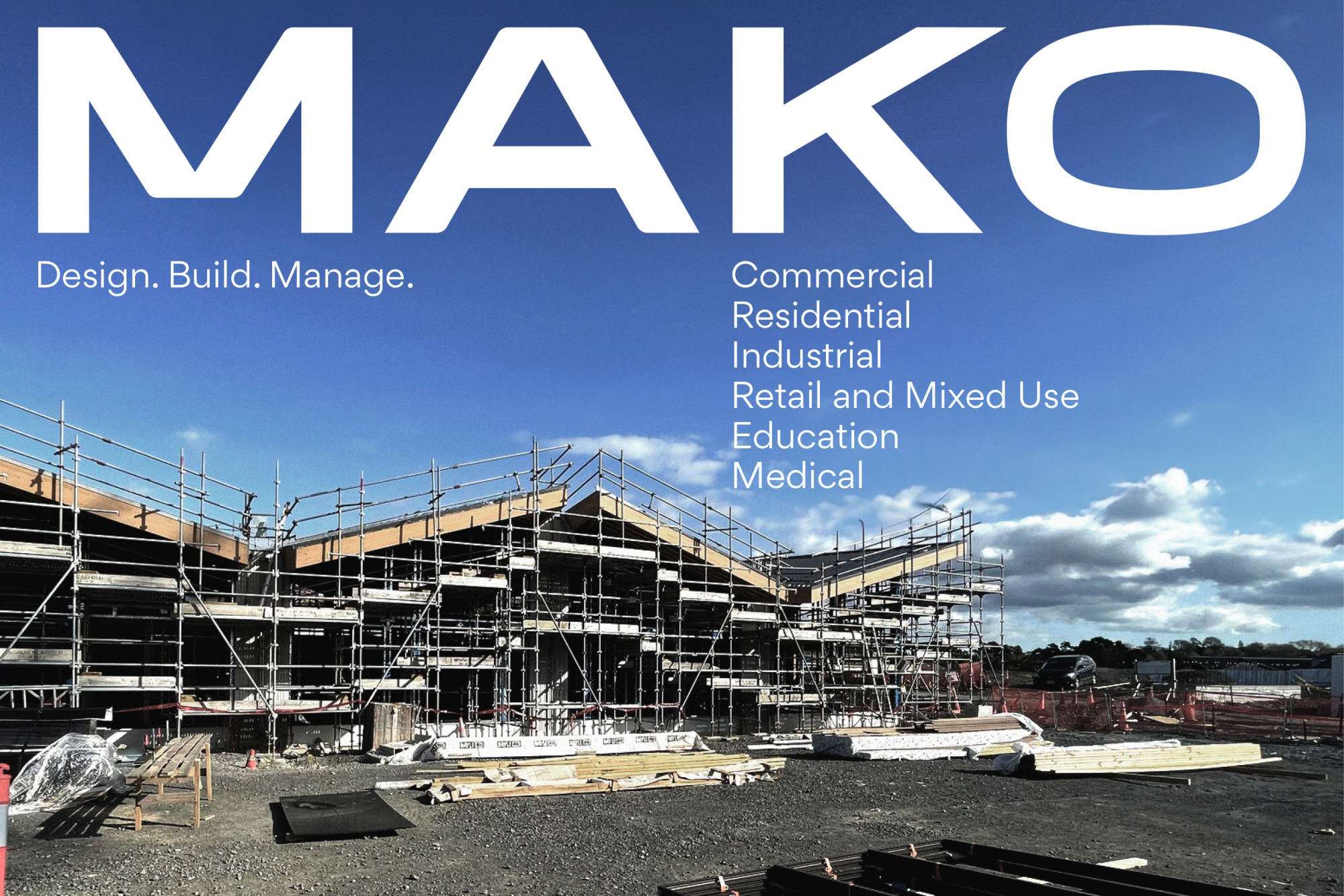
The opportunity arose to extend the reach of this side of the business. While Mako would continue as Matvin's construction provider, it would look to pitch for construction projects outside of the existing business structure. To do this, they needed a refreshed brand that would communicate who they were and what they did and position themselves in the market as 'the' commercial construction specialists.
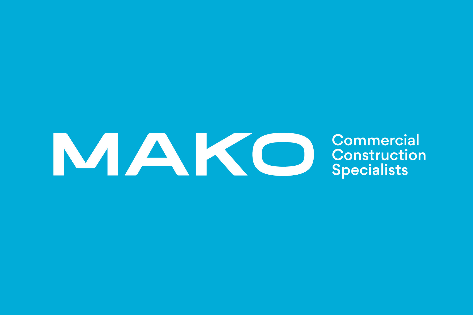
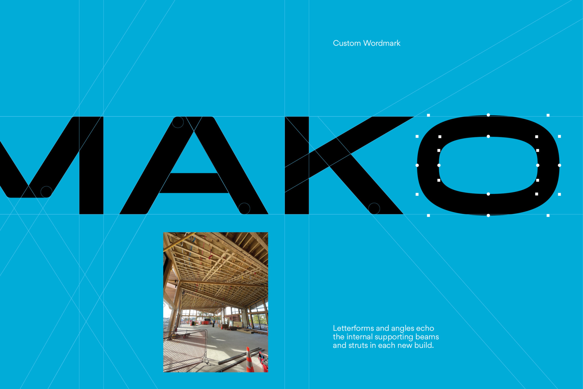
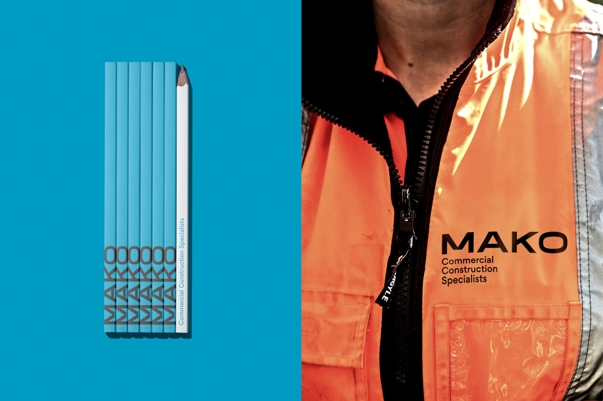
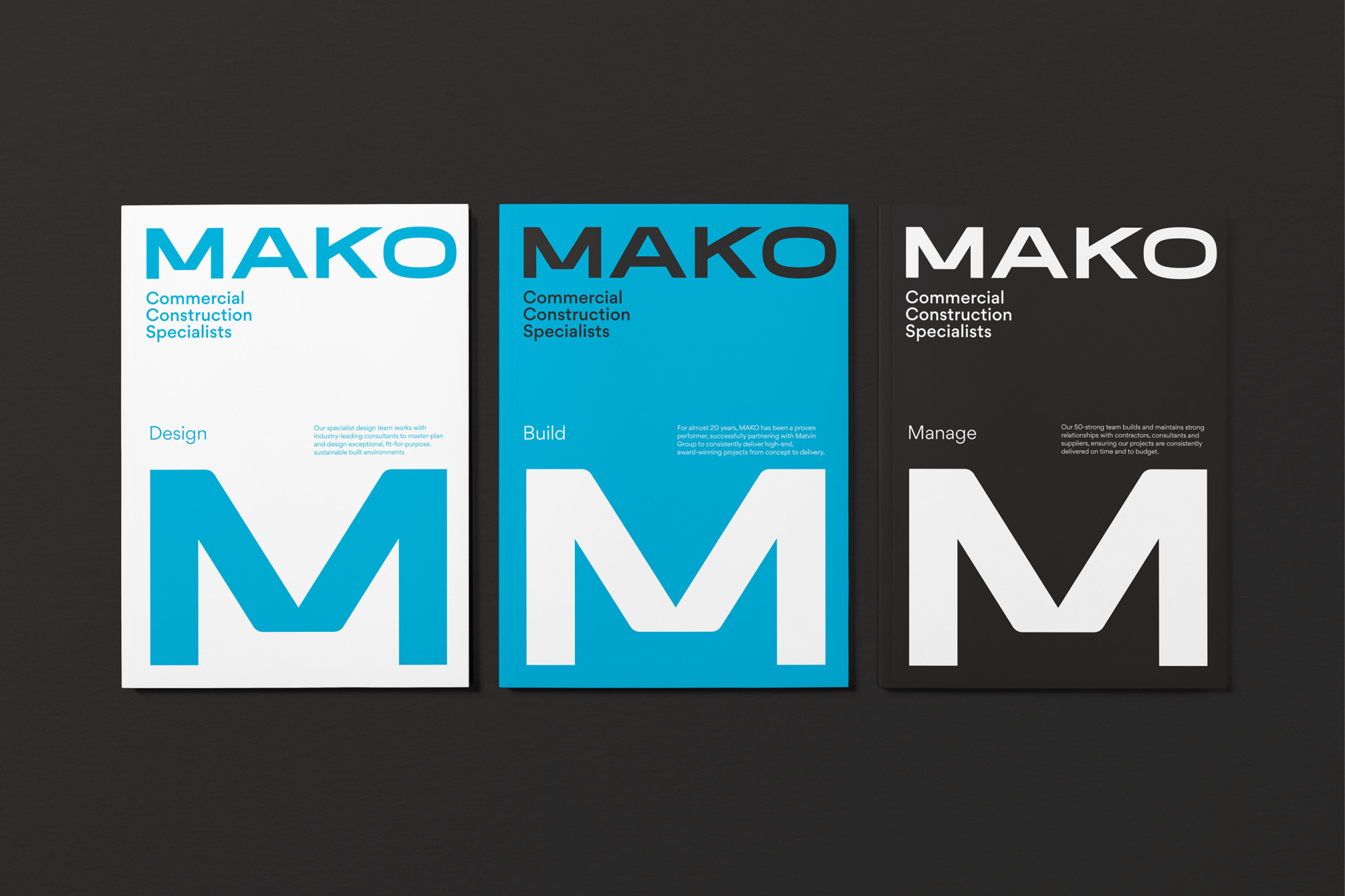
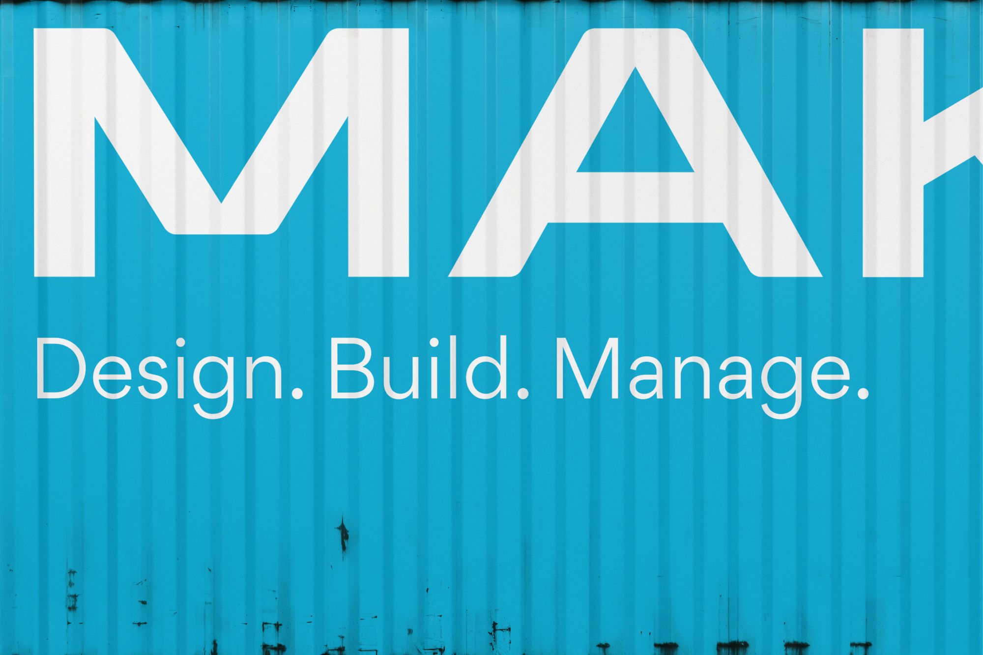
The key consideration of the project was to make a significant impact with a concise, four-letter brand name. Taking cues from the construction process, custom letterforms were crafted to mirror the extended linear and angular lines of wood and metal beams. These concealed elements of a structure provide buildings with shape, form, structure, and strength, serving as a perfect visual representation of the Mako team's values and proposition.
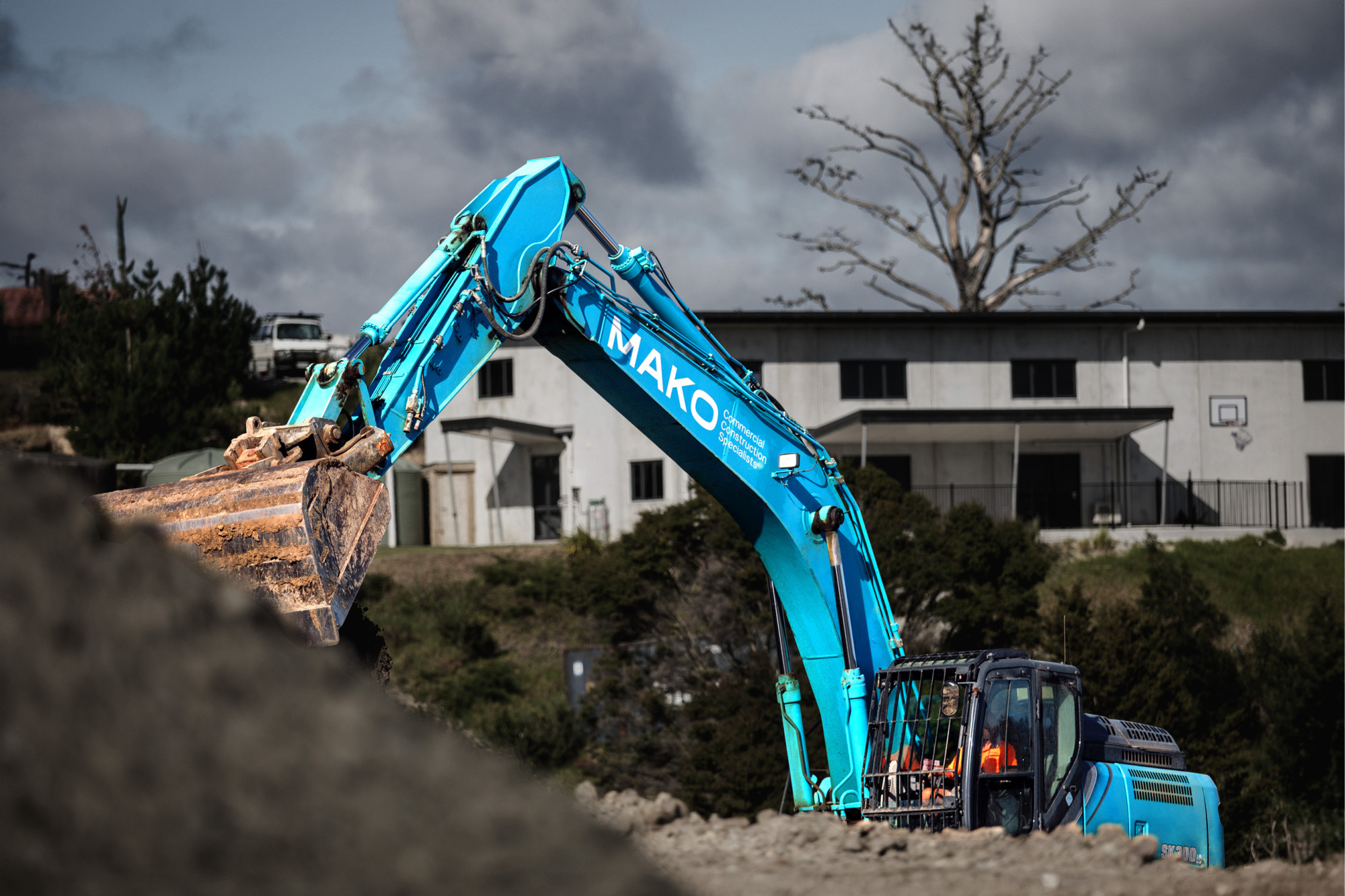
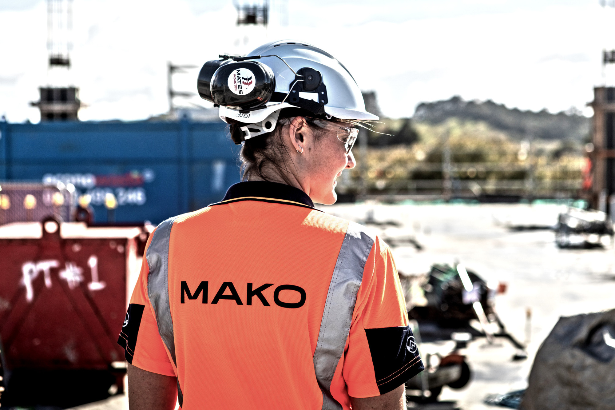
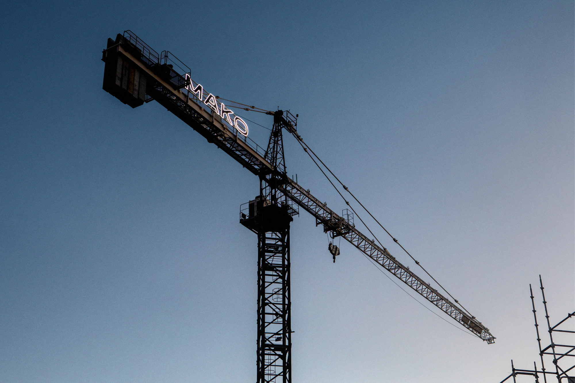
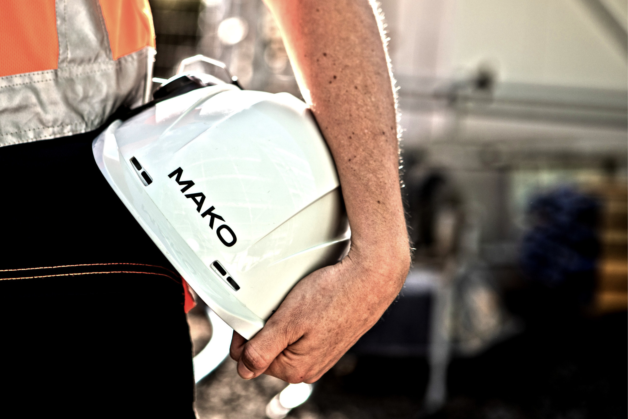
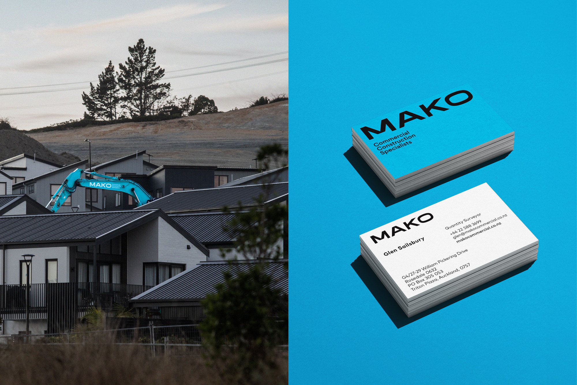
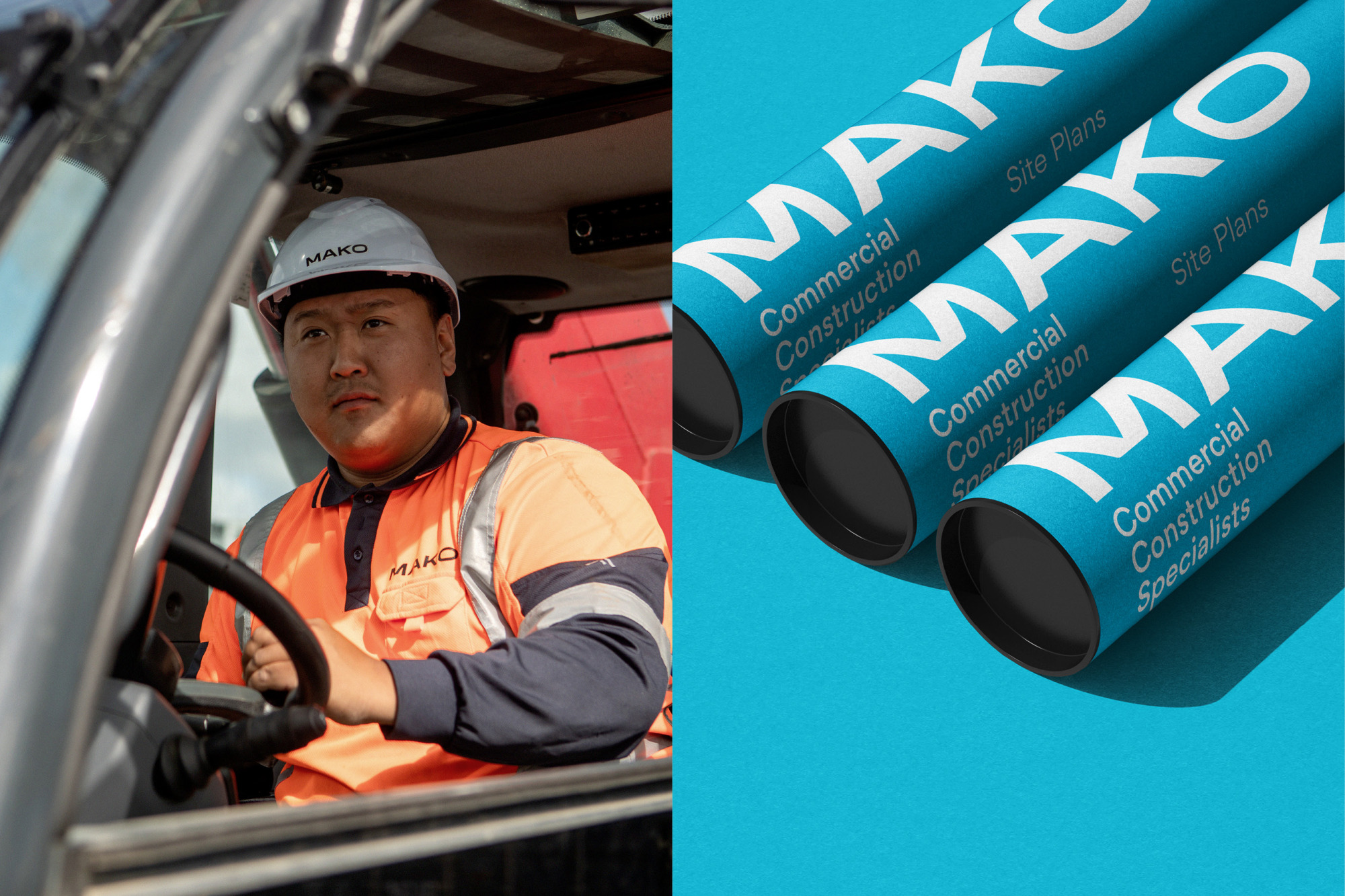
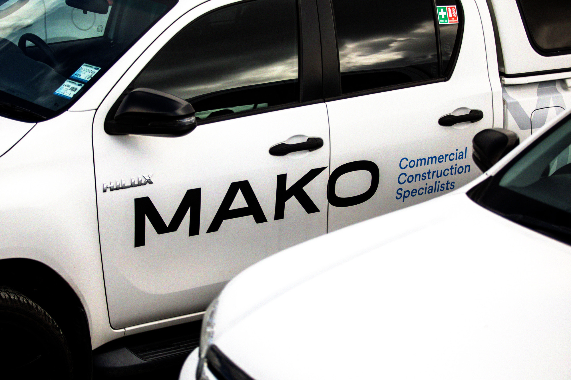
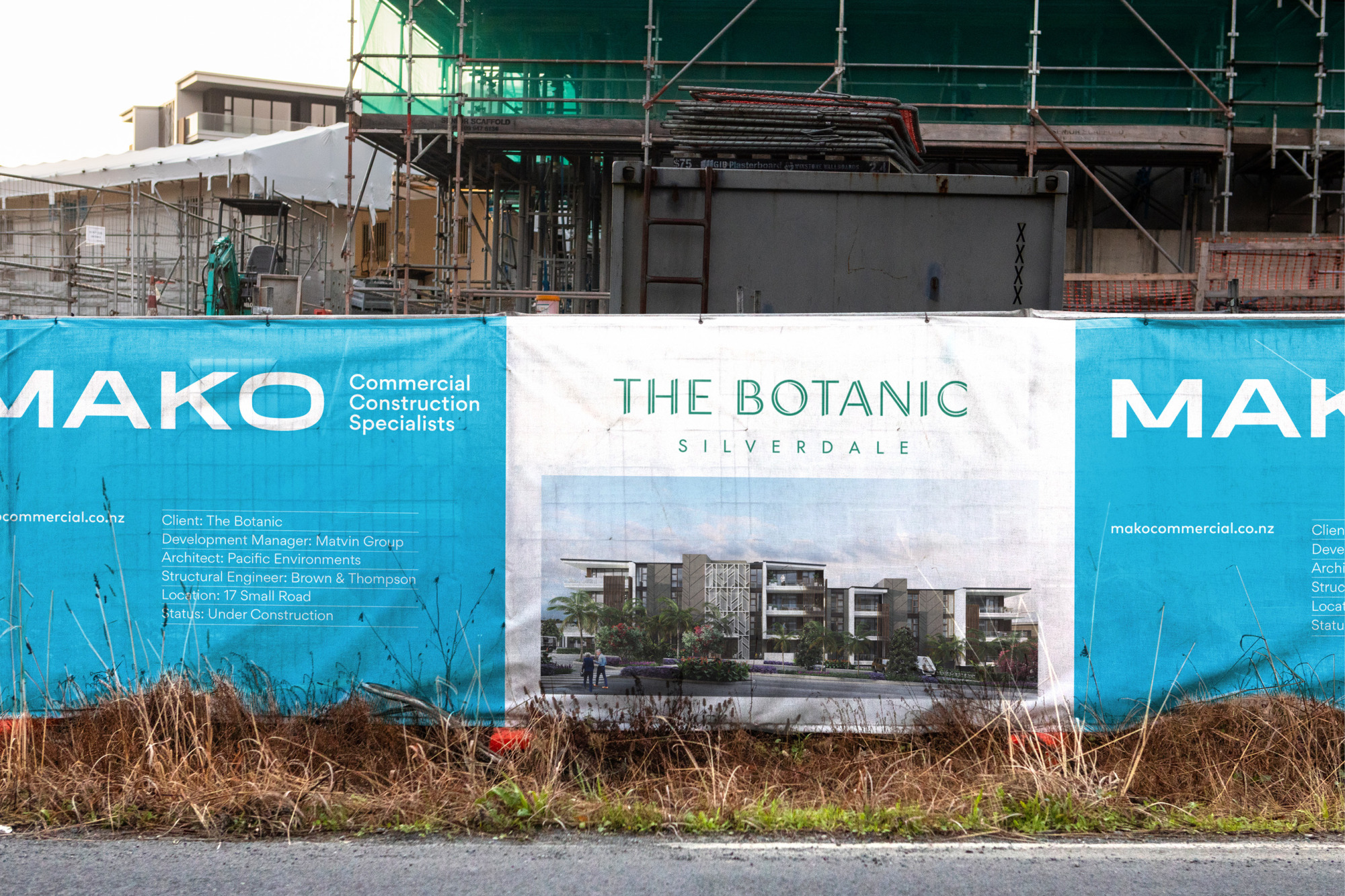
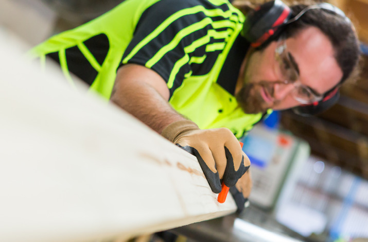
The simplicity of the wordmark allows for its use in a wide range of applications, both large and small. The primary guideline is to use it at different scales, from large applications like staff uniforms and vehicle liveries to construction site hoardings and hi-vis vests. A straightforward colour palette is focused and impactful; the use of a vibrant ocean blue with accents of black and white creates a distinct brand identity within the industry.
© All images are copyright of Onfire Design and cannot be used without prior permission.