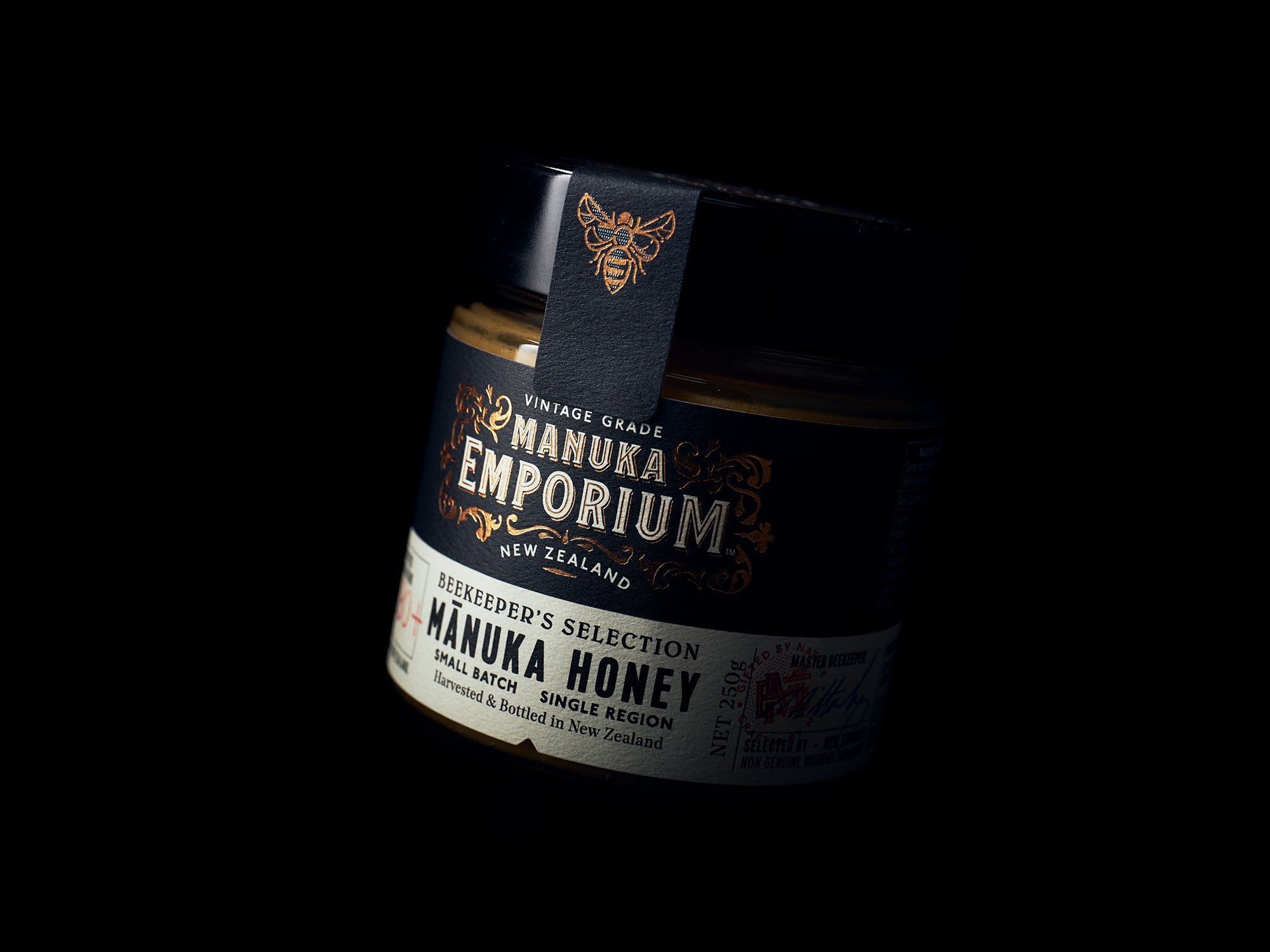
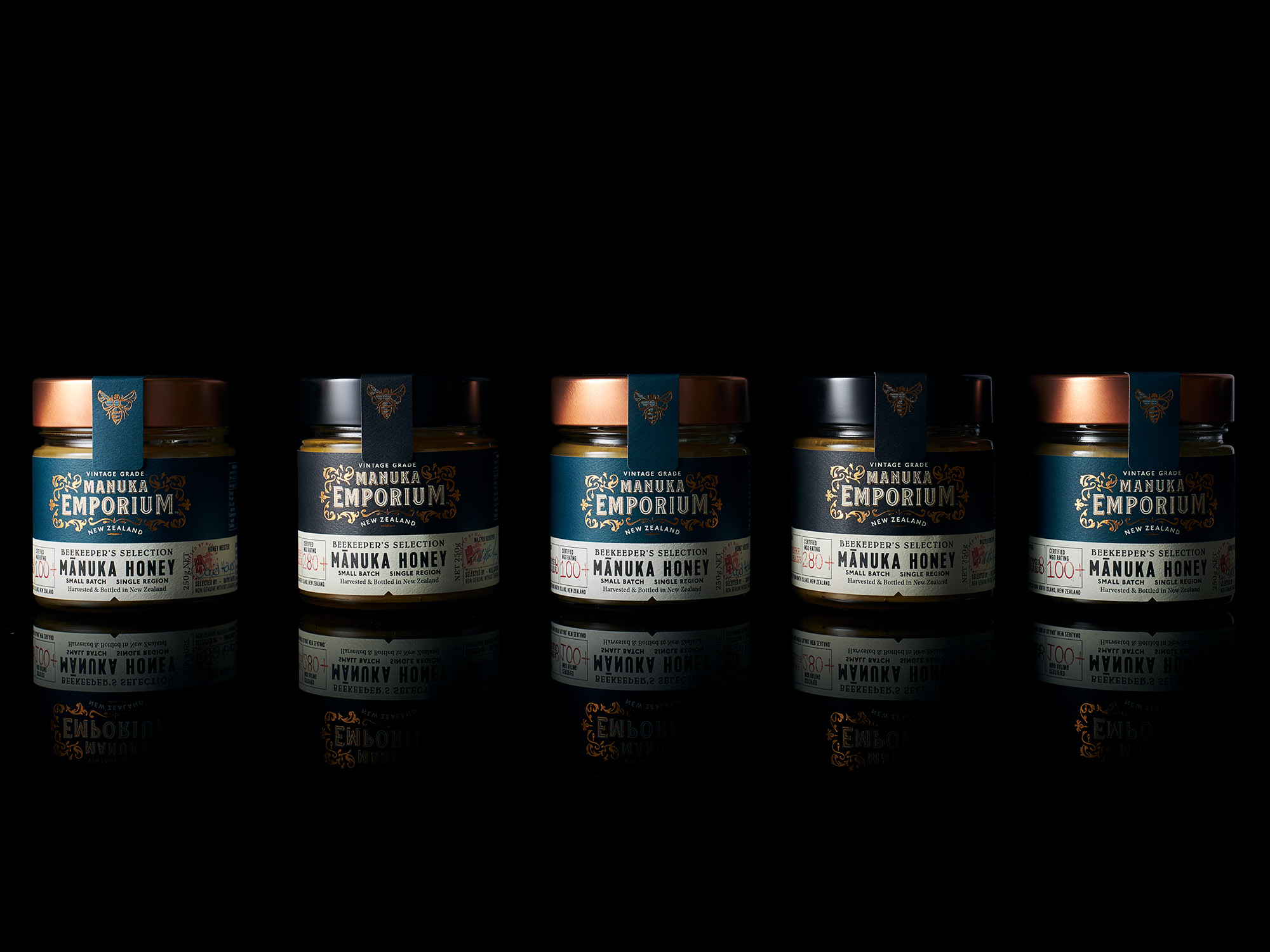
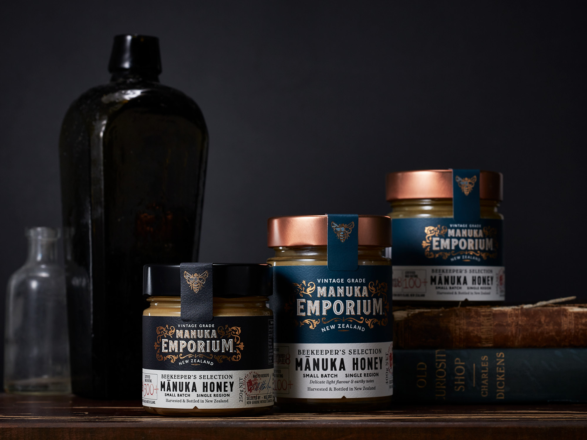
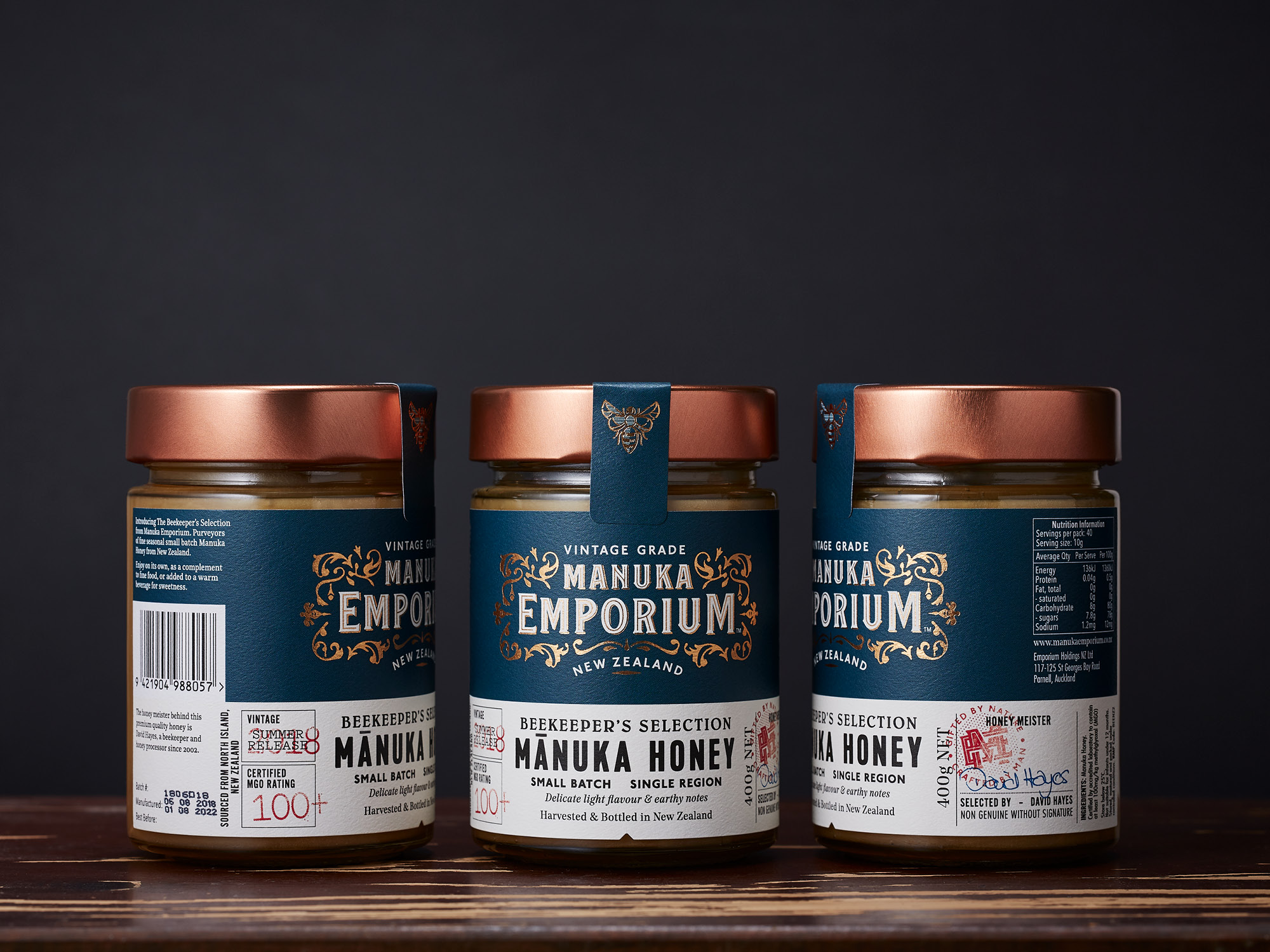
Capturing Time Honoured Traditions

Manuka Emporium

Onfire Design Manuka Emporium Honey Packaging Branding Design banner2

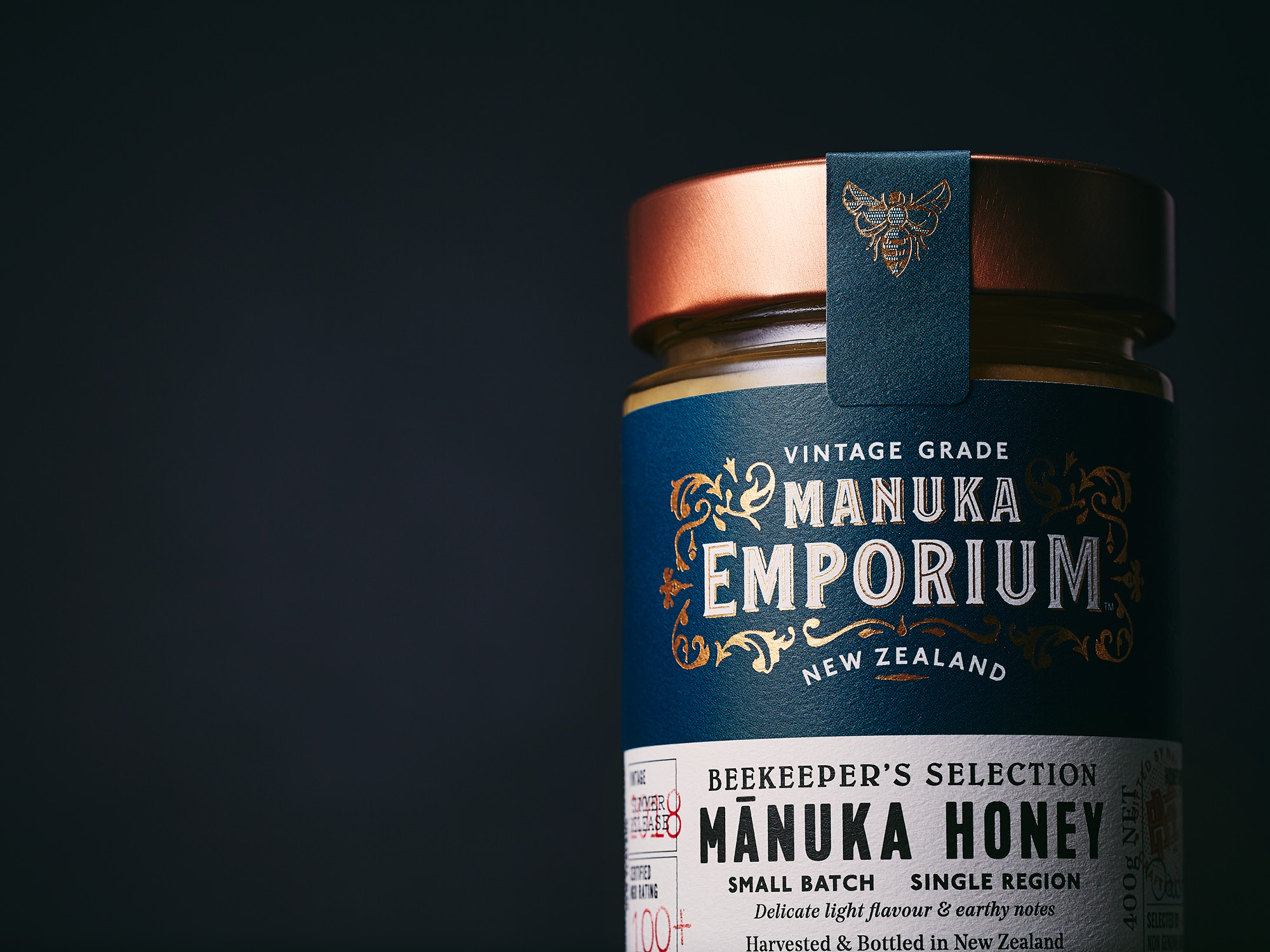
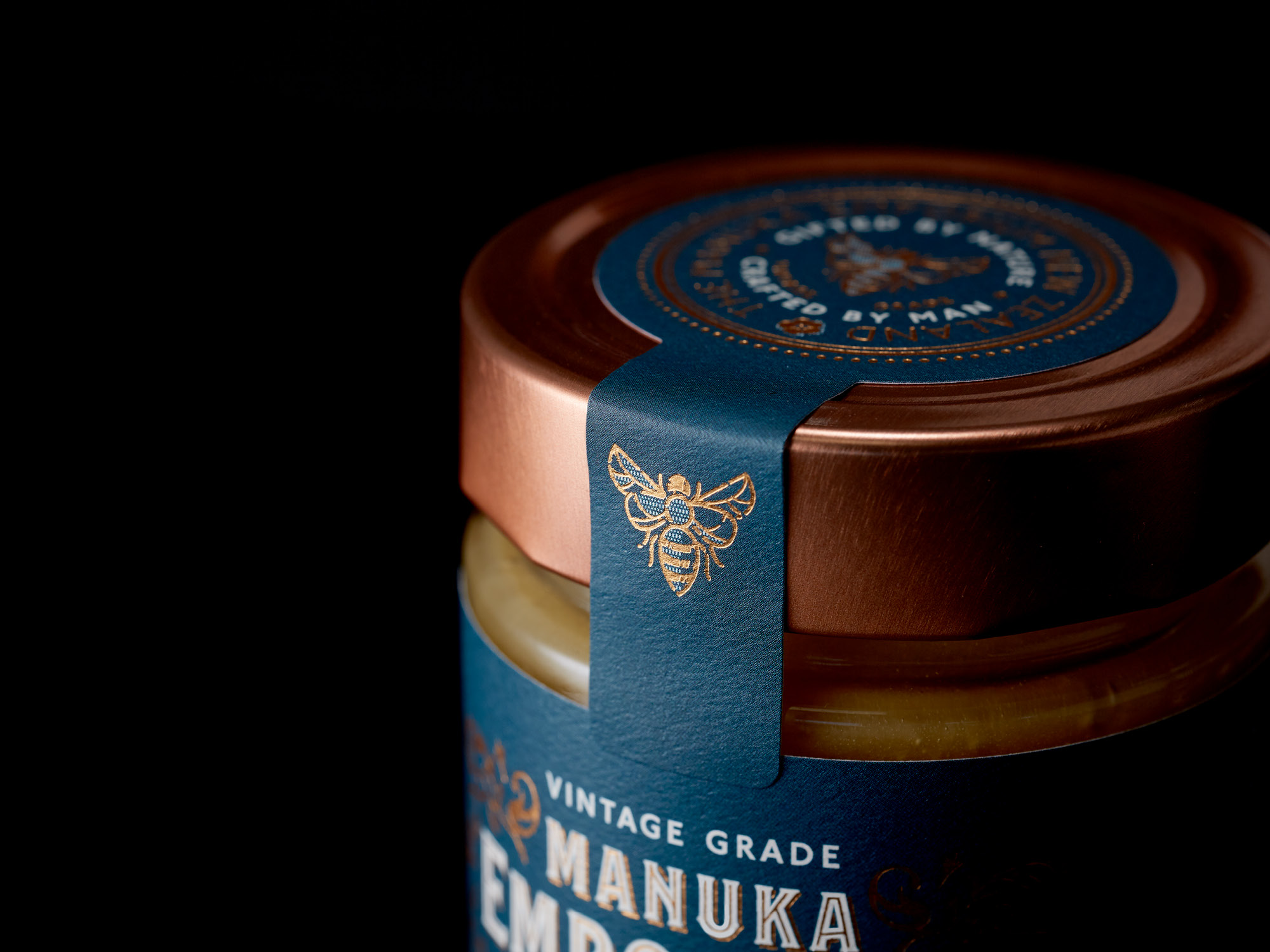
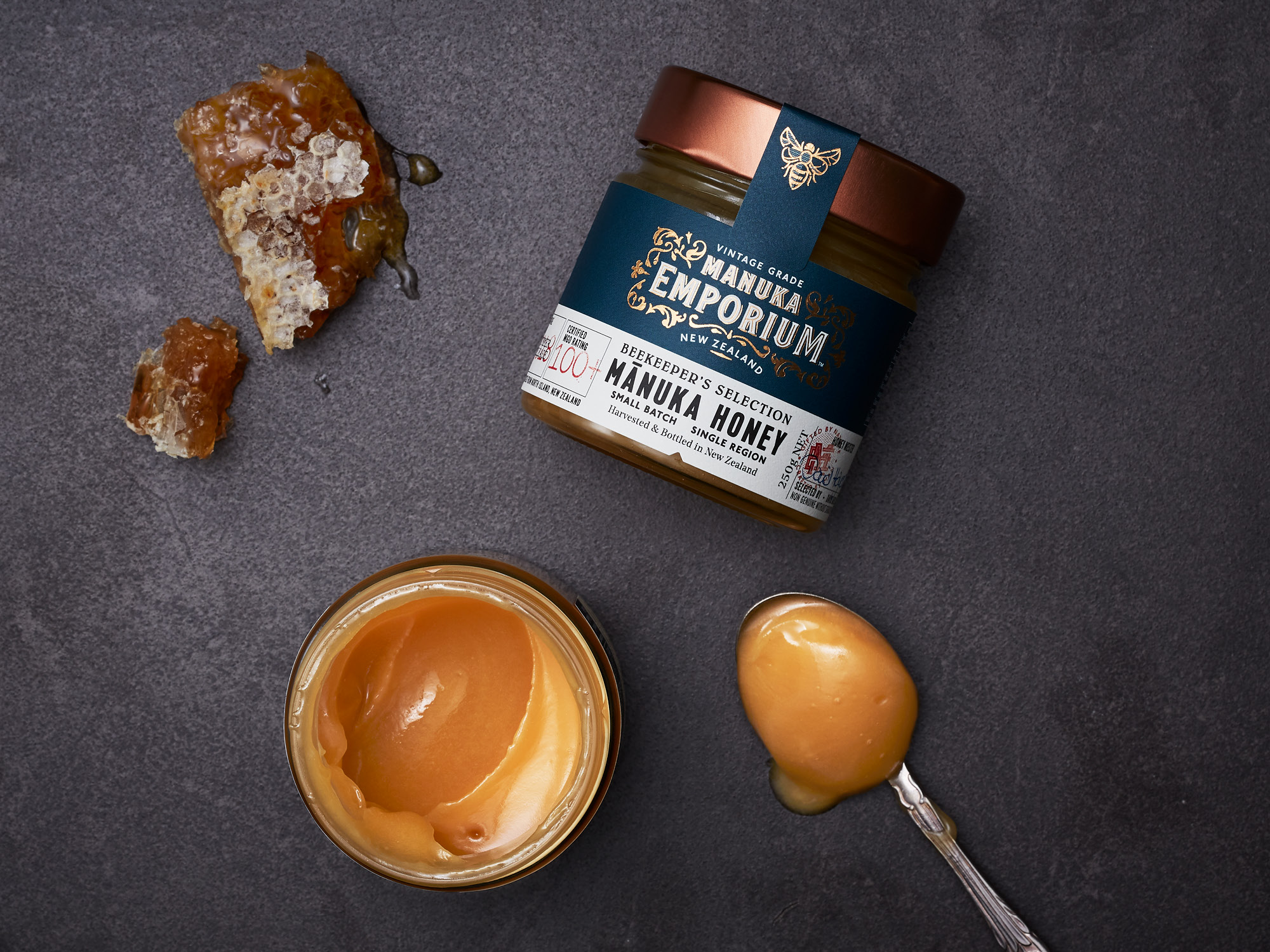
In today’s world of fast moving consumer goods, honey is often mass produced in bulk to meet demand, blended with varieties from numerous regions which dilutes the true provenance, character and flavour of the core ingredient. Manuka Emporium is a new honey brand challenging this mentality.


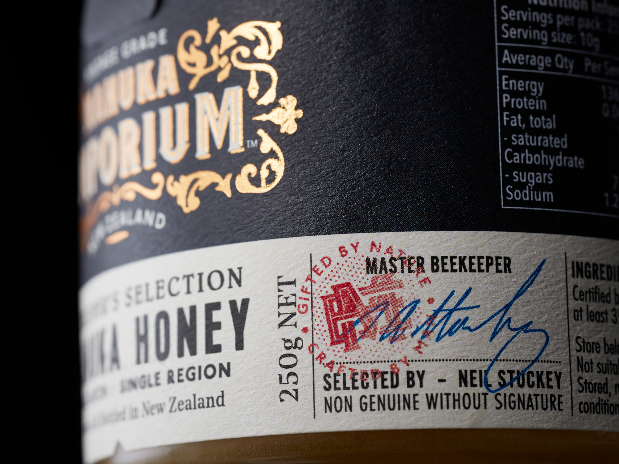
Working with a select group of today's apiarists in New Zealand, Manuka Emporium were inspired by the attitude, persistence and honey making philosophies of those who have come before and focused on delivering a product that is truly special in the market. The beekeepers from yesteryear harvested and sold pure single source honey to their local general stores which was then bottled and labelled by the shopkeeper. Simple, honest and true.


As featured on

Packaging of the World → 
Fab News →
The Dieline →
Studio AC →


Awards

Gold, World Brand Design Awards 2018 →
Silver, Pentawards 2019 →


Deliverables

Brand Strategy
Tone of Voice
Brand Identity
Packaging Design

Onfire Design Manuka Emporium Honey Packaging Branding Design 3
Onfire Design Manuka Emporium Honey Packaging Branding Design 20
Onfire Design Manuka Emporium Honey Packaging Branding Design 21

The brief was to create a superior brand that echoed the values of these skills and create an compelling visual language that would appeal to the discerning consumer looking for that special item for a social occasion or gifting. Inspired by the authenticity, opulent decoration and typographic crafting of premium liquor brands that can be discovered in old whisky lounges and bars, the brand exudes the charm and character of a Victorian era shop. Product details were added with the Beekeepers Selection label, proudly displaying vintage, season, style, flavour notes and the apiarists signature.

Onfire Design Manuka Emporium Honey Packaging Branding Design 22
Onfire Design Manuka Emporium Honey Packaging Branding Design 23
Onfire Design Manuka Emporium Honey Packaging Branding Design 24

Copper foiling, red stamps, different colour labels denoting MGO strength and a unique bee motif add premium cues to the quality of the product.

The Beekeepers Selection is the purest of foods, gifted by nature.

Onfire Design Manuka Emporium Honey Packaging Branding Design 25
Onfire Design Manuka Emporium Honey Packaging Branding Design 26

© All images are copyright of Onfire Design and cannot be used without prior permission.